If you're planning an upcoming webinar, you might be in the process of drafting your email sequence. Confirmation emails are a crucial part of any series since they let webinar registrants know that their registration was successful.
This guide will show you what to include and offer curated examples as inspiration.
To skip straight to the webinar confirmation email examples, click here!
What to include in your webinar confirmation email
The webinar registration confirmation email is one of the most important parts of your email sequence.
It accomplishes three main goals:
-
Letting your registrants know that their registration was successful
-
Giving registrants the opportunity to save the event to their calendar
-
Reinforcing the decision the registrant made when they first signed up
All three of these goals culminate in getting registrants to follow through on their commitment and actually show up for the webinar itself. The sections below will go over everything you need to include in your webinar confirmation email.
Subject line
Like all webinar emails, the subject line is the first thing that recipients see and will determine whether or not they even open the email. There are a few things you can do to increase your click-through rate (CTR) and avoid ending up in the spam folder:
-
Include the webinar title. This will not only remind registrants what the webinar topic they signed up for was but also let them know that the email is in response to their submission rather than a spam invite.
-
Use sentence case. Avoid using all caps in your email subject lines since this is likely to trigger the spam filter. Instead, opt for sentence case. In addition to evading the spam folder, this will also be easier for recipients to read.
-
Avoid using trigger words. Spam filters have been known to divert inbound emails to the spam folder if their subject line contains "trigger words" that are common in spam emails. "Click here", "free", and (ironically) "not spam" are a few examples of these trigger words.
Tip: Make sure to use the exact same title from the registration page and/or registration form to avoid confusing recipients.
Schedule
Once you get recipients to open your webinar confirmation email, the next step is to share essential details. Perhaps most essential is the exact date and time of the webinar event. Ideally, you would include the time/date in the subject line itself.
Alternatively, you could have the webinar date in the subject line and then the exact webinar time inside the body text of the email. In any case, be sure to include the full schedule so that registrants know when the event will be happening.
You might also want to include a "Save to Calendar" button that people can use to save the upcoming webinar to their Google Calendar (or other calendar services) so they don't double-book their schedule.
Tip: For bonus points, include information on the time zone (and countries within that time zone) to help registrants figure out what time it would be on their end.
To learn more, read our full guide on The Best Time and Day to Host a Webinar for Maximum Attendance!
Join link
Knowing when the webinar is happening is good but how to join it is even more crucial. If you're going for a plain-text webinar confirmation email then you can simply include a webinar link (perhaps with some bolded text preceding it) to let registrants join when the time comes.
Even better would be to embed the link in a button that recipients can click on to join the webinar.
Tip: Have your most important links/buttons (such as those for joining or saving the webinar) at the top of your confirmation email and place further reading material towards the bottom.
A hook to get them to show up
While it's generally recommended to keep your webinar confirmation emails as concise as possible and only cover the most pertinent details, you might want to include one (two at most) key pieces of information in the email body to increase attendance.
Use these hooks to remind existing registrants why they signed up and what they stand to gain by showing up (or conversely, stand to lose by not attending). There are many ways to do this but you should choose one approach and focus on it rather than using all of them at once.
Below are some examples of things you could include but remember to focus on just one hook!
-
Restate your webinar’s promise. Tell registrants how they, their lives, or their business will be different after attending the webinar. This reminds registrants why they signed up while agitating pain points and highlighting the benefits of attending your webinar.
-
Ask a thought-provoking question. Ask the registrant a question to start a conversation with them. Even just one reply or a quick exchange can exponentially increase the odds of them attending on the day of the webinar.
-
Reinforce your credibility. Information that establishes the credibility of the webinar host/guest presenters can convince registrants to follow through on the day of the event. The job title, company name, and industry experience of each speaker should help.
-
Provide social proof. Share testimonials of past attendees talking about how they were different after attending the webinar and in which ways their lives improved. You can also go one level deeper by sharing case studies.
-
Share a teaser video. A short teaser video from the host can reinforce the decision to sign up for the webinar and get registrants hyped for the presentation. These generally shouldn’t be more than a minute long.
-
Assign webinar prep material. You can also include relevant resources within your confirmation email. In the interest of keeping link clutter to a minimum, only link to one or two resources for registrants to read up on before attending the webinar.
Webinar confirmation email examples
Now that you know what to include in your webinar confirmation email, it's time to look at the curated list of examples. We've included examples from multiple industries including SaaS, e-commerce, programming, personal finance, risk management, and more to make the list as useful as possible.
Here are 14 examples of webinar confirmation emails:
-
AuditBoard
-
Human8
-
Bizzabo
-
Euromonitor International
-
BrightTALK
-
WebJunction
-
Eventbrite
-
Schull.io
-
PBLink
-
PLM Central
-
commercetools
-
ESS Group
-
Yusmoj Solutions
-
eWebinar
1. AuditBoard
Source: AuditBoard
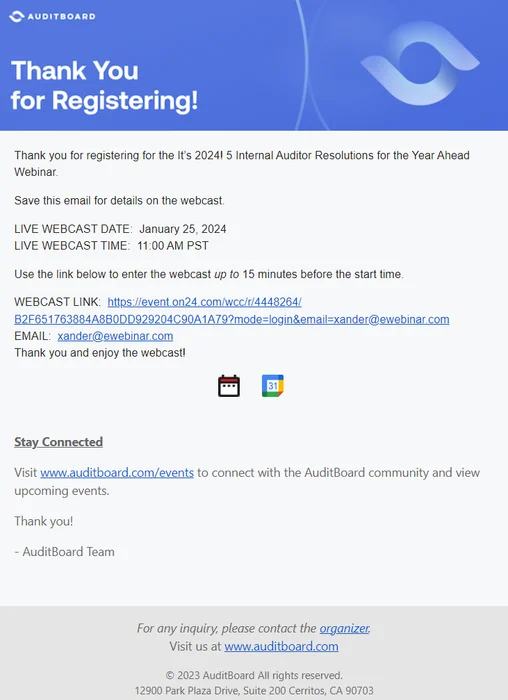
The risk management software AuditBoard adheres to all the best practices by restating the title of the event then prominently featuring the time and date — along with a link to join the presentation. They've also included buttons that registrants can use to save the event for their calendar.
2. Human8
Source: Human8
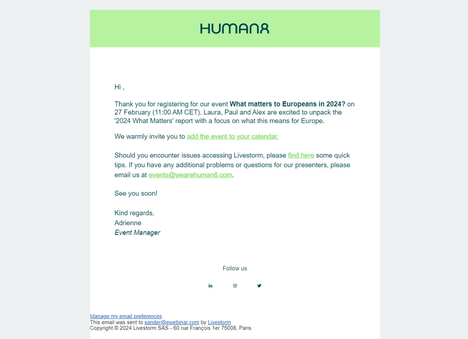
The consulting company Human8 takes a plain-text approach to their webinar confirmation emails while including a calendar link and contact email. They've also included their logo and brand colors in the interest of cohesive webinar branding.
3. Bizzabo
Source: Bizzabo
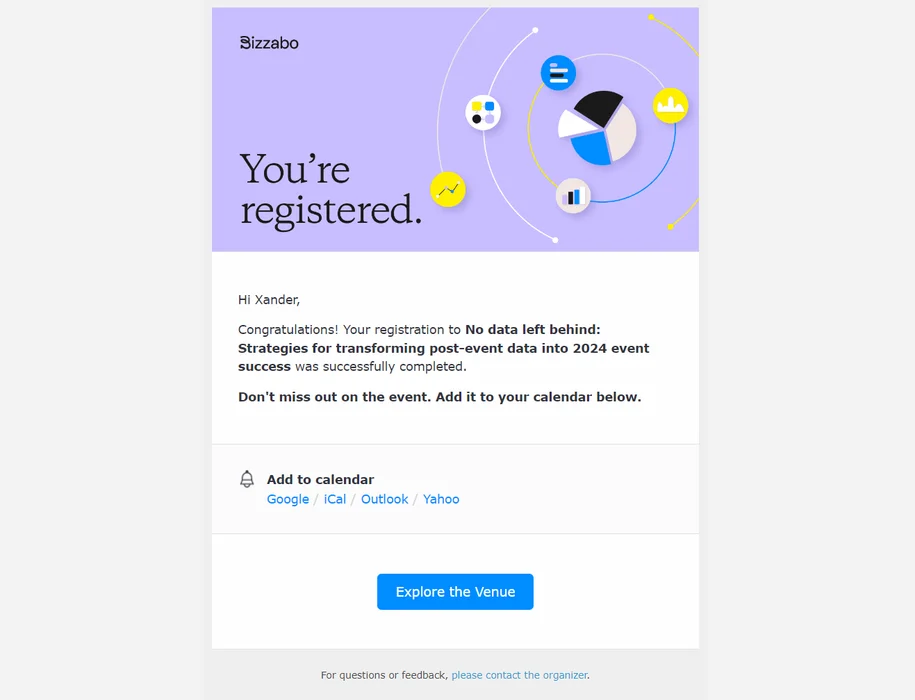
The event management software Bizzabo strikes a balance between conciseness and design with its short-but-aesthetic confirmation email. In addition to bolding the webinar title, they've also included calendar links for Google, iCal, Outlook, and Yahoo calendars.
4. Euromonitor
Source: Euromonitor
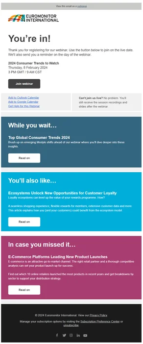
The market research provider Euromonitor includes the title, date, and time at the top of their confirmation email. However, they've also inserted additional resources and exclusive content below that registrants can consume while they wait for the event.
5. ServiceNow
Source: ServiceNow
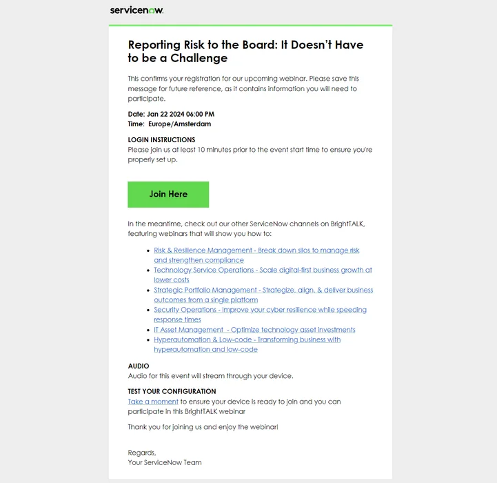
The workflow automation platform ServiceNow is a great example of how to include a lot of information while still ensuring key details stand out. The time/date are bolded while the join button is colored in a high-contrast green to ensure recipients see them before reading the rest of the text.
6. WebJunction
Source: WebJunction
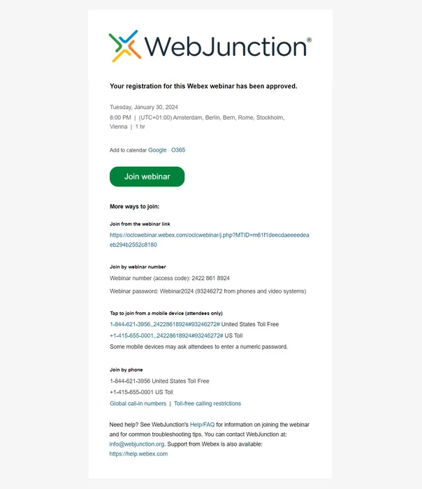
The library training platform WebJunction checks most of the boxes from our what to include section by having the time/date at the top, using country examples for the time zone, including calendar links, and adding a button for registrants to join the webinar.
Note: You'll notice that WebJunction also has a "Join by phone" option. Not all webinar platforms support dial-in attendance so your mileage may vary depending on the software you use.
7. Eventbrite
Source: Eventbrite
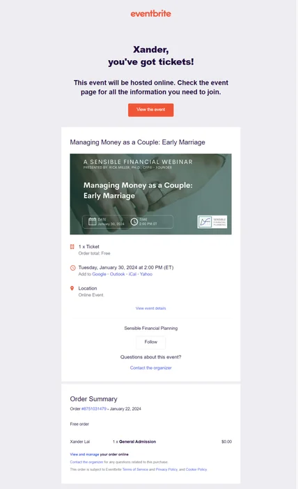
Eventbrite is a ticketing platform used for event management and the example above is from a webinar by certified financial planner Rick Miller. You'll notice that the confirmation email specifies that the order total is free since Eventbrite also lists events that you need to pay to attend.
8. Schull.io
Source: Schull.io
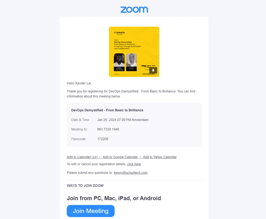
The EdTech platform Schull.io uses Zoom to host webinars and send confirmation emails. This means that the title, date, time, meeting ID, and passcode are all included — along with calendar links. The downside is the lack of a branded experience since Zoom's logo and colors are still clearly visible.
9. PbLink
Source: PbLink
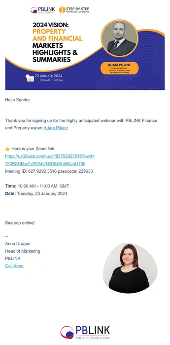
The membership organization PbLink uses graphics rather than text to summarize the webinar title, date, time, and presenter information. They've also taken the liberty of including the event schedule and join link below the banner as a contingency in case the image fails to load for certain recipients.
10. PLM Central
Source: PLM Central
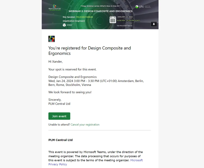
The software consulting firm PLM Central uses its banner graphic, concise text, and join button to keep the confirmation email as short as possible. In a rare move, they've also included a "Cancel your registration" link at the bottom for those who can't attend the event.
11. commercetools
Source: commercetools
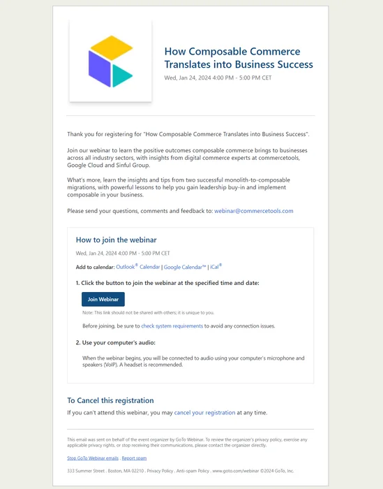
The headless commerce platform commercetools has a rather text-heavy approach to their confirmation email. However, they do include useful information on how to join the webinar (which should probably be higher up) and, like PLM, have a registration cancelation link.
12. ESS Group Inc
Source: ESS Group Inc
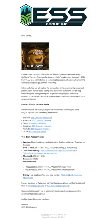
The government-contracting mentoring academy ESS Group doubles down on meme culture and social media handles to resonate with younger demographics while highlighting their webinar benefits. Our only critiques would be the lengthy intro and placement of the social media links above the access details.
13. Yusmoj Solutions
Source: Yusmoj Solutions
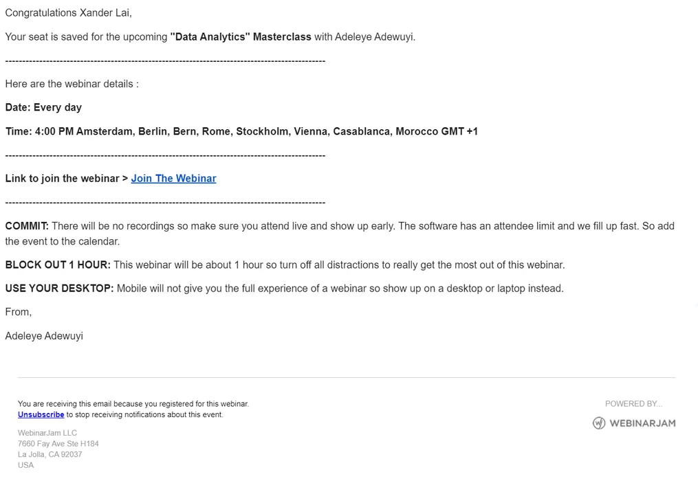
The IT consulting/training company Yusmoj Solutions doesn't have the sleekest design or the best copy but they do manage to bold the most important details. Furthermore, they even use seven different cities — conveniently located above the join link — to help recipients grasp the time zone.
14. eWebinar
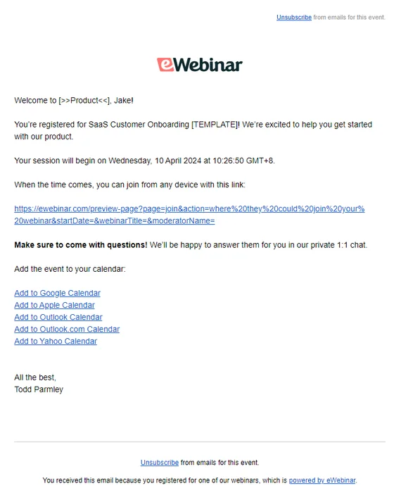
We looked at many webinar email examples so let's take a peek at what confirmation emails look like on our own webinar platform, eWebinar. You'll find the webinar date, time, time zone, join link, and calendar links all neatly wrapped in a compact package.
Note: Because our software comes with confirmation email templates, all users have to do is fill in the name of their event and (optionally) a link to their website.
What else you'll need for a webinar email sequence
A confirmation email alone isn't enough to complete your webinar email sequence. There are 2-3 other types of emails that you'll need as well. The sections below will give you a brief look at each of them before we wrap this guide up.
Webinar invitation emails
Those with existing audiences can use email marketing campaigns to get an early influx of registrants to their next webinar. Sending out a webinar invite email to your newsletter subscribers is optional but is at least worth considering when building out your email sequence.
Webinar reminder emails
Including a webinar reminder email (or, ideally, multiple reminders) in your email sequence will bolster attendance rates by ensuring that people don't forget about the webinar. This is especially important if there's a large gap between the date people can register and the day of the actual event.
Here's the recommended schedule for sending out webinar reminder emails:
-
First reminder: one week before
-
Second reminder: one day before
-
Third reminder: two hours before
Webinar follow-up emails
The post-webinar follow-up email is an important part of the process to ensure that you're able to capture leads and close any attendees who didn't convert during the presentation itself. You can also include a webinar recording for registrants who didn't show up for the event.
You might choose to include a post-webinar survey as well in order to gather feedback from webinar attendees. Last but not least, you can use follow-up emails to promote future webinars and therefore get attendees to sign up for upcoming events.
To learn more, read our full guide on Best Webinar Survey Questions to Ask Before, During, and After!
Conclusion
We hope that the information and examples in this guide have shined a light on what you need to include in your own webinar confirmation emails. If you're still not sure where to start, using an email template may be the best approach.
Feel free to have a look through the eWebinar template library to see all our available webinar email templates. Each template comes with at least six emails that you can use, edit, and send out to anyone who registers for your webinars.


![How to Write Webinar Follow-Up Emails That Get Results [With Email Templates]](/_image/5ab8b8bffb0251a4.png)