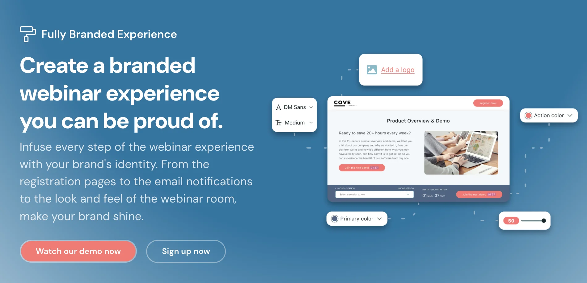
Webinar branding doesn’t simply end in adding your logo and choosing an attractive template. It’s about creating a unique identity that resonates with your audience and bringing them a memorable experience. This experience shouldn’t be just till the webinar lasts.
You need to captivate them from the moment they get your invitation to after the webinar has ended.
In this post, we'll go over:
-
What is webinar branding?
-
Key elements of webinar branding
-
Importance of webinar branding
-
Best practices for branding your webinar
-
Webinar branding in live vs. automated webinars
-
Successful webinar branding examples
What is webinar branding?
Webinar branding is precisely the same as business branding. Like branding a new business, webinar branding involves the strategic use of consistent visual and thematic elements to create a cohesive and memorable experience for the users. From the design of promotional materials to the tone of the presenter's voice, webinar branding covers everything.
Key elements of webinar branding
The process of webinar branding comes down to three key elements:
Customized visuals
One of the major elements that need close consideration when working on your webinar branding is customized visuals.
To ensure that your webinar has been well branded, you need to develop a consistent color scheme, use branded imagery, and incorporate your logo in your videos. This allows you to create visually appealing slides and promotional materials for your webinars.
Engaging content
Many marketers don’t consider the webinar content itself to be part of the branding strategy. In reality, it’s arguably the most important factor. As such, you should build your presentation around interesting content ideas that the audience will find helpful and actionable.
It’s also important that your content aligns with your brand voice and values. Whether it's the language used in the presentations or the style of your slides, everything should reflect your brand identity.
Damian Grabarczyk, the co-founder and growth marketer of PetLab Co., says:
"In our early days, we turned to webinars as a bridge to connect personally with pet owners and enthusiasts. It wasn't just about sharing knowledge but about building a community. We focused on creating engaging, interactive content that resonated with our audience's passion for pet care. This meant incorporating real-life stories, interactive Q&A sessions, and expert insights that resonated with our audience's love for their pets. This approach transformed our webinars from simple information sessions to vibrant, community-building events. The result was a loyal following that grew organically, drawn by the authentic connection we fostered through our content. It's a testament to how engaging content can turn a brand into a trusted companion in a customer's journey."
Interactive elements
You might want to incorporate interactive features such as polls, Q&A sessions, and surveys in your webinars. Our webinar platform, eWebinar, lets you insert 20+ unique interactions by dragging the playhead and clicking on the "Add interaction" button:
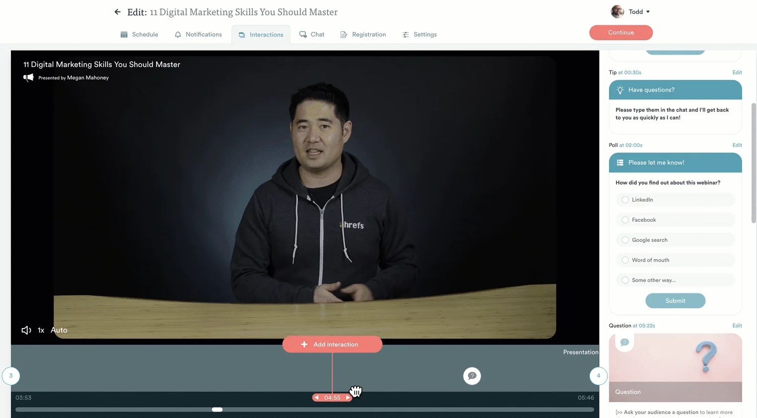
You can use these elements to gather feedback, allow your participants to interact with the presenter, and send customer data to your integrated CRM of choice. These interactions also encourage audience participation while increasing engagement rates and watch time.
Note: Make sure that these interactive elements align with your brand tone and identity.
If you want to experience an interactive on-demand webinar for yourself then watch our demo!
Importance of webinar branding
Branding your webinars is more than just aesthetic enhancement. It plays a pivotal role in achieving broader business objectives.
Webinar branding is important because it:
- Builds trust and credibility
- Strengthens brand identity
- Enhances audience recall
- Generates sales and conversions
Builds trust and credibility
Publishing branded webinars consistently can help build trust and credibility for your business. When people look at your branded videos all the time, they start recognizing your brand just by looking at your videos. It creates a sense of familiarity and recognition.
This is very important to build trust among your audience. When participants recognize your brand elements, they are more likely to engage and perceive your content as reliable.
Strengthens brand identity
Webinars provide a unique platform to showcase your brand personality. When you align your webinar content with your overall brand identity, you reinforce the distinctive qualities that set your brand apart. This is very important to strengthen your brand identity.
Enhances audience recall
A well-branded webinar is always more memorable than one that’s not branded. When attendees associate your content with your brand, they are more likely to recall it long after the webinar concludes.
As a result, there will be increased brand recall and recognition.
Generates sales and conversions
Hosting webinars can also help boost your sales and conversions. As mentioned above, webinars can help create brand recognition. This builds trust and motivates people to buy more confidently from you. As a result, your sales and conversions start increasing.
Now that we have looked at the importance of branding, let’s move ahead and check out how to brand your webinar.
Best practices for branding your webinar
Branding a webinar can be challenging, especially when you’re trying to do it to set a mark in your industry. But you can easily do it if you have a proper strategy with practical steps. The sections below will go over some of the best practices to stick to when branding your webinars!
Define your brand guidelines
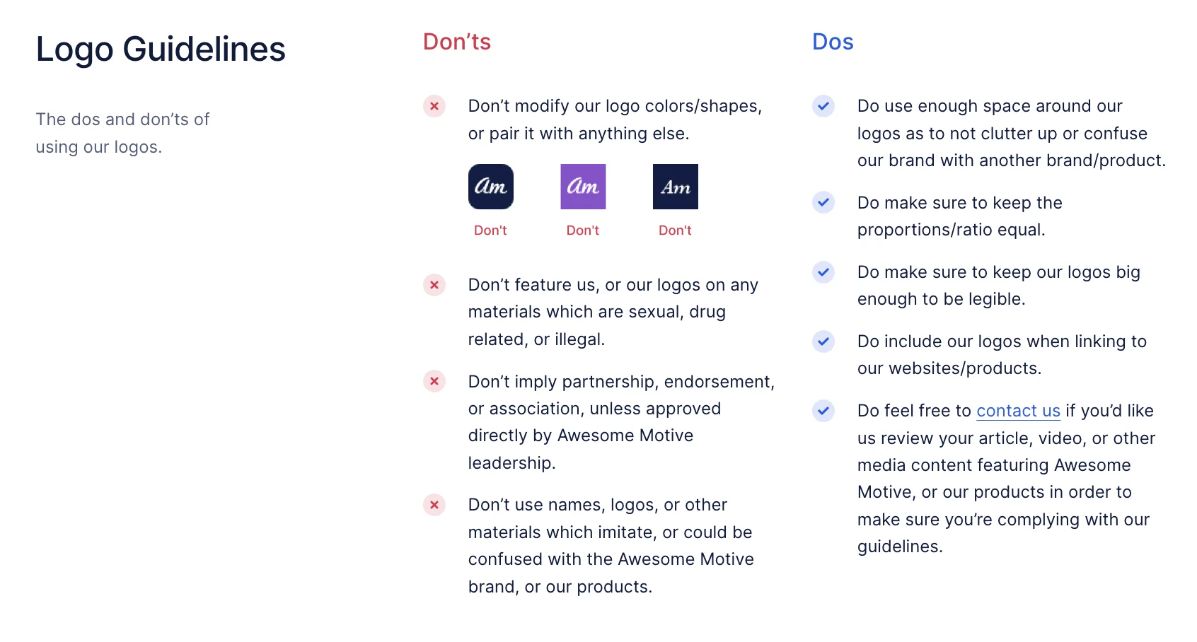
The first thing to consider when branding your webinars is to have defined guidelines for your brand. These brand guidelines should cover what your visual elements, tone of voice, and overall presentation style should be like.
Source: Awesome Motive Inc.
Having such a guideline ensures a consistent brand experience across all your webinars. Besides, it makes it easy to implement the branding process more smoothly.
Create branded webinar templates
Creating some branded templates for your webinars can be a great way to bring about consistency in your online events. So, go ahead and design some visually appealing templates for your brand. You should consider having the following elements in your templates:
-
Consistent branding through logos, fonts, and overall design.
-
Clear well-defined structure for introduction, main content, and conclusion
-
Engagement elements like polls, Q&As, surveys, etc.
-
Visually appealing graphics and imagery
-
Audience interaction elements through reactions, CTAs, social share buttons, etc.
You can then use these templates for your presentation slides, promotional emails, and registration pages. Just make sure that they align with your brand colors, fonts, and imagery.
Have a look at our library of webinar templates!
Integrate branding into promotion
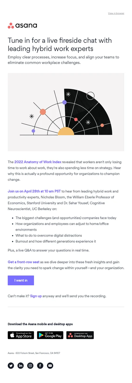
When it comes to branding your webinars, don’t always limit yourself to your online events. You also have to maintain consistency across all digital marketing platforms. This can be for your webinar invitations, email newsletters, or social media posts.
Source: ReallyGoodEmails
It’s important to infuse your promotional materials with brand elements. Consistent branding at every touchpoint helps in creating a seamless and recognizable user journey.
Leverage customization features
Many webinar platforms offer customization options. If yours is one of them, why not take advantage of these features? You can use it to include your logo, add your brand colors, and other elements within the webinar interface.
The best thing about using these features is that you don’t need to build a new template from scratch. All you need to do is add your elements into the existing section and you’re good to go.
Train presenters on brand consistency
It’s not always important to have a single presenter for your webinars. You might have different faces to host your events. No matter how many presenters you might have, it's important that you train them to understand the importance of maintaining brand consistency.
Provide them with proper guidelines regarding the language, tone, and visual elements to be used during the webinar. This helps ensure a unified brand message.
Webinar branding: live vs automated
Webinars fall into two main categories: live webinars and pre-recorded webinars. Irrespective of which format you’re using, branding your webinar is crucial for its success. Webinar branding approaches differ based on which format you’re using. Live webinars are generally time-sensitive and real-live events.
For such webinars, the focus is on building a connection between the audience and the presenter. So, you need to incorporate real-time personalization. This can be about addressing your attendees by name, responding to their questions, and engaging with the audience one-on-one.
To make your webinars visually appealing, use branded overlays, lower thirds, and other live graphics. In automated or pre-recorded webinars, you should be more focused on using consistent branding elements. This should be in terms of your visuals, messaging, tone, etc.
However, you should consider a few general branding best practices like a consistent logo and brand palette. You can also create branded handouts, slides, and materials for both types of webinars.
Successful webinar branding examples
Let’s take a look at a few examples of successful webinar brands!
HubSpot’s Grow Better webinar series

Source: HubSpot
HubSpot’s ‘Grow Better’ webinar series is a perfect example of successful webinar branding. They have incorporated all important elements like their logo, color scheme, font, etc., consistently in their webinar.
Neil Patel’s Digital Marketing webinars
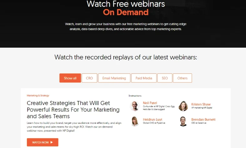
Source: Neil Patel webinar replays
Neil Patel’s ‘Digital Marketing’ Webinar series has the most professional look because of how well it has been branded. The content has been neatly aligned to make it look clean and modern.
Social Media Examiner's "Social Media Marketing World" virtual event
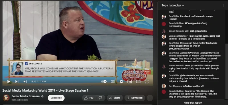
Source: Social Media Marketing World 2019
Social Media Marketer’s webinar branding is another perfect example to draw inspiration from. They have done a great job displaying the logo consistently below the webinar. It’s a very smart way to highlight your brand name and create a memorable experience for your users.
The use of interactive elements to highlight people’s comments makes the webinar more engaging. It’s a very smart way to keep users engaged and interested in the event for longer.
Conclusion
Webinar branding is a powerful tool for creating impactful online events that leave a lasting impression on your user’s minds. By incorporating these best practices into your webinar strategy, you can not only build a strong brand presence but also enhance audience engagement and elevate your overall online presence.
As you embark on your webinar journey, remember that every interaction is an opportunity to reinforce your brand and leave a positive, lasting impression on your audience
Author bio: Syed Balkhi is the founder of WPBeginner, the largest free WordPress resource site. With over 10 years of experience, he’s the leading WordPress expert in the industry. You can learn more about Syed and his portfolio of companies by following him on his social media networks.


