
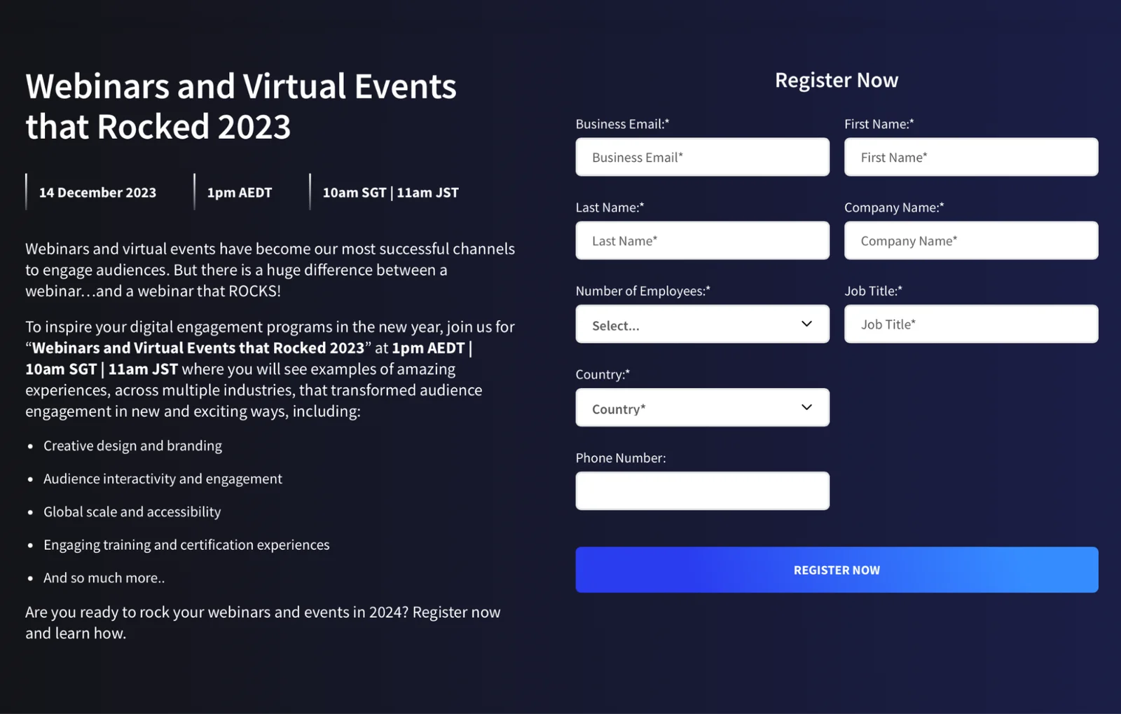
A survey of over 2,000 marketers found that 89% of respondents reported webinars outperforming all other channels for the purpose of generating qualified leads. 89% of respondents. However, webinars are only a powerful lead generation tool if you can get people to sign up for them.
As such, designing better webinar landing pages could be the only thing standing between you and a reliable stream of leads for your business. This guide will show you 28 of the best webinar landing page examples we came across during our extensive research so you can leverage the same tactics they use.
Let's dive in!
Webinar landing page best practices
Before we go through the list of the top 28 webinar landing page examples, it will be helpful to briefly go over the best practices for designing your own webinar page. There are four questions your webinar landing page needs to answer before a visitor turns into a registrant:
-
Is this for me?
-
Who’s behind this training?
-
Can I trust what they’re teaching?
-
When can I watch?
Your landing page design should center around answering those four questions as quickly as possible and moving them toward the call to action at the end. If you're able to agitate a pain point or two while answering those questions then you'll get even more signups once people reach the CTA.
Note: If you aren't interested in finding out what these best practices are then click here to skip ahead to the section on webinar landing page examples. However, these best practices were distilled by analyzing the copy, graphics, and design from the 28 landing page examples below.
Hook visitors with an enticing headline
No one starts by reading the webinar description. Your body copy may be what drives sign-ups but that'll never happen if potential customers aren't hooked by the headline. This is why your webinar headline needs to include three key elements:
-
Webinar's topic
-
Its key benefits
-
A sense of urgency
In other words: What is it about, why should they watch it, and how soon do they need to register?
"How to 2x Organic Traffic With On-Page SEO [Registration Ends Soon]" will be more compelling than "Get Traffic With Content Marketing (Webinar)" because it offers specific details on the webinar's focus, highlights the desired outcome, and triggers FOMO by instilling a deadline for people to sign up.
You could even switch out "[Registration Ends Soon]" with "[Limited Spots Only]" if you want to swap out urgency for scarcity. Urgency is about how much time people have while scarcity is about how many people can join — a small but powerful difference if you know which one resonates with your audience.
Note: You never want to fake scarcity as that would risk losing the trust of your audience. It’s fine for live webinars but, if you’re running pre-recorded webinars 24/7, be transparent about it.
If you want to learn more about crafting a high-converting webinar title then read our full guide on The Best Webinar Titles to Give Your Signups a Boost!
Create a bullet list of benefits offered/problems solved
Source: Slack
These key discussion points don't need to be long but they should clearly communicate the problems being solved, benefits being provided, and how the attendee's life will change after the webinar — their dream outcome.
This will be far more effective than a dry list of which topics you’ll go over during the presentation. You also don't want to give too many details as that might overwhelm interested visitors so always narrow the focus on the core problems, benefits, and outcomes.
Tip: Having 3-5 bullet points tends to be the sweet spot when outlining the agenda.
Here's an example:
-
How to drive more revenue with your campaigns
-
Identify ways to reduce your marketing costs
-
Spend less time on unqualified leads
It’s worth noting that this bullet list can serve as your entire webinar description. If the agenda and topics you’ll be covering are compelling enough, you don’t need any additional fluff text to go before or after it.
Establish credibility with speaker bios
Telling people who the webinar host is and why they can trust them is the next obstacle you need to overcome to get them to sign up. There are three main paths to establish the credibility of a webinar host (or guest speaker):
-
Name. For well-known individuals, their names may be all it takes to establish credibility and drive signups. That said, most of us aren’t named Alex Hormozi or Andrew Huberman so more work will need to be done.
-
Experience. Sharing how many years or decades of experience a webinar host has is the most straightforward way to get the audience to trust you. After all, those with a solid track record will be better equipped and qualified to teach the secret sauce to attendees.
-
Title. Regardless of how long you’ve been in the industry, holding a relevant position at a prestigious company will earn the trust of most registrants. Wouldn’t you want to learn about email marketing from the CMO of Mailchimp?
If there are other presenters aside from the webinar host then name-drop them, add a headshot, and apply the same credibility tactics above. Guest speakers will also be more likely to cross-promote the webinar to their audience if you feature them on the landing page.
Source: eLearning Industry
This is a highly effective way to leverage existing audiences while you're still on the journey toward building your own. That said, there’s no guarantee that guest speakers will promote the webinar — so be sure to do your own promotion as well.
To learn more, read our full guide on 25 Ways to Promote An On-Demand, Evergreen Webinar!
Build trust with social proof
Social proof tells visitors that other people have already gotten value out of previous sessions — which makes them more likely to sign up for the next webinar. Testimonials and reviews are the most common forms of social proof on webinar landing pages.
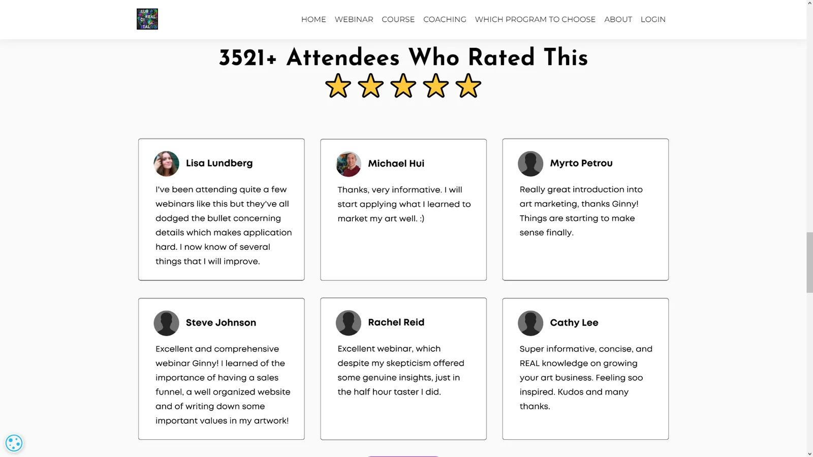
Source: Surreal Digital
However, you could also link to more in-depth case studies or even showcase any industry awards you may have won. When deciding which reviews or testimonials to highlight, prioritize those that outline the key lessons an attendee took away from the webinar.
Tip: If most of your testimonials are in video form rather than text, you can create a supercut and then embed the short compilation video in your webinar landing page.
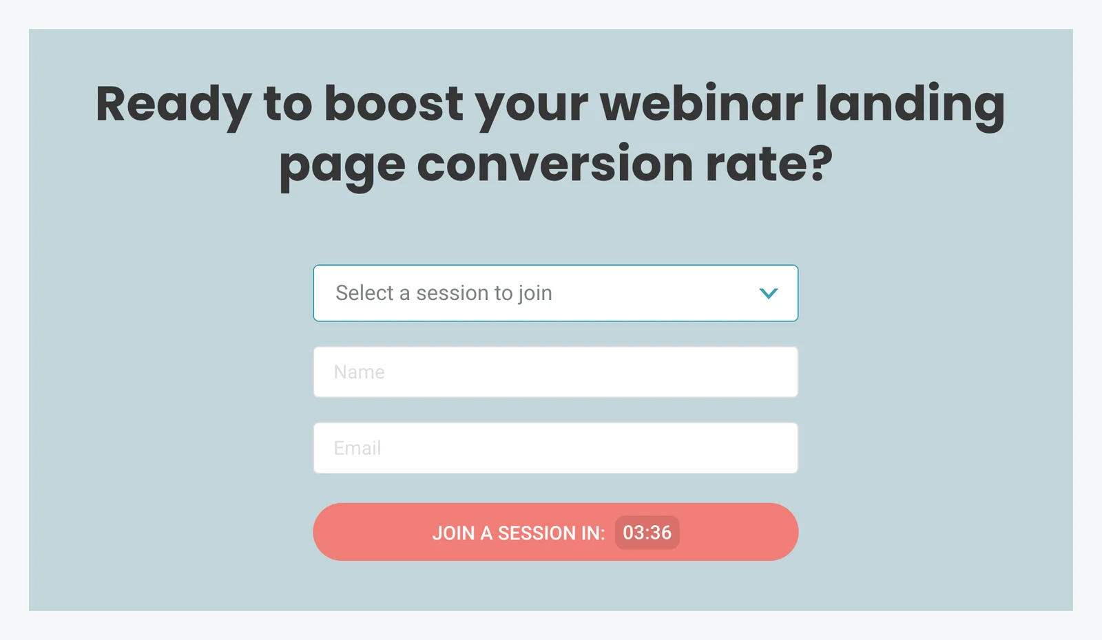
Prominently display the event’s date and time
Your webinar registration landing page should always include key event details like the time and date. This will ensure that you answer the final question a website visitor will have before turning into a webinar registrant — which is “When can I watch?”
If you're hosting live webinars then this will likely be a one-time event so people need to know exactly when it's happening to avoid missing it. On the other hand, those using a pre-recorded webinar could run them on a recurring schedule or even make them available on-demand.
Note: This is what our product, eWebinar, was specifically designed to do. Watch our on-demand demo to learn more about how you can make recorded webinars just as interactive as a live webinar.
In these cases, it's usually best to offer a dropdown, calendar, and/or join link so people can join the session that's most convenient for them — therefore increasing attendance rates. If you want to instill a sense of urgency then consider adding a countdown timer above your webinar details:
Customers on our webinar platform are even able to add countdown timers to their on-demand webinars by setting up "just-in-time sessions" that are automatically scheduled to start within a few minutes of the visitor landing on your page.
Add a clear CTA button to register
The call to action or CTA is the culmination of the registration process — and thus the final barrier you need to overcome to start driving webinar signups. This is true whether you have the signup form on the webinar landing page itself or use the CTA button to redirect visitors to a registration portal.
There are a few CTA best practices you should follow when trying to create a high-converting webinar landing page:
-
Put the same CTA at the top and bottom of the webinar landing page
-
If your landing page is particularly long, insert a third CTA in the middle
-
Use a high-contrast color for your CTA button so it stands out from the text
-
Embed the countdown timer within the CTA button itself to maximize urgency
-
Split-test your CTA against different variations to see which version converts best
If you want to learn more about optimizing your CTA then read our full guide on How to Create a High-Converting Webinar Landing Page for a Live or Evergreen Webinar!
Verify browser and device compatibility
If the registration form doesn't show up properly on mobile devices then you're losing half of your potential webinar attendees. This is why you should always test the sign-up form on multiple platforms and browsers to make sure it's working properly.
Once you’ve verified that your landing page works, it’s time to figure out how to make it work better. This is where A/B testing comes in. Don’t worry, it’s the last step in the process (other than the ongoing pursuit of driving more targeted traffic towards your webinar landing page).
Optimize performance with A/B testing
Running an A/B test on different variations of your webinar landing page can help you continuously improve your conversion rates. Bigger changes lead to more obvious results in less time so be bold in your testing (you can always revert later).
The order you should test things are:
-
Headlines
-
Body copy
-
CTA
Your CTA button will be the easiest to split-test since there are only so many variations you can try but optimizing your headline will yield the fastest results so we recommend starting there. In general, you only want to change one of these elements in each variation so it's clear what caused the impact.
Webinar landing page examples
Now that you're familiar with the best practices of webinar landing page design, it's time to get into the examples themselves. We pulled the best examples from multiple industries including SaaS, coaching, consulting, online education, and more to make this list as valuable as possible.
Here are 28 examples of webinar landing pages that convert:
-
Hootsuite
-
Salesforce
-
Slack
-
eWebinar
-
BigCommerce
-
ON24
-
eLearning Industry
-
LearnWorlds
-
Mailchimp
-
Twello
-
SproutSocial
-
Surreal Digital
-
Gartner
-
Wenta
-
Business Gateway Fife
-
Training Industry
-
SCORE
-
Awin
-
Personnel Today
-
DataCamp
-
Microsoft
-
Organizational Talent Consulting
-
Animas Coaching
-
HR Solutions
-
Oregon State University
-
BrightTALK
-
Work Excellence
-
Totara
1. Hootsuite
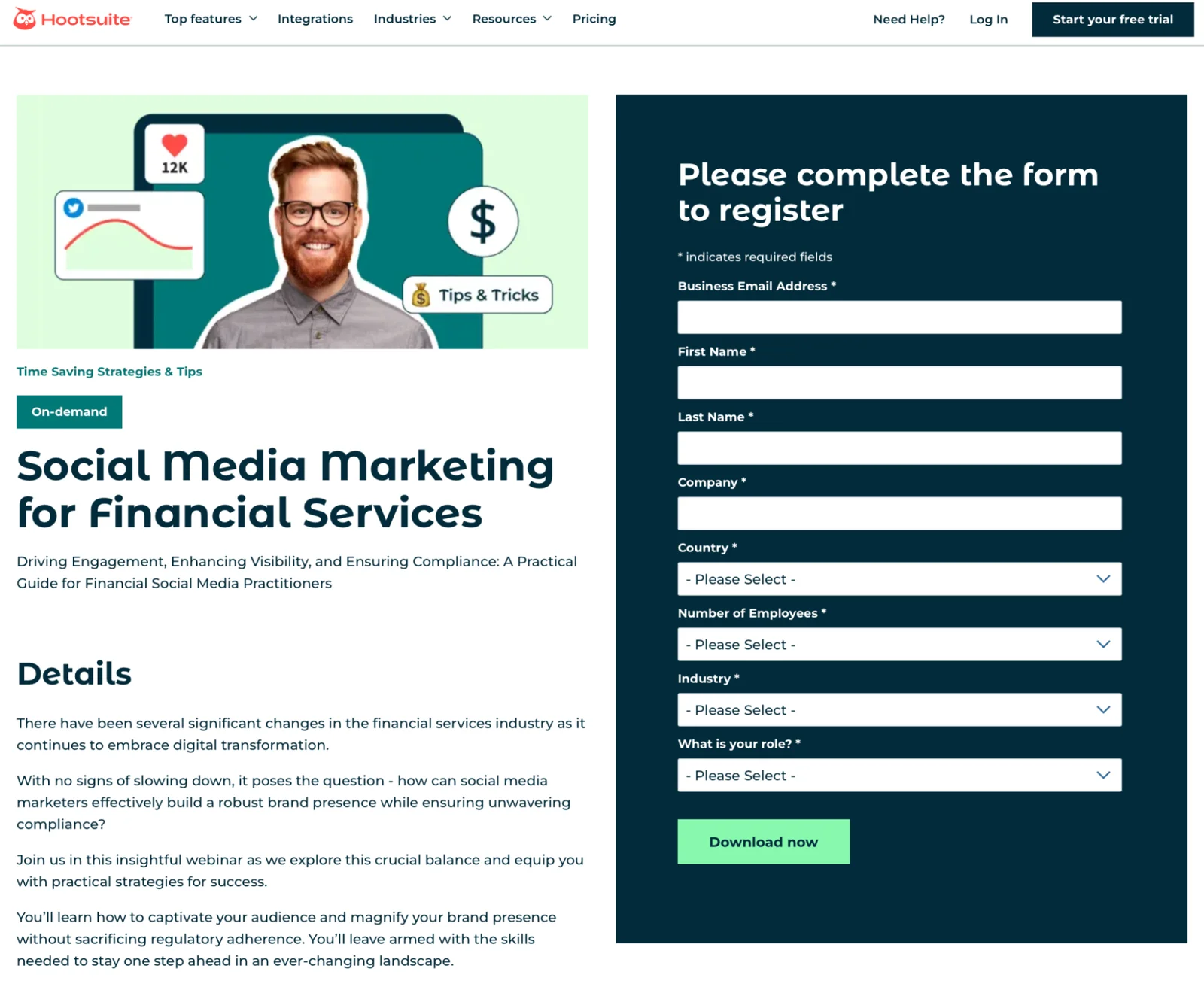
Source: Hootsuite
Starting off with Hootsuite, their headline does an excellent job of conveying both what the webinar is about and who it's for. They also have an "On-demand" tag above the headline to let people know that they can watch the webinar right now and use a high-contrast CTA button to highlight the next step.
2. Salesforce
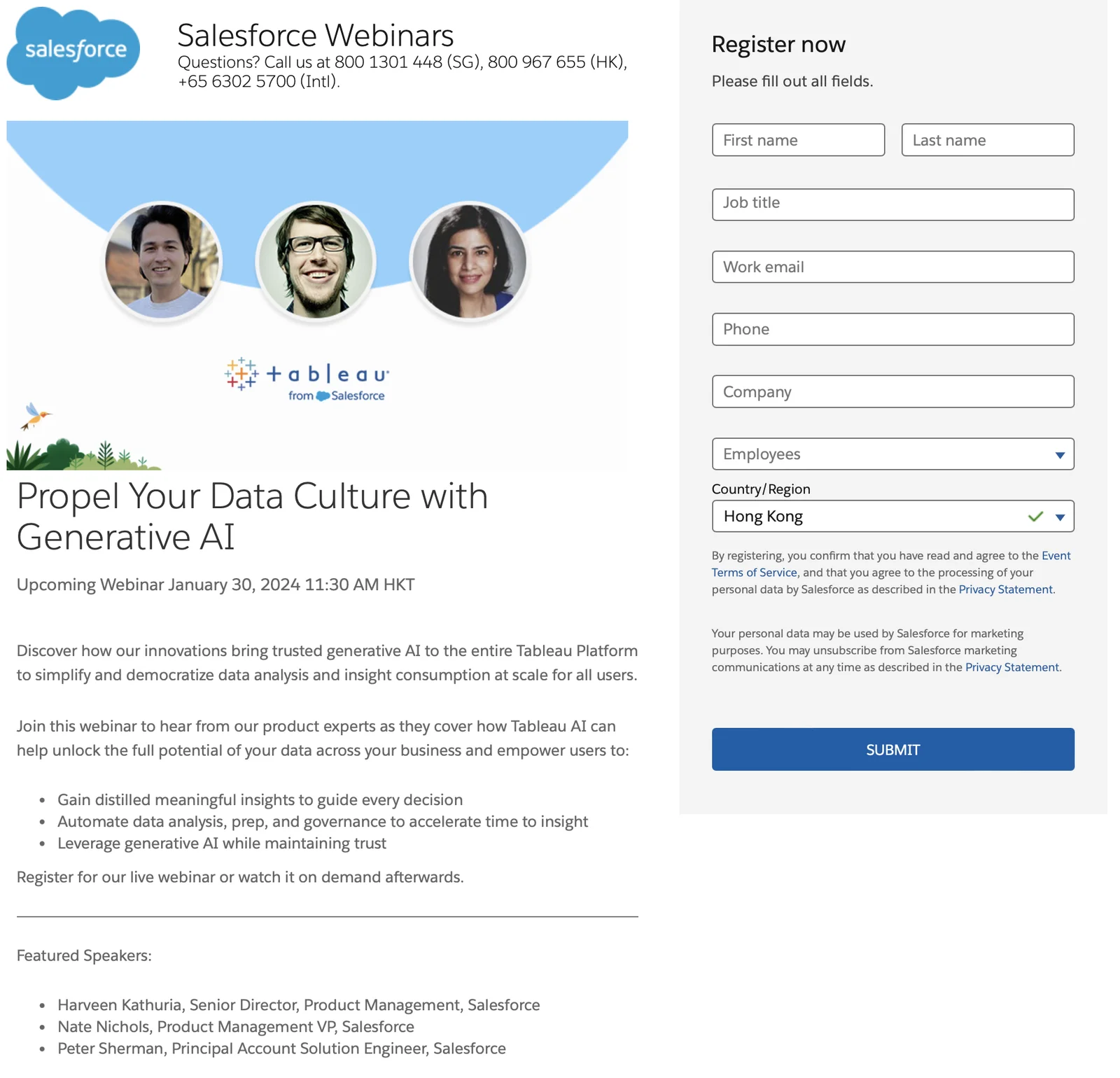
Source: Salesforce
Salesforce's headline touches on both the desired outcome and the webinar topic that will get them there — in this case, generative AI. You'll notice that Salesforce hits multiple best practices here by prominently displaying the date/time, including a bullet list agenda, and featuring guest speakers.
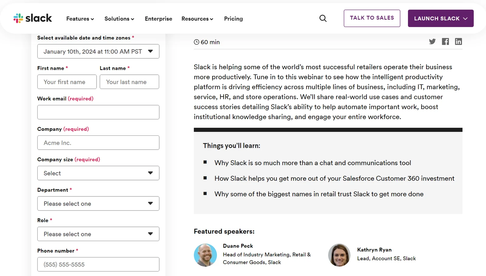
3. Slack
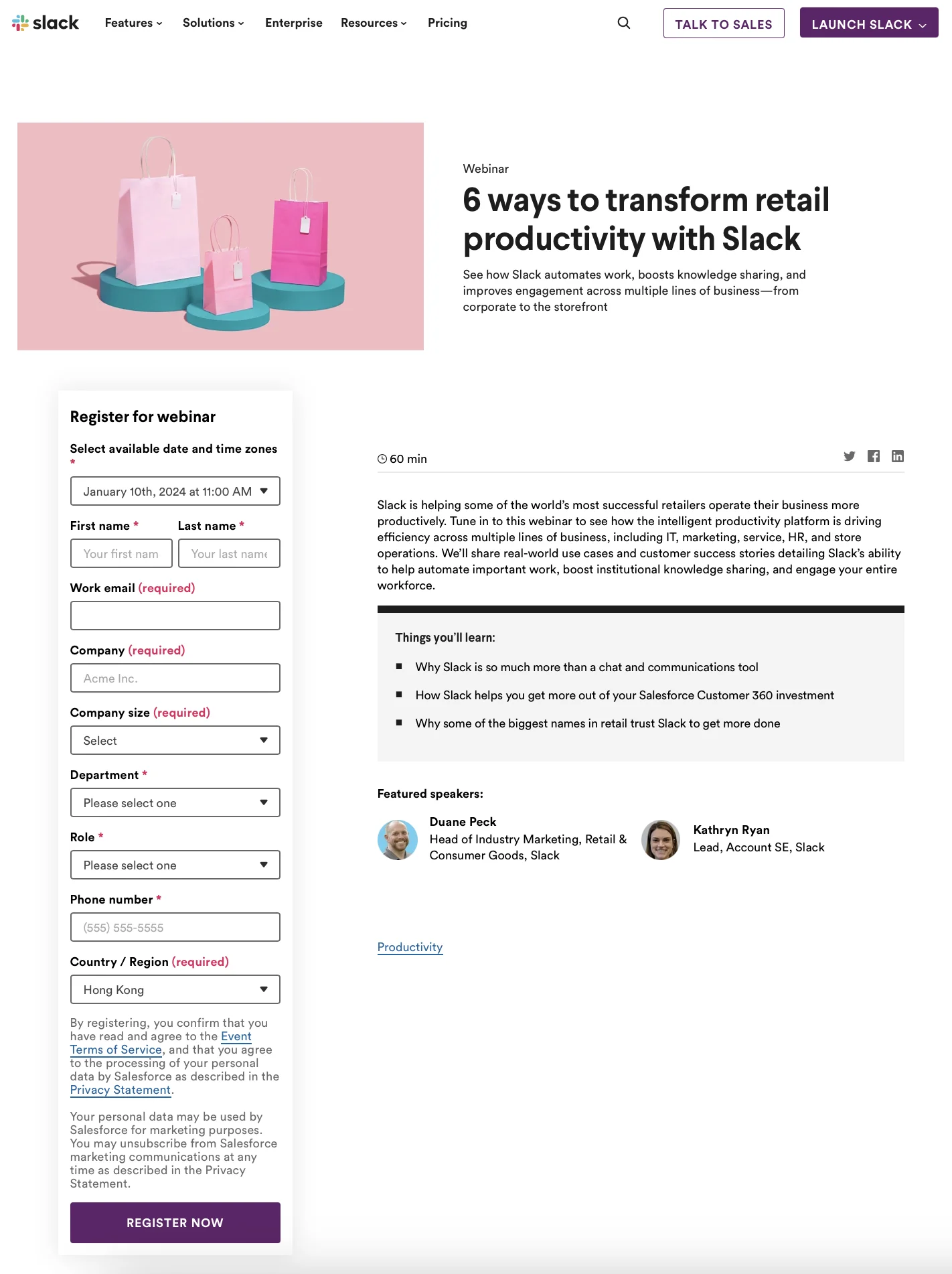
Source: Slack
Slack's headline focuses exclusively on tying their product to the desired outcome then uses the text below it to elaborate on the specific benefits that it provides. It also features an agenda bullet list, guest speakers, and session availability dropdown to reach attendees in other time zones.
Note: Our webinar platform, eWebinar, lets you automatically adapt your scheduled sessions to the time zone of the registrant so they can watch the presentation whenever it's more convenient for them.
4. eWebinar
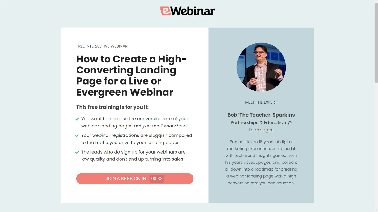
eWebinar — hey, that’s us! — covers both the skill being taught (landing page creation) and the beneficial outcome (higher conversion rates) in the headline itself. The landing page also includes a concise bullet list description and a highly credible author bio for the webinar host.
5. BigCommerce
Source: BigCommerce
BigCommerce takes a more minimalist approach to make the agenda bullet list the center of attention. This can be effective if you're confident that the core topic of your presentation is enough to make people sign up — but also runs the risk of not hooking people in to begin with.
6. ON24
Source: ON24
ON24 differentiates its webinar landing page by using a darker theme and using bolded white text to increase the contrast of key details. The landing page displays the webinar schedule in three different time zones to ensure that prospects from all their core markets don't miss the presentation.
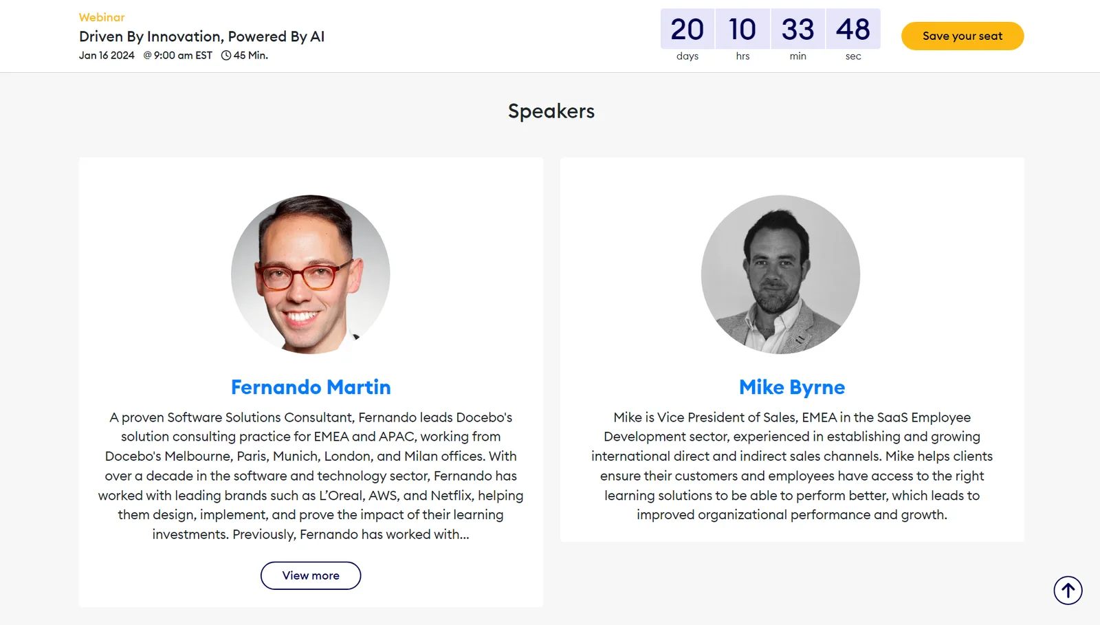
7. eLearning Industry
Source: eLearning Industry
While the headline is fairly vague, the eLearning Industry makes up for this by including the date, time, webinar length, and guest speaker headshots above the fold. In addition to an in-depth agenda, they also include a countdown timer at the top of their registration form to increase urgency.
8. LearnWorlds
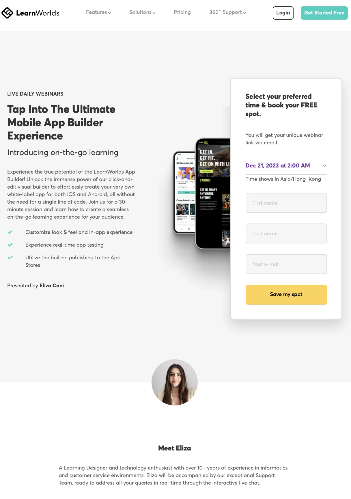
Source: LearnWorlds
LearnWorlds sacrifices urgency in favor of maximizing availability with the "live daily webinars" statement above their headline. The landing page also lists the key benefits of their product, specifies that the webinar is free to attend, and has a dropdown that lets registrants choose their preferred time.
Note: Our product, eWebinar, lets you record a presentation once and then run that webinar multiple times per day on autopilot while retaining all the interactivity of a live webinar.
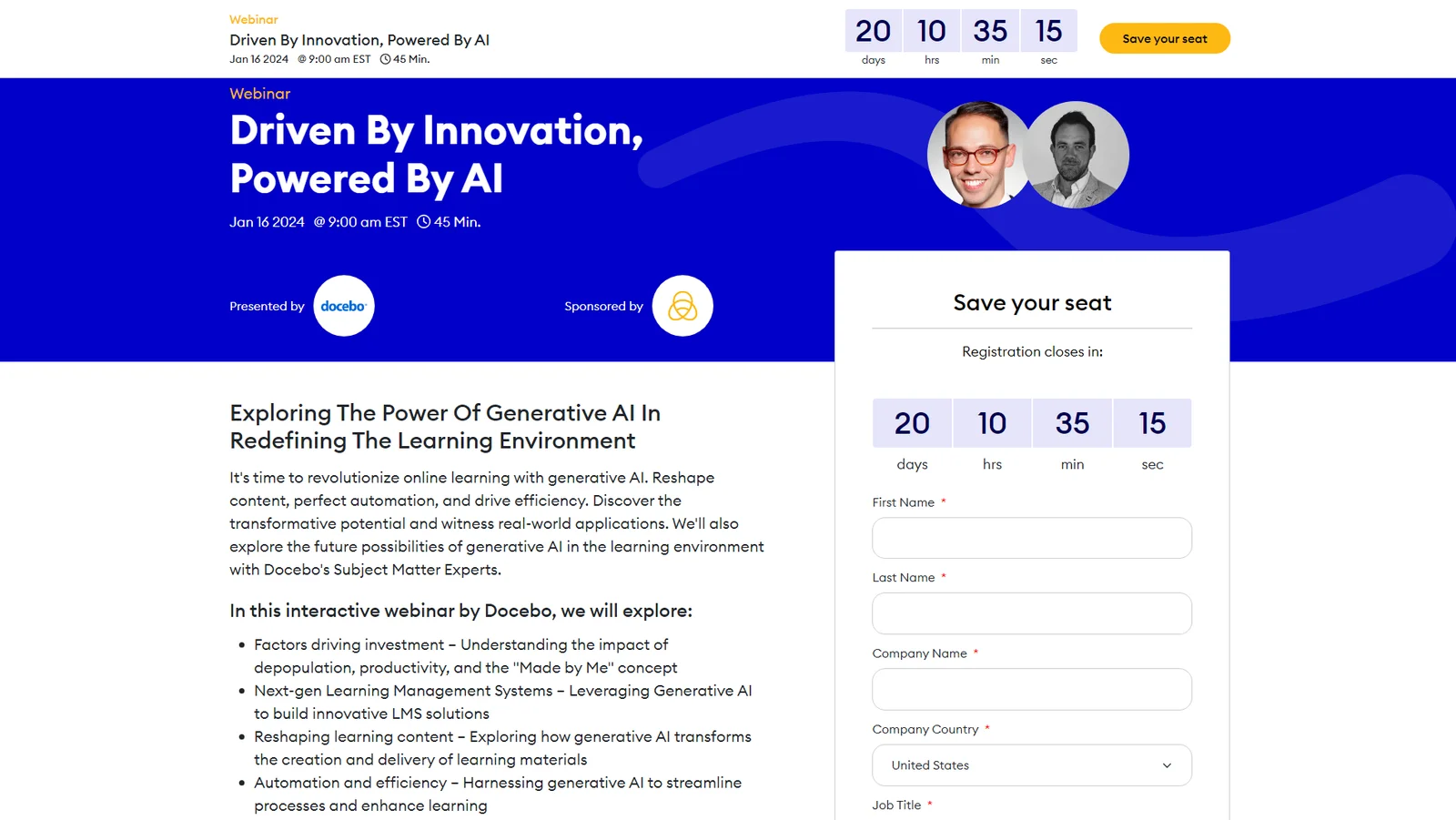
9. Mailchimp
Source: Mailchimp
Mailchimp doesn't have the most modern design on this list but they do make up for that with a solid description and agenda bullet list. The "Show in My Time Zone" function is a nice touch that helps registrants find the most convenient webinar session to fit into their schedule.
10. Twello
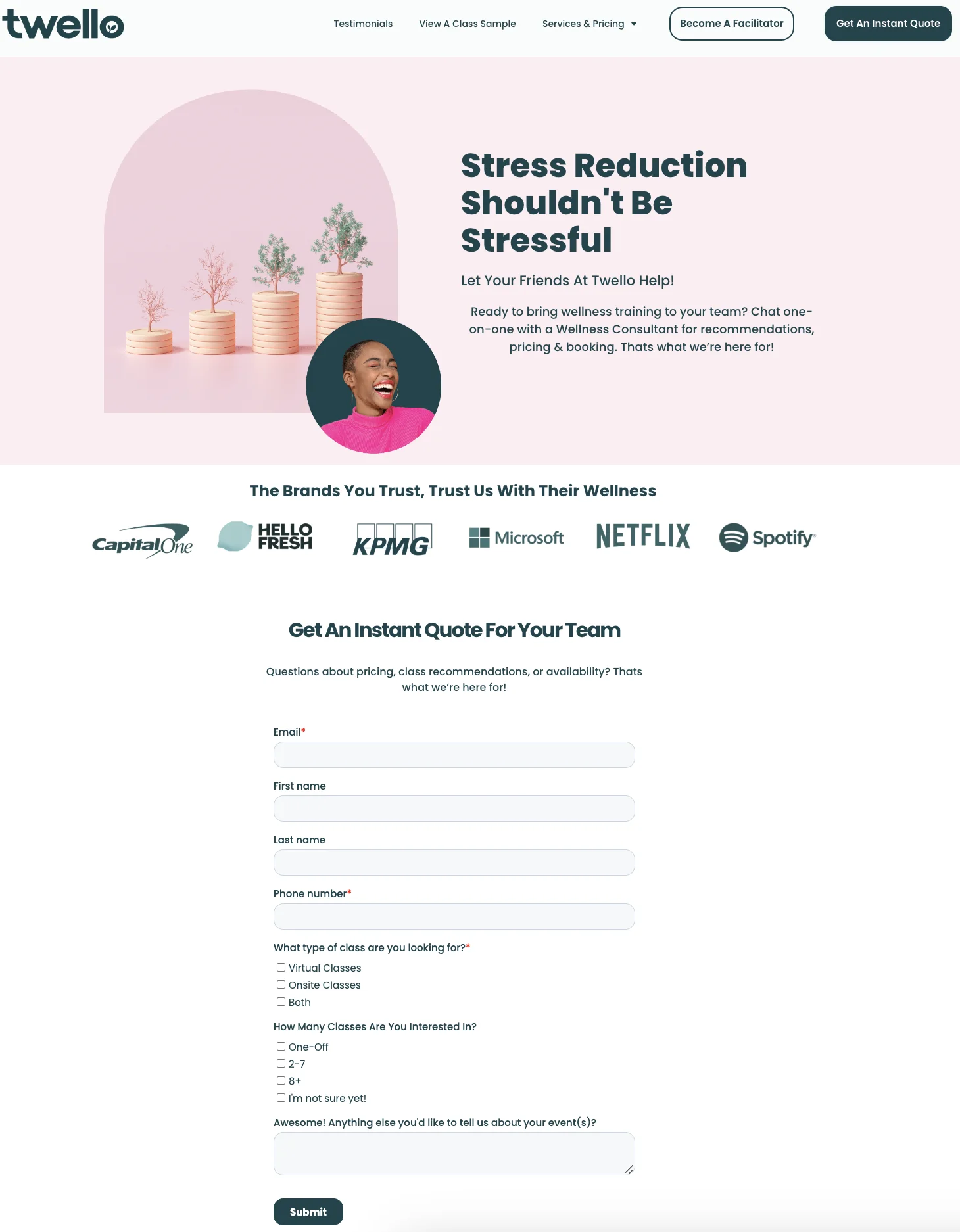
Source: Twello
Twello doubles down on social proof by displaying a lineup of trusted brands that they've worked with. They also provide an option for onsite classes in case the lead on their landing page isn't interested in learning through virtual webinars.
Tip: You can have a look at eWebinar's case studies to see a live example of how to collect, format, and display social proof.
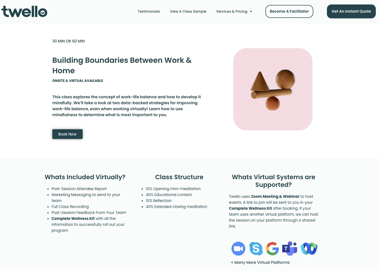
Source: Twello
As a bonus, Twello even offers to host webinar sessions through Skype, Google Meet, Microsoft Teams, and other virtual platforms instead of their usual platform (Zoom Webinars). This flexibility can attract clients who are interested in the webinar itself but dislike a particular software solution.
11. SproutSocial
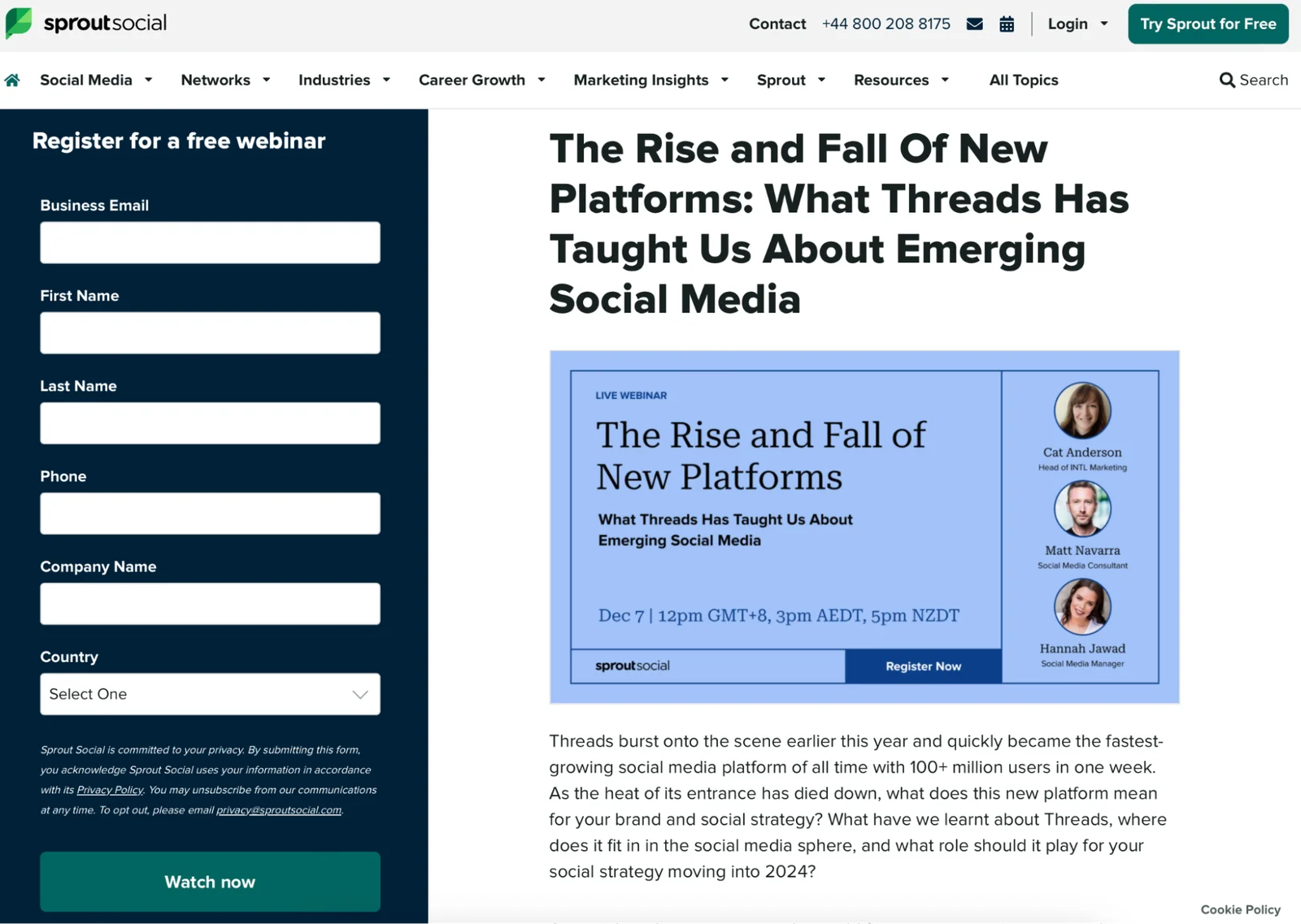
Source: SproutSocial
SproutSocial puts the title of their webinar both in the headline of the page and in the graphic to ensure people aren't left wondering what the presentation is about. They also feature all three guest speakers and list the scheduled time using two time zones (in addition to GMT).
12. Surreal Digital
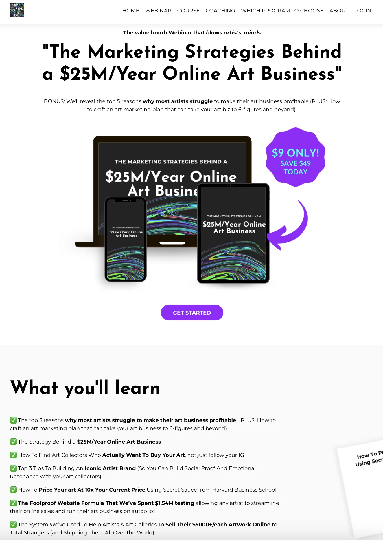
Source: Surreal Digital
Surreal Digital uses a large bold headline with an equally large dollar figure to hook prospects in. They also tease the pain point that their target audience, artists, face. Lastly, they have an exhaustive list — with bolded highlights — of everything the paid webinar will teach attendees.
13. Gartner
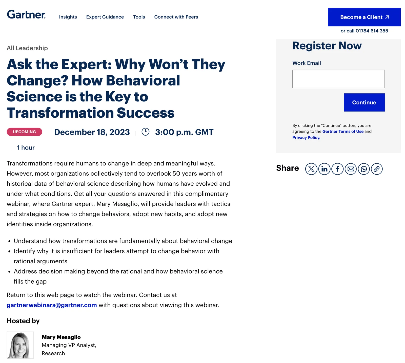
Source: Gartner
Gartner establishes credibility by starting with "Ask the Expert" then delves into the webinar topic, date, time, and length to make their above-the-fold copy as persuasive as possible. The description itself is a bit dense but Gartner makes up for that with the agenda bullet list and expertise of their webinar host.
14. Wenta
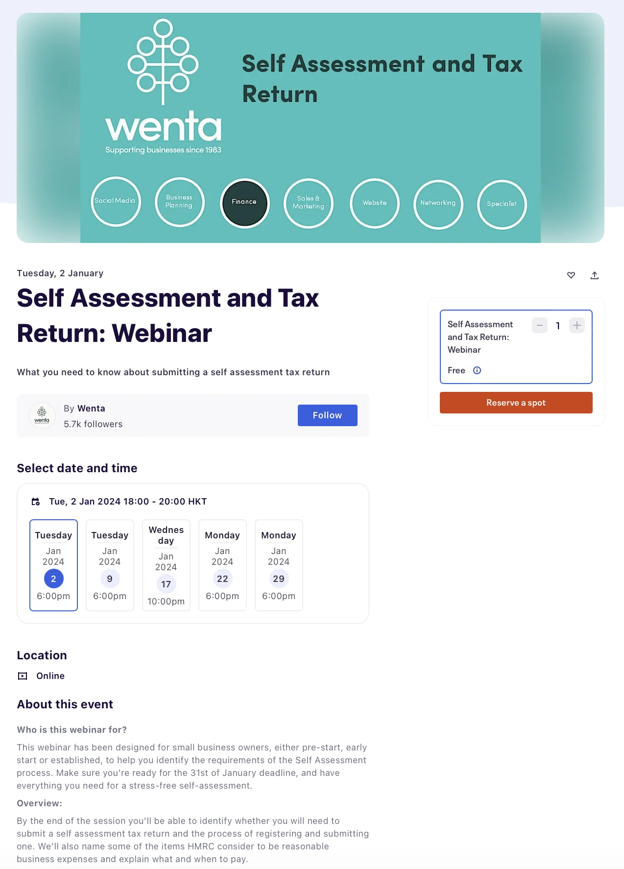
Source: Wenta
Wenta's headline is nothing special — not that making taxes interesting is an easy task — but they leverage their 40-year track record in the featured image to attract signups. Wenta also uses a sleek session list to let registrants select the date and time that works best for them.
15. Business Gateway Fife
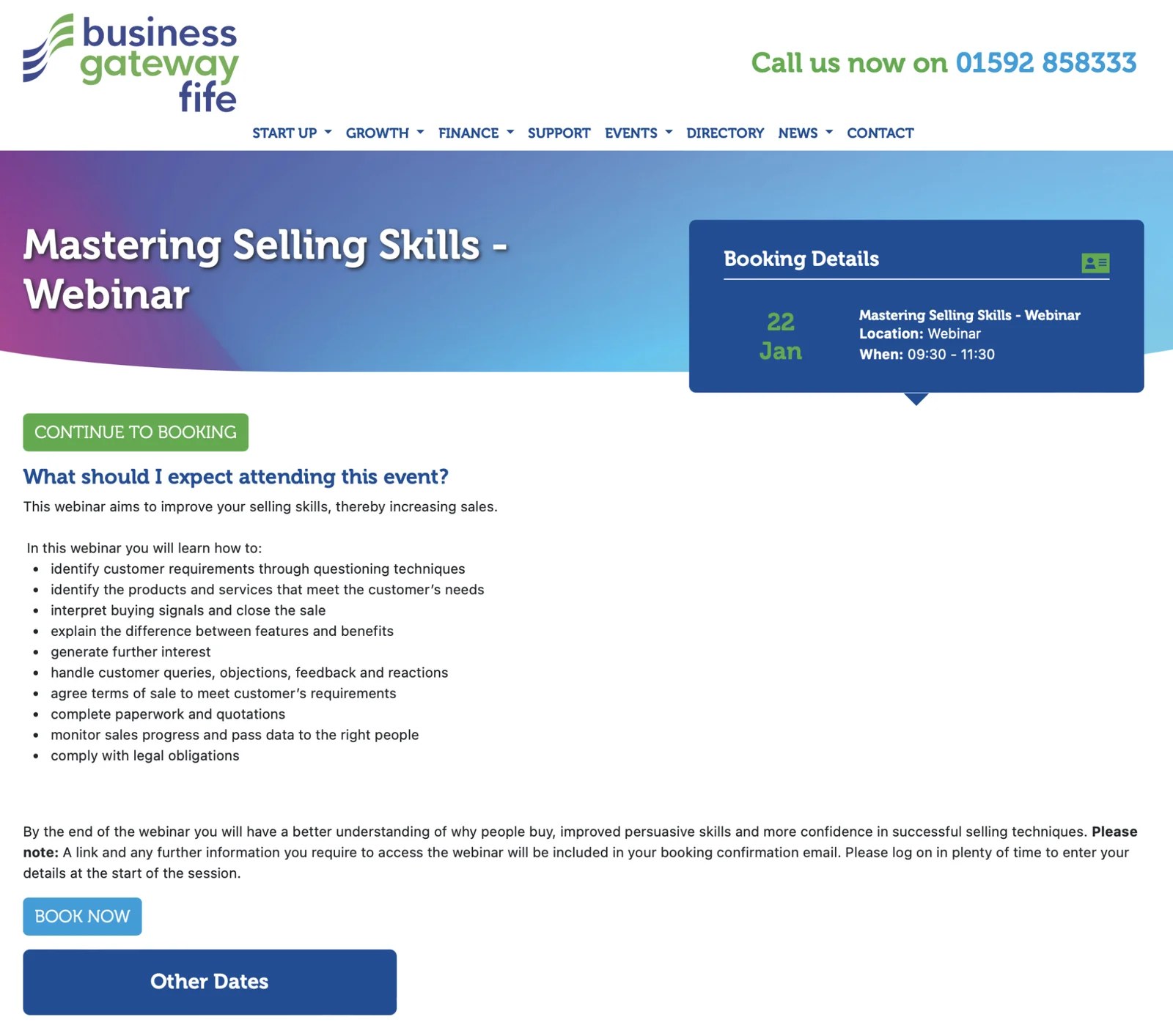
Source: Business Gateway Fife
This webinar landing page from Business Gateway Fife proves that substance over style still works by letting the agenda bullet list do the talking. They also feature the schedule details above the fold and use a high-contrast CTA button to seal the deal.
16. Training Industry
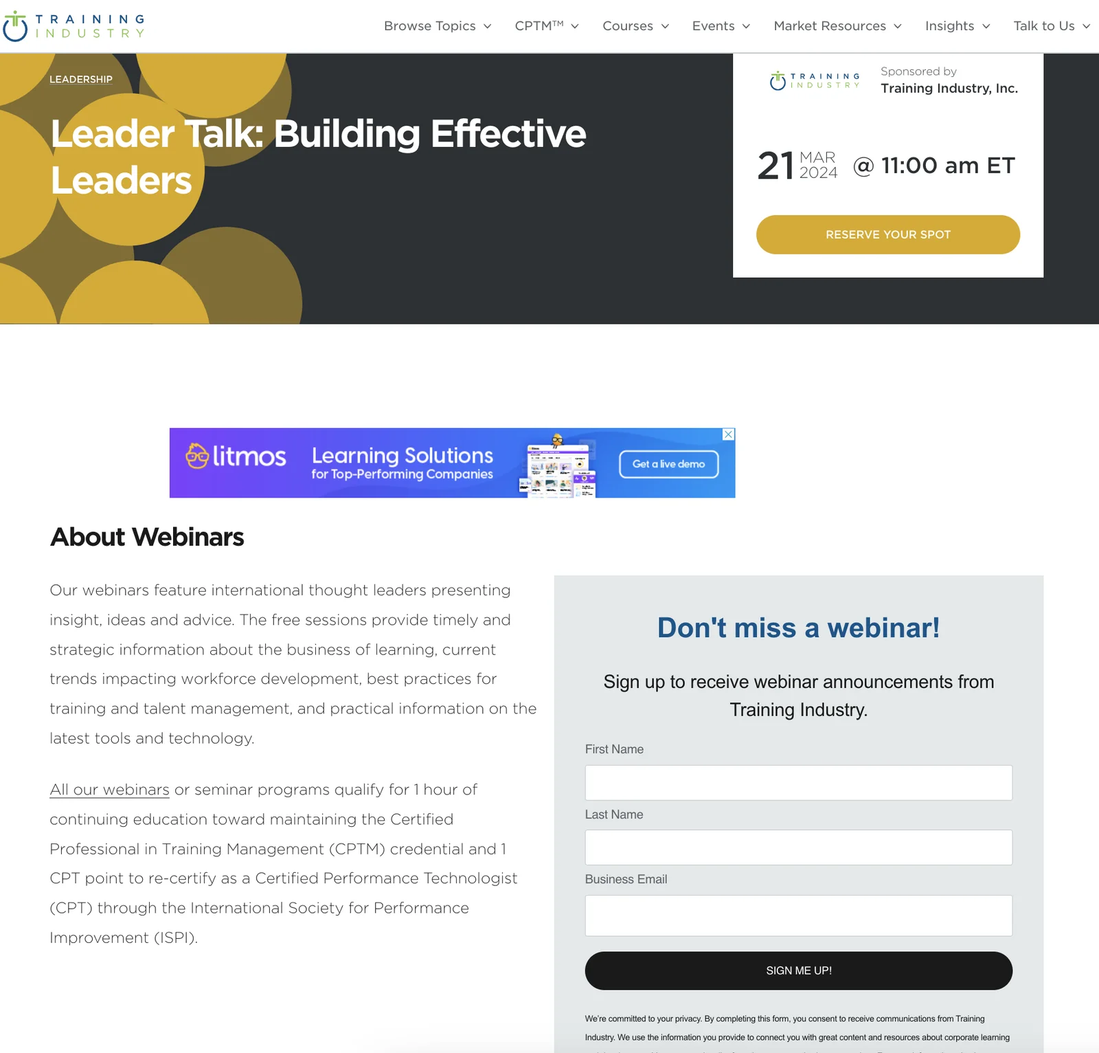
Source: Training Industry
Training Industry uses a minimalistic design style while still including the scheduled date, a high-contrast CTA button above the fold, and a headline that outlines the main benefit. However, the body copy could use some work and the announcement form distracts from the primary CTA.
Tip: You'll want to avoid putting display ads in your webinar landing page the way Training Industry did since these could divert attention away from the presentation you're advertising.
17. SCORE
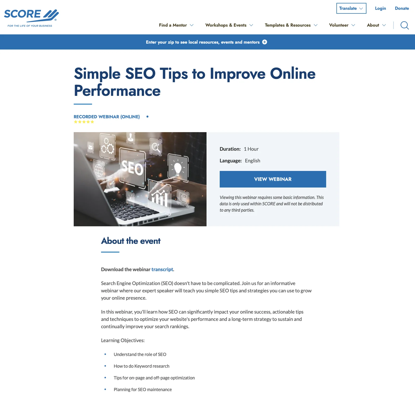
Source: SCORE
SCORE incorporates the core benefit into the landing page headline, specifies that the webinar is pre-recorded, and uses an obvious CTA button to highlight the next step. It also has a well-written agenda bullet list (which they should move higher up in the page to fully utilize).
Note: There's nothing wrong with opting for pre-recorded webinars like SCORE does. However, you need to ensure that the sessions are still as interactive as a live webinar. This is what our webinar platform, eWebinar, is designed to help you do.
18. Awin
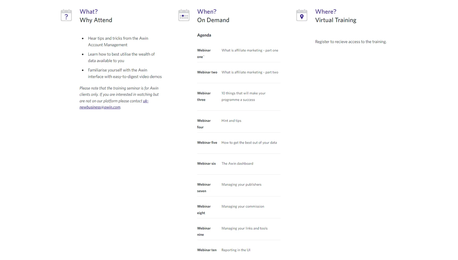
Source: Awin
Awin uses a "what, when, where" structure to guide visitors through their webinar landing page and answer any questions they might have. However, they really should have used a dropdown on the "When?" section since it's more than twice as long as the segment before it.
19. Personnel Today
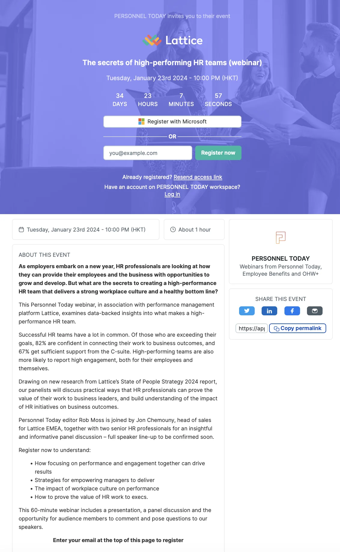
Source: Personnel Today
Personnel Today does an excellent job of outlining the benefits, date, time, and CTA button above the fold. Unfortunately, their description has a fluffy and generic introduction that rambles on for multiple sentences before getting into the benefits — with the agenda bullet list all the way at the bottom.
20. DataCamp
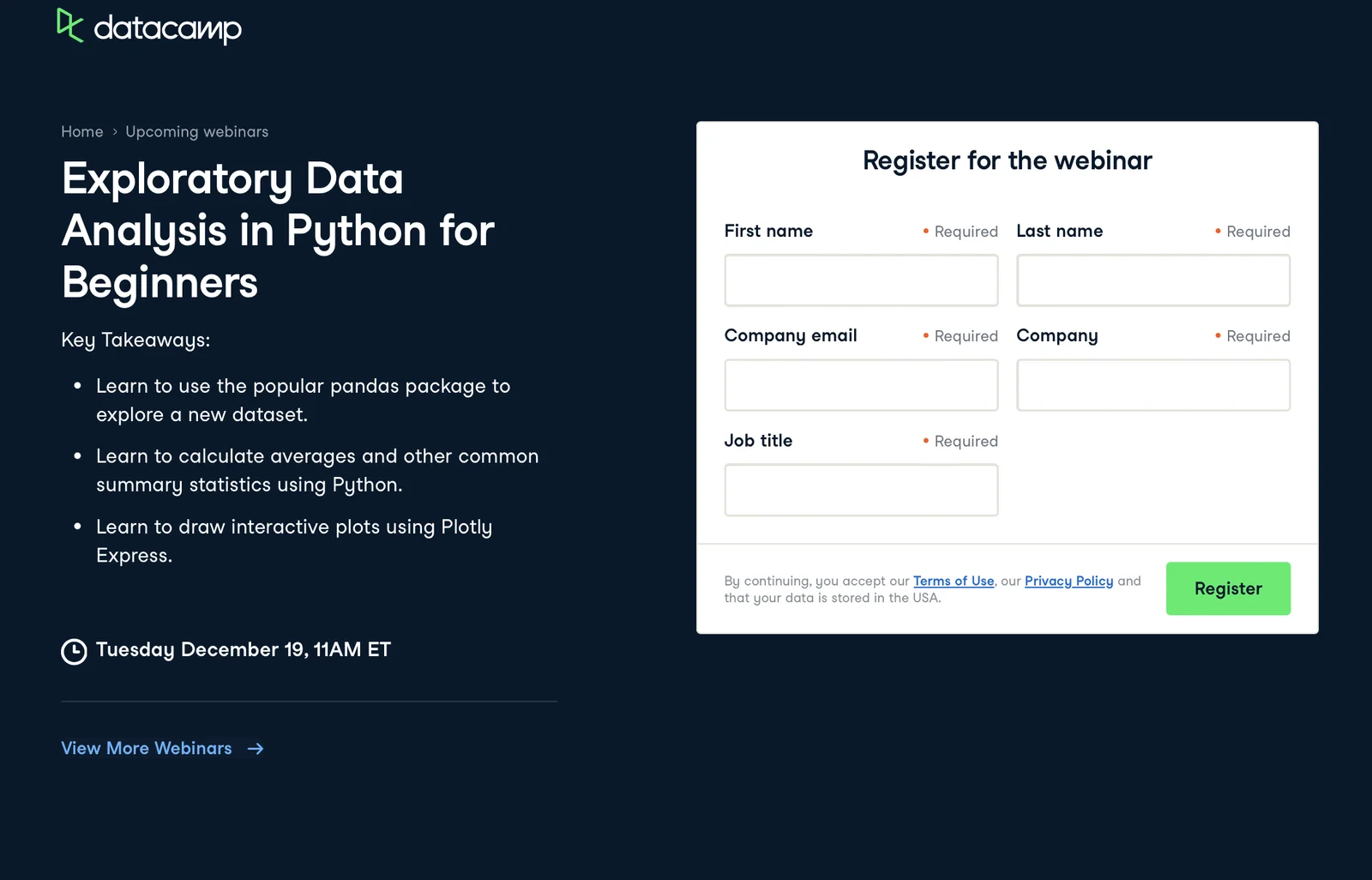
Source: DataCamp
DataCamp does the opposite of Personnel Today by putting the agenda bullet list right below the headline to ensure everyone sees it. They also recognize that it's okay to use jargon in this instance since their target customer will know what these programming terms mean.
Tip: Jargon should be used sparingly but, when it works, your webinar will come off as more credible to target customers from technical industries.
21. Microsoft
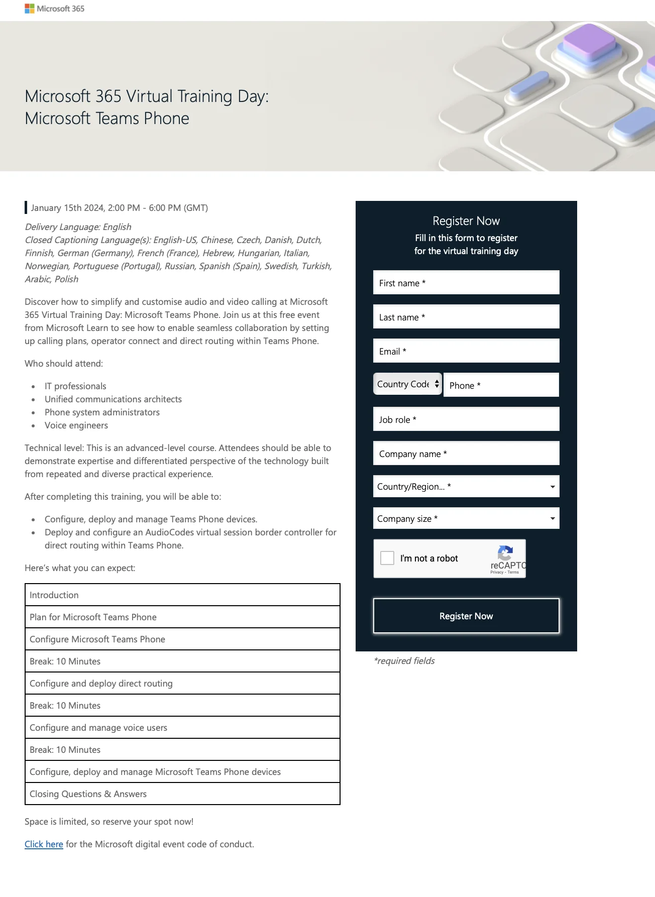
Source: Microsoft
Microsoft caters to a global audience and their webinar landing page aptly reflects that by listing the schedule in GMT while listing out all the languages that the training is available in. It also has bullet lists outlining who the webinar is targeted towards and which skills they'll learn by attending.
22. Organizational Talent Consulting
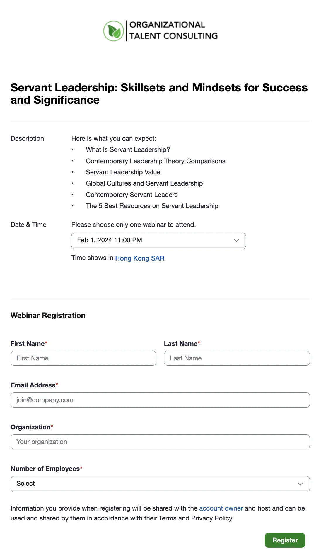
Source: Organizational Talent Consulting
Organizational Talent Consulting uses the agenda bullet list as their entire description then moves straight into the date and time (while indicating the time zone sessions are displayed in). Their registration forms could use some work as they're too far down and contain non-essential fields.
23. Animas Coaching
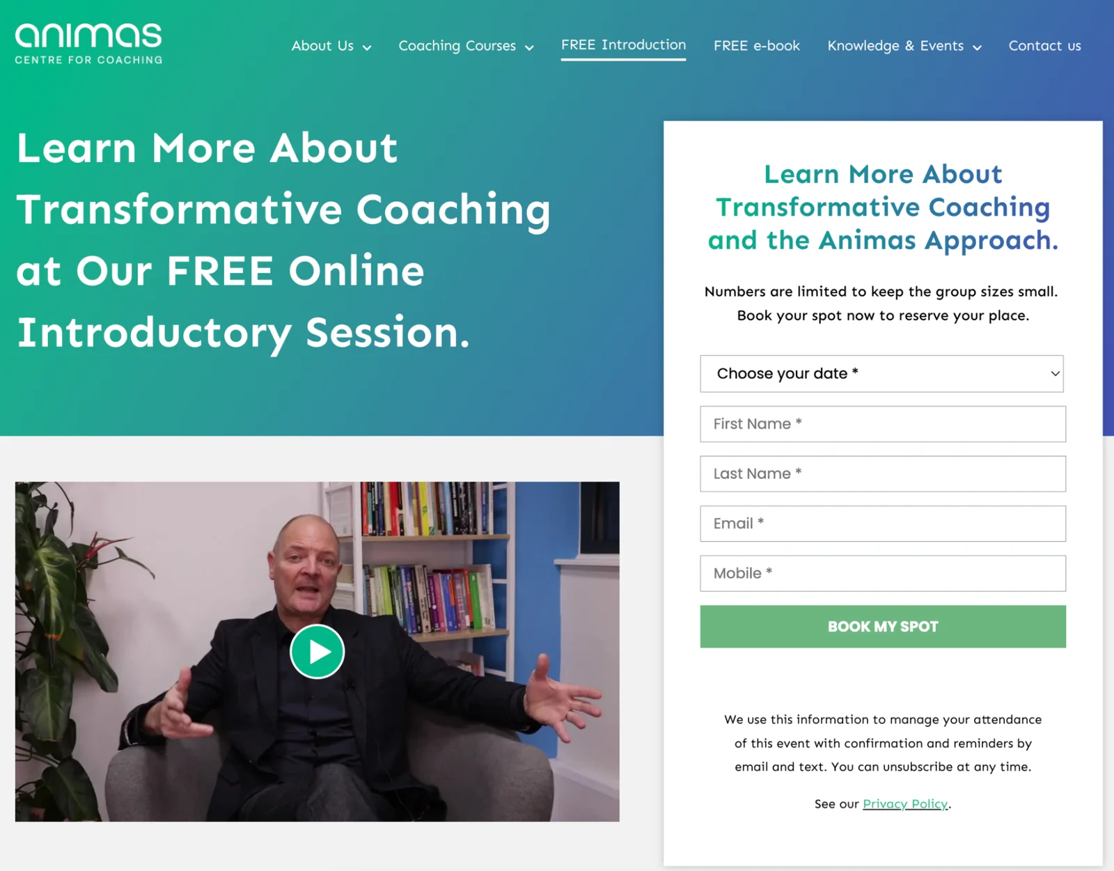
Source: Animas Coaching
Animas Coaching uses "FREE" to enhance its headline's appeal and embeds a video in the webinar landing page for those who want to learn more before signing up for a session. They also abide by the scarcity best practice we covered earlier by stating that numbers are limited to keep group sizes small.
24. HR Solutions
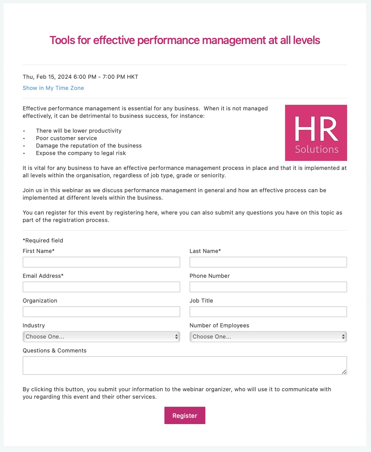
Source: HR Solutions
HR Solutions' webinar landing page is a mixed bag. Their headline is vague and the description could be better. However, they're still able to get people to sign up by sticking to the fundamentals of showing the time/date, using a bullet list, and having a high-contrast CTA button that's hard to miss.
25. Oregon State University
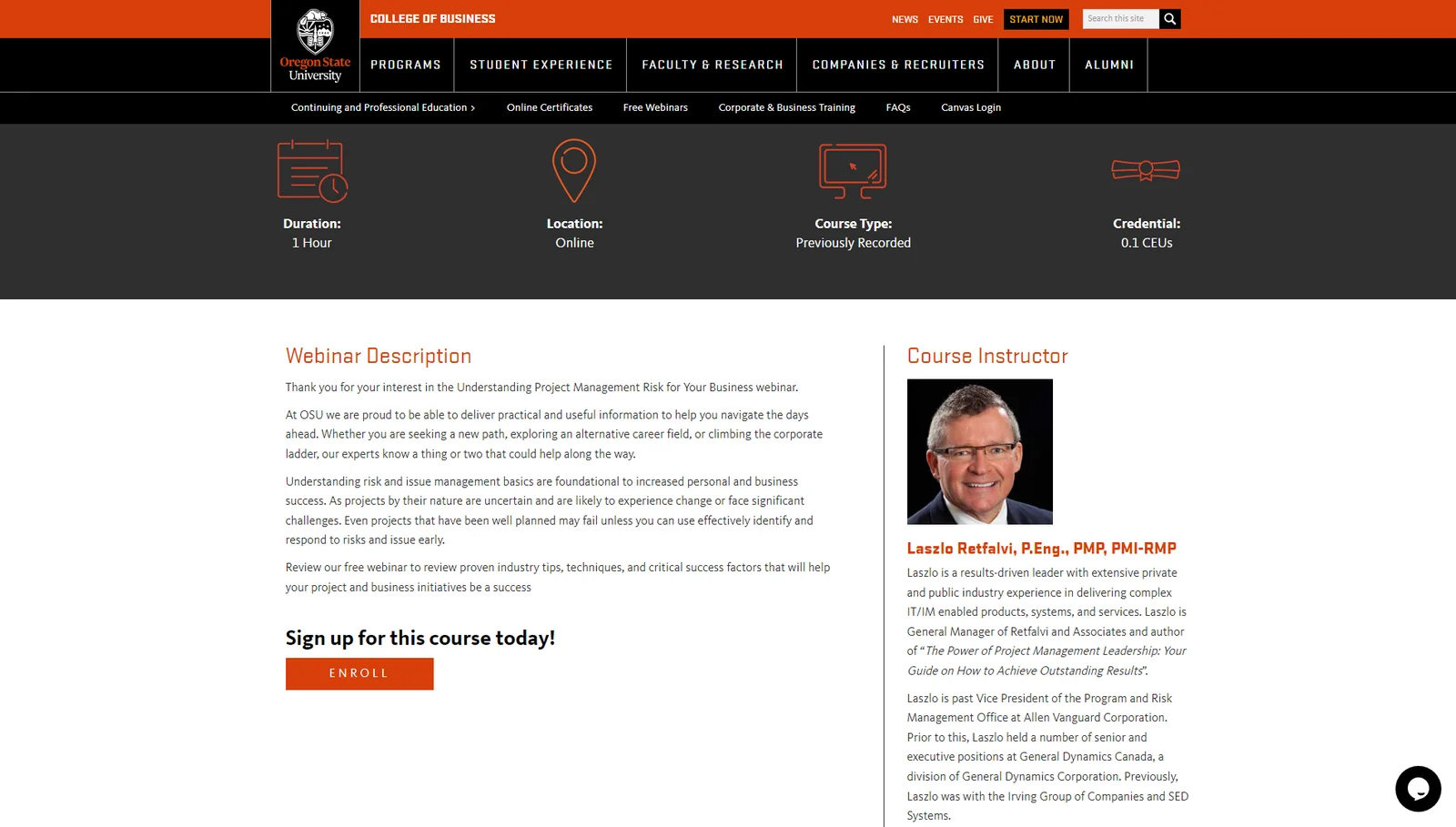
Source: Oregon State University
Despite Oregon State University's fairly dated landing page design, it goes all-in on the expertise of its webinar host and course instructor. The host's track record and titles both help establish that he's qualified to educate attendees on a technical subject matter — especially for academic purposes.
26. BrightTALK
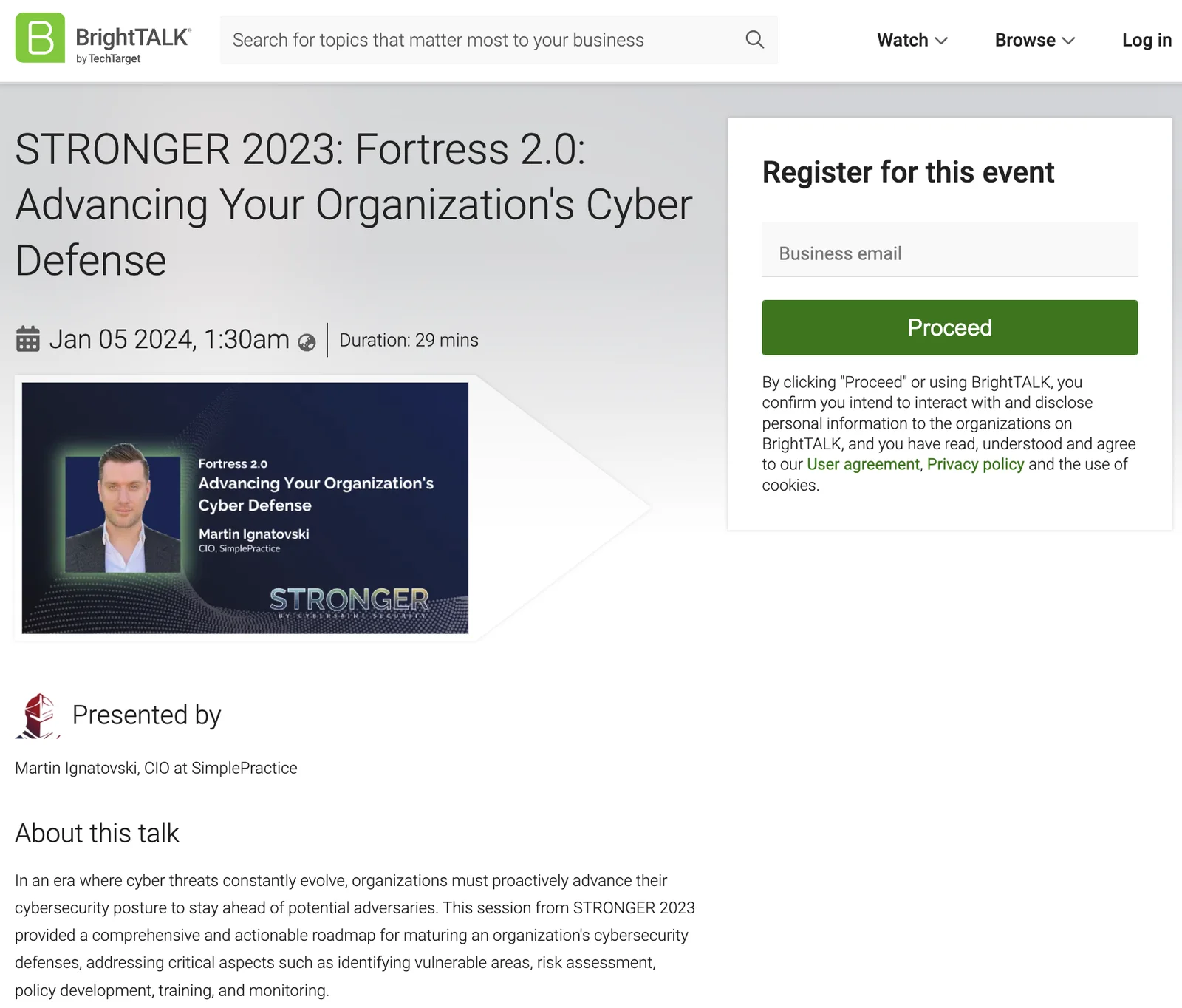
Source: BrightTALK
BrightTALK's webinar landing page does use some buzzwords in its headline but still mentions the core benefit of improving cybersecurity. More notable is the fact that visitors only need to enter their email and click "Proceed" to register. Eliminating all other fields removes friction from the signup process.
27. Work Excellence
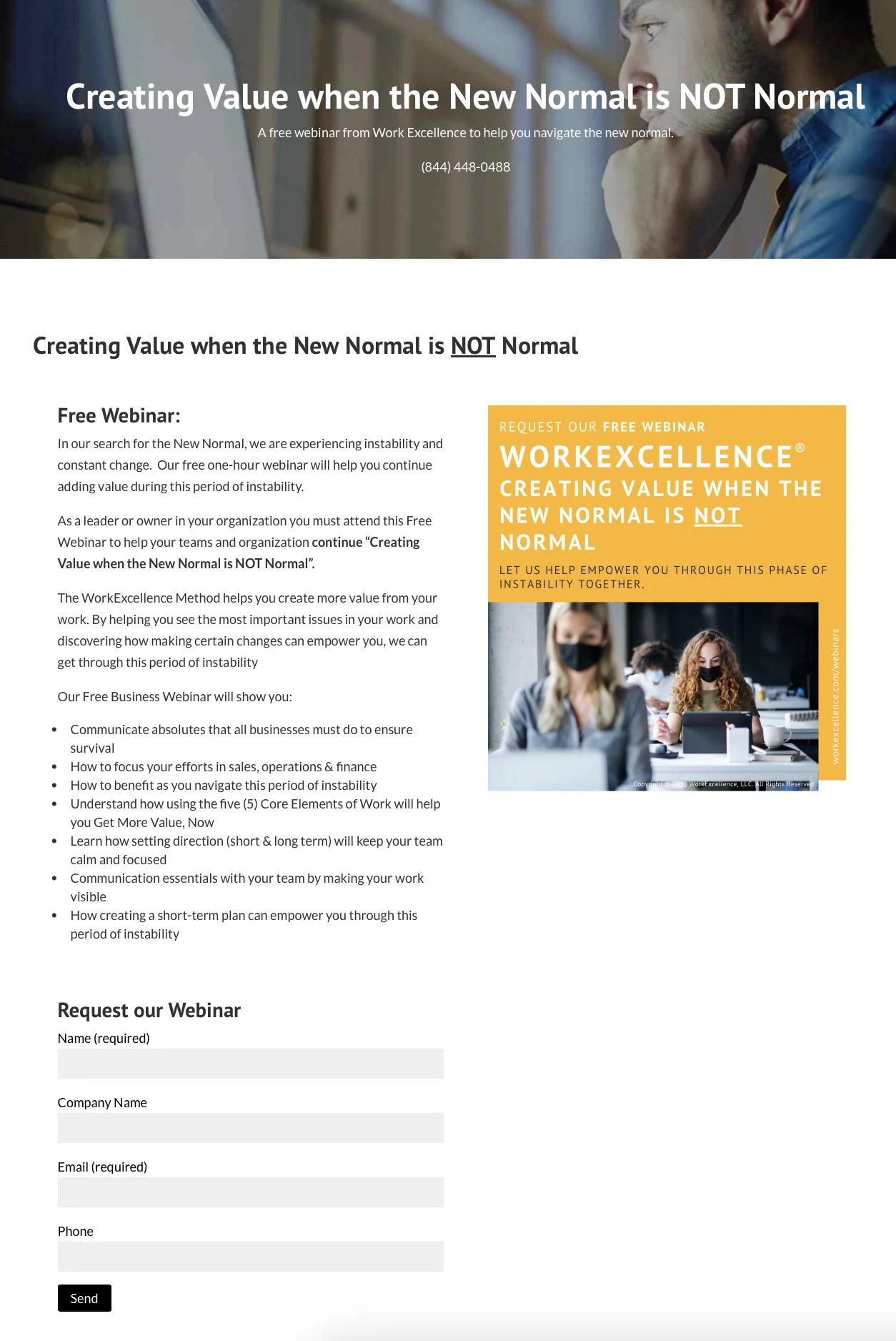
Source: Work Excellence
Work Excellence uses contemporary language in its headline and relatable graphics to connect with its target audience. They also emphasize that the webinar is free and list down everything that the presentation will show attendees.
Note: Using trendy phrases like "new normal" in your webinar landing page can increase its conversion rate but will come at the cost of having to refresh your messaging in the future.
28. Totara
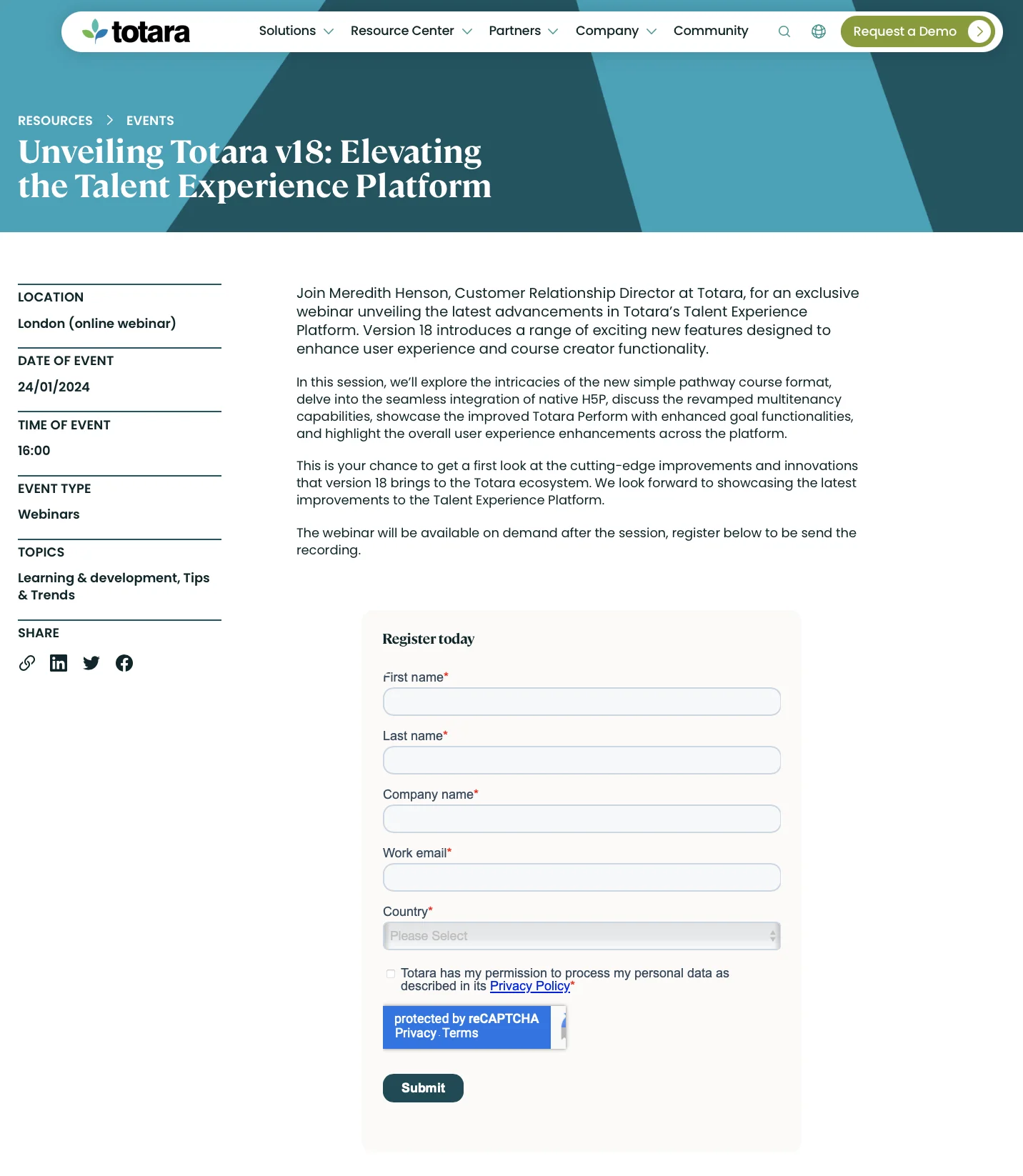
Source: Totara
Totaro uses their landing pages to promote their webinars while simultaneously mentioning all the new features that their product has. All necessary information is neatly included in the sidebar to ensure that people attend their upcoming product demo and feature announcement webinar.
Conclusion
As you can see, there's no shortage of webinar landing page examples to learn from. We hope you use the examples above as a reference for how to create a great webinar landing page that turns visitors into registrants, registrants into attendees, and attendees into customers.
You can actually automate this entire process using eWebinar so all you have to do is drive more visitors toward your webinar landing page. In fact, we even have a webinar landing page template gallery that you can use to speed things up.
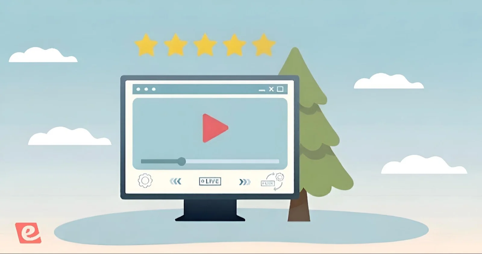
Watch our on-demand product demo below or click here to see our webinar templates!
![How to Craft High-Converting Webinar CTAs [Examples + Best Practices]](/_image/w=1600/cms-assets/134b6700b68d30d2.png)