We are excited to announce our newly revamped Schedule tab!
You can now go to your eWebinar homepage and edit any webinar to see the changes for yourself.
The new Schedule tab comes with a number of new features and benefits:
- Cleaner, more intuitive interface
- Defaults that anticipate your needs
- Far more flexibility in recurring schedules
- On-demand webinars at the forefront
- New registration form preview
Cleaner, more intuitive interface
The first section of the page, Event settings, is where you can now choose an Event type: Recurring, One-time, Specific dates and times, or On-demand only.
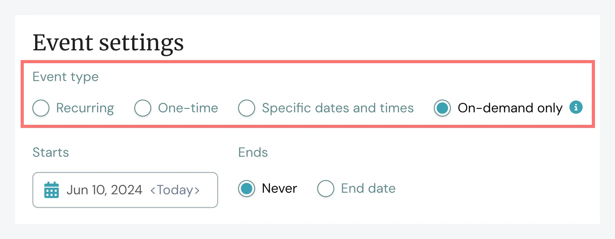
Based on your choice, the whole page will automatically adjust so that it only displays the options that are relevant for that type of event, making it easier to figure out exactly what you need to do to complete your schedule.
A more compact design helps make the experience even better.
Smarter defaults that anticipate your needs
An added benefit of choosing an Event type upfront is that the default settings associated with each option better reflect the most common choices (and best practices) for that scenario, so you don't have to think about it too much.
For example, when you choose One-time event, we assume you'd like to do that in a Fixed time zone, which is the norm.
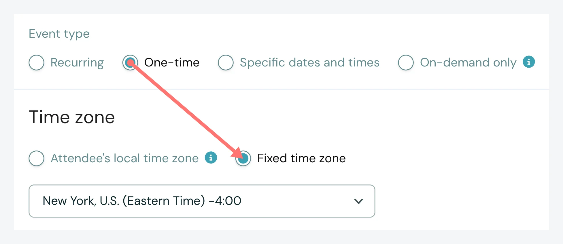
You can always change the defaults but having them in place should reduce a lot of the guesswork for you.
Far more flexibility in recurring schedules
Previously, you were only able to define a single repeating pattern in a recurring schedule – such as weekdays at 10 AM and 2 PM – but now you have the flexibility to add as many as you need.
This means, for example, you can schedule your webinar to happen at different times on different days throughout the week.
In the example below, the webinar is set to happen on:
1. Mondays, Wednesdays, and Fridays at 10 AM and 2 PM
and
2. Tuesdays and Thursdays at 11 AM and 3 PM.
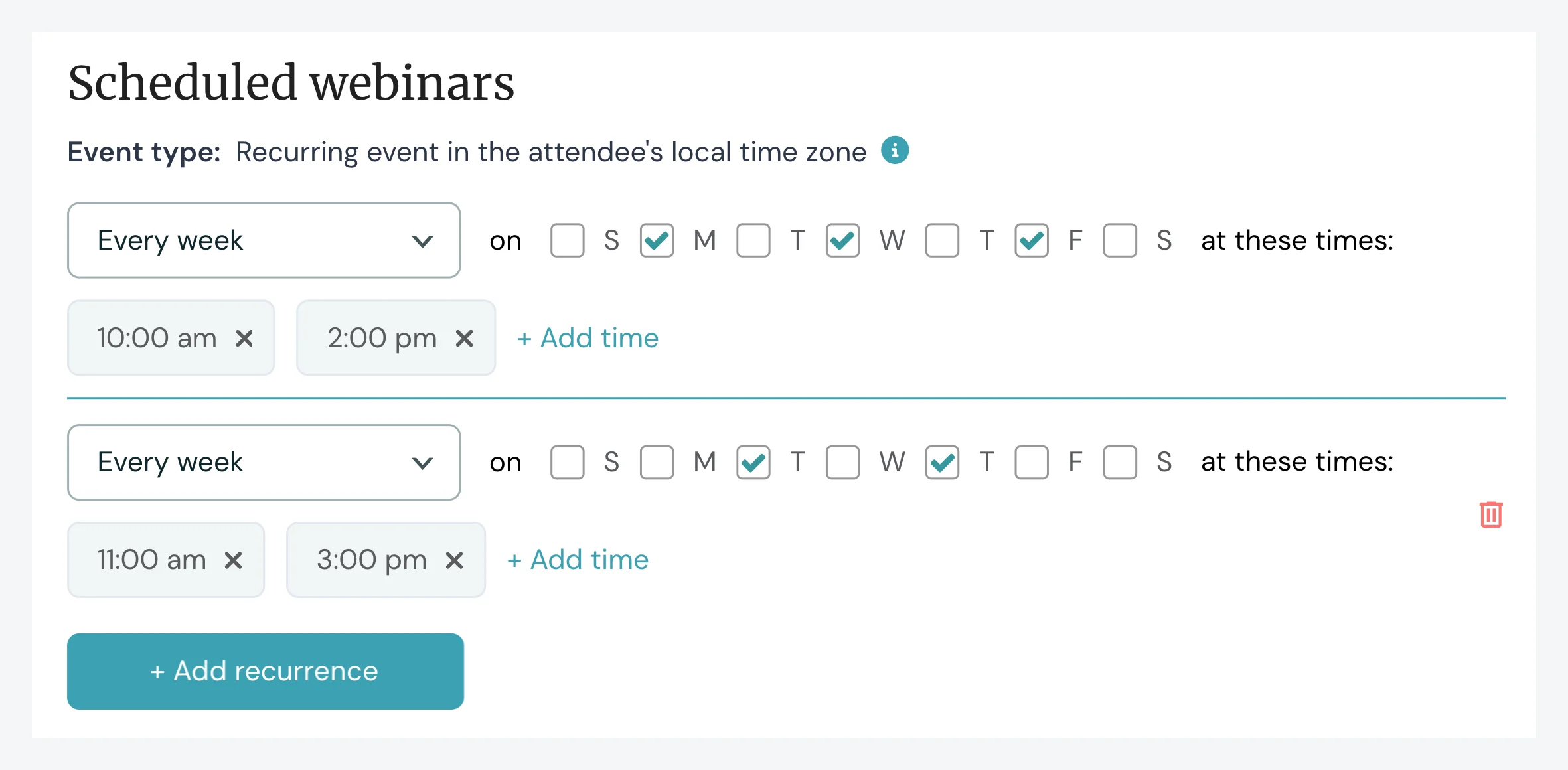
There are also a few new recurring options to choose from such as Every two weeks (bi-weekly) and Once a month (e.g. the first Tuesday of every month) — giving you even greater flexibility.
On-demand webinars at the forefront
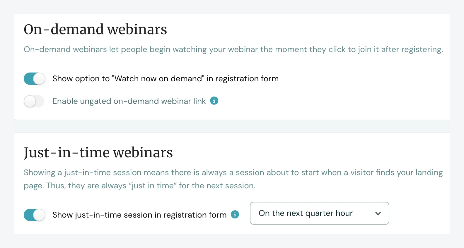
Before, the setting to make your webinars available on demand was buried inside the options for just-in-time sessions. Now that on-demand webinars have their own section, they are much easier to find. Plus, separating them out like this makes it possible for you to enable on-demand and just-in-time webinars at the same time.
Note: This help article explains all the new scheduling options in detail, if interested.
New registration form preview
You can now see a preview – on the Schedule tab itself – of what the top of your registration form will look like to potential registrants, including the options they'd see in the sessions drop-down menu at that very moment in the specified time zone.
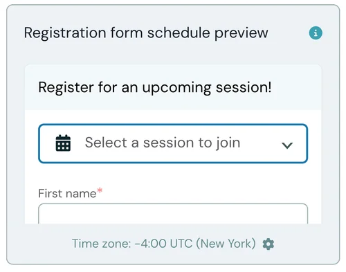
This feature existed before, but we hope it's now easier to understand what it is and what it does — especially for brand-new users — and that its sleeker design makes the page feel less cluttered.
Tip: If you hover over the registration form preview, an edit icon appears that will take you to where you can edit the form itself. When you're done, there is an Edit schedule link in the form editor, so you can easily jump back and forth between the two. (Watch this 7-second video to see what to look for.)
We hope you enjoy the new Schedule tab and all the benefits that come with it!


