
Interactions are the building blocks of an interactive eWebinar.
This guide covers each interaction available in eWebinar, including:
- What it does
- When to use it
- How it works
- Examples of how it can be used
We’ve grouped the interactions in this reference as follows:
- Interactions to Ask or Learn About Attendees
- Interactions for Your Primary CTA
- Understanding Conversion Tracking
- Interactions to Share Something Valuable
- Three Interactions that Serve a Special Purpose
- Integration-Related Interactions
In this guide, we also cover:
- Settings shared by most interactions
- Using images to enhance the experience of interactions
- Using icons for visual variety and clarity
Why interactions matter
Interactions serve three main purposes:
- Increasing engagement and watch time
- Verifying comprehension
- Collecting useful data
Knowing which purpose you’re going for helps you decide which interactions to add and where.
Separately — and arguably most important of all — interactions are how you drive attendees toward your primary CTA. That’s significant enough to get its own section below.
To understand the overall strategy, watch the eWebinar Academy’s How to Make an eWebinar Interactive, then follow the playbook: How to Plan Interactions for Your eWebinar →
How to add an interaction
Open the eWebinar editor, go to the Interactions tab, and scrub the timeline to the moment where you want the interaction to appear. Click the + button above the timeline and pick the interaction type from the menu, or choose See all interactions to browse the full template library. Configure its settings in the editor that opens, then save.
Settings shared by most interactions
Before reviewing individual interactions, it’s helpful to understand the settings that apply across most of them. Once you understand how they work, you can apply them consistently no matter which interaction you’re using.
Timing
Every interaction has a Timing setting that controls when it appears in your eWebinar.
There are two formats:
Appear at — the interaction shows at a specific moment in its room (waiting room, intro, presentation, or exit). Times count from the start of that room, so enabling, disabling, or replacing an intro does not move your presentation cards.
Start at / End at — the interaction appears for a defined duration (for overlays like image or hotspot). Overlays and agenda items are presentation-only.
Use timing to align interactions with what’s happening in that part of the session so they feel natural and well-placed. New AI interaction places the card in the room your timeline cursor is in (with room-appropriate prompts); generating a full set of AI interactions stays presentation-only.
Pin above video
When enabled, the interaction appears as both a standard card and a pinned banner above the video player.

The card will appear in the interactions panel as usual. If that card is later pushed out of view by another interaction, the banner version remains pinned above the video.
- Only one pinned interaction can be visible at a time
- If a new pinned interaction appears, it replaces the previous one
This is useful for keeping something visible longer — like a CTA — while the session continues.
When to pin your primary CTA to the top of the video
Some presenters wait to surface their CTA until a specific moment — after the pitch has been made and the value is clear. Others introduce it early and pin it for the duration, on the principle that if someone is ready to act before the end, there’s no reason to make them wait.
Both approaches are valid. The right choice depends on how your presentation is structured and how much you want to control the moment of conversion.
If you pin a CTA early, surface it again at its natural moment in the presentation — so attendees who have been watching all along still experience it as a deliberate call to action, not just a persistent banner. When the second instance appears, you can also pin it to the top of the video — which replaces the original banner and lets you update the language at that moment if you want the CTA to feel different the second time around.
Make this interaction required
This setting forces attendees to complete an interaction before continuing.
When enabled:
- You provide a message explaining what they need to do in order for the video to continue playing
- You set a time limit to respond
- If they don’t respond in time, they are removed from the session
Use this sparingly for key actions where completion truly matters.
For example, if you ask attendees to identify their use case early in the session, making it required ensures you have the data you need to surface relevant follow-up interactions using conditional display.
Learn more about required interactions →
Conditional display
Conditional display lets you control who sees an interaction based on attendee data.
You can base conditions on:
- Registration data
- Previous interaction responses (polls, questions, etc.)
- System properties (like device type)
How it works:
- Select a property
- Choose a condition such as: has a response / has no response / is any of / is none of
- (If applicable) select the matching values
Example: Show a follow-up interaction only if someone selected a specific answer in a poll.
Example: Make a use case poll required early in the session, then use conditional display to show different resources, CTAs, or tips to each group based on their answer.
This allows you to create more personalized, dynamic eWebinar experiences.
Learn more about conditional display →
Property name
The property name is how the interaction’s data is stored.
- It determines how responses are saved in eWebinar
- It’s what you map to fields in your CRM or integrations
You can view and manage all properties (including custom ones) in the Properties page in your profile.
Using images to enhance the experience of interactions
Many interactions allow you to include an image. This can be used to break up the visual experience and keep attendees engaged.
Without variation, a long session can start to feel repetitive or visually flat. Adding images periodically helps re-engage attention.
Use images when:
- You want an interaction to stand out
- You are breaking up a longer section without images
- You want to reinforce a concept visually
Images can also be used to introduce delight or humor. A well-chosen visual can make the experience feel more human and memorable.
You can also use animated GIFs sparingly to add movement and energy. When used intentionally, they can help reset attention and keep the experience from feeling static.
Keep images simple and relevant. They should support the message, not distract from it.
Using icons for visual variety and clarity
Most interactions allow you to choose an icon.
Icons serve two purposes:
- They create visual variety in the interaction panel
- They help attendees quickly recognize and return to specific interactions by clicking the icon in the dock (to the right of the interactions pane)
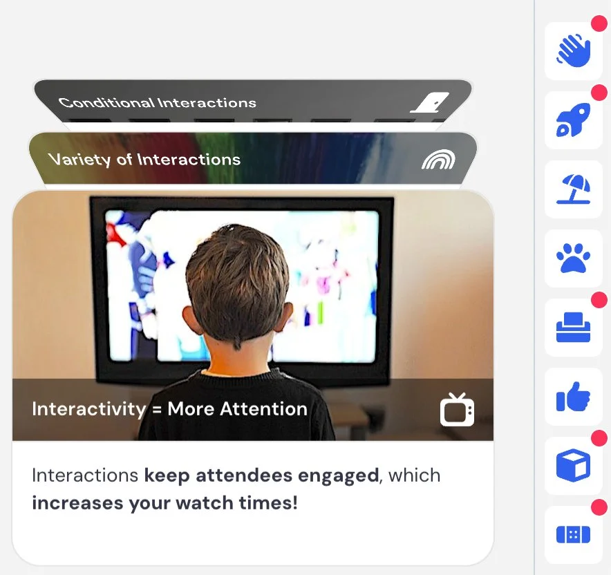
Using icons to represent different interactions can make the experience easier to navigate, but icons don’t always need to be literal.
You can also use icons to introduce personality, delight, or humor. A slightly unexpected or playful icon can make an interaction feel more engaging and less mechanical.
Choose icons intentionally so they reinforce the purpose or tone of each interaction, while adding visual interest to the overall experience.
One approach worth trying: match the icon to the image you’ve used for the interaction. If you use a photo of a dog, use a dog icon. If you use a photo of a rocket, use a rocket icon. Since people are far more likely to remember a visual than text, pairing a distinctive image with a matching icon makes it much easier for attendees to find and return to a specific interaction when using the dock.
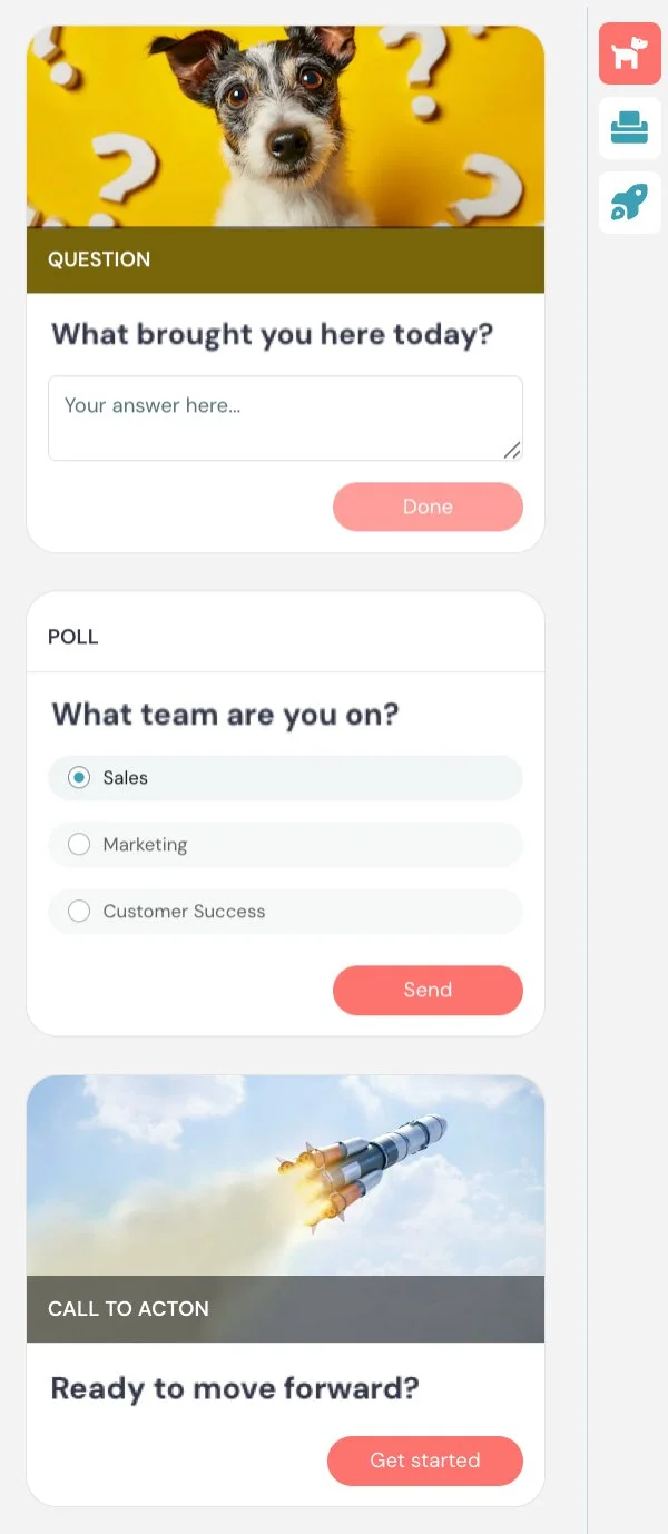
Interactions to Ask or Learn About Attendees
Question
What it is
An interaction that lets attendees submit a response to an open-ended question during the session.
What it’s best for
- Collecting qualitative feedback or insights
- Letting attendees share thoughts
- Capturing context you can’t get from multiple-choice responses
- Starting conversations early with simple icebreaker questions (when notifications are enabled)
How it works
When the interaction appears, attendees see a prompt and a text field where they can type their response. When submitted, responses are recorded and can be reviewed later. If enabled, responses can also trigger notifications for moderators, allowing for real-time awareness or follow-up.
Key settings specific to this interaction
Notify moderators of responses — if enabled, moderators are notified of responses by email, desktop notification, or Slack, based on their current chat notification settings. Responses are treated the same as chat messages for notification purposes.
Appear at, Pin above video, Make this interaction required, and Property name are shared across interactions.
When to use vs. not use
Use it when:
- You want open-ended input from attendees
- You want to collect feedback or insights
Do not use it when:
- You need structured or easily segmentable data → use Poll
- You want to capture contact details → use Contact form
Examples
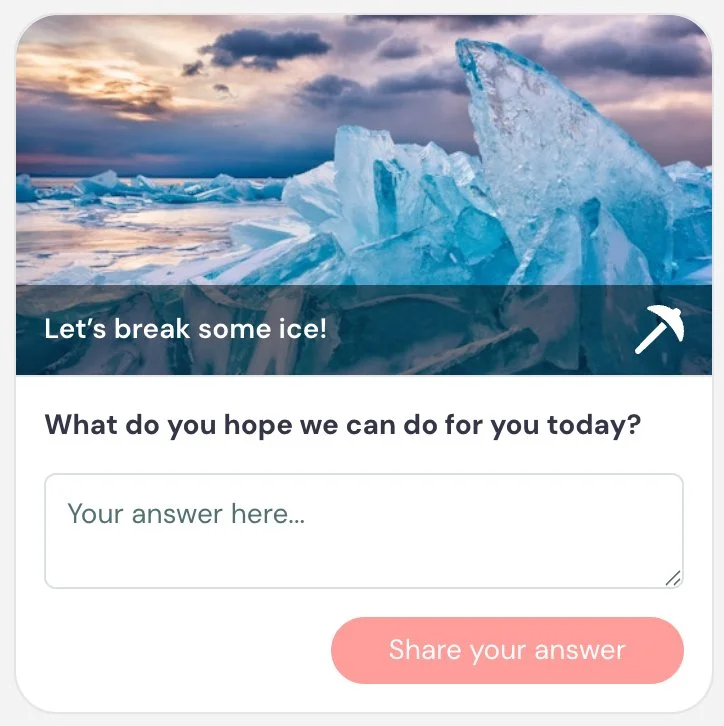
Example 1 — Icebreaker (Engagement)
Opens the session with a low-effort prompt that gets attendees comfortable engaging early
Card title: Let’s break some ice 🧊
Card description: What do you hope we can do for you today?
Button text: Share your answer
Example 2 — Gather feedback on content (Data)
Surfaces real-time reactions to a specific section so you know what's landing and what needs more clarity
Card title: What did you think?
Card description: What was most helpful or unclear in this section?
Button text: Share feedback
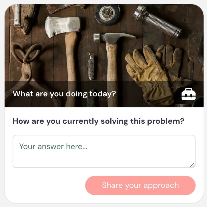
Example 3 — Identify challenges (Data)
Uncovers the attendee's current approach, giving context for how to position your solution
Card title: What are you doing today?
Card description: How are you currently solving this problem?
Button text: Share your approach
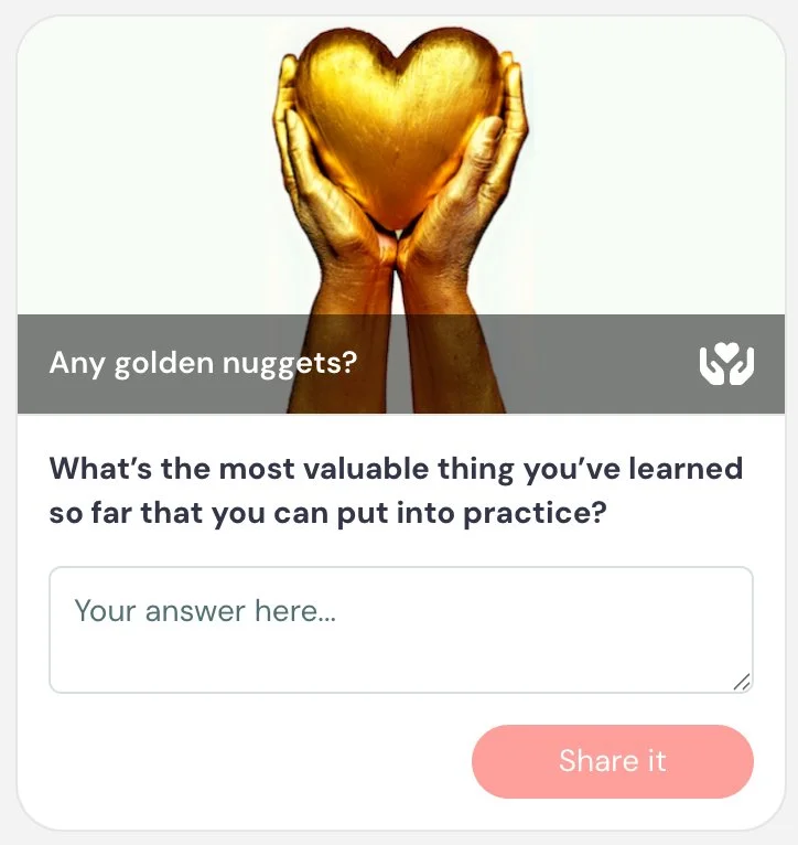
Example 4 — Golden nugget (Engagement)
Prompts attendees to reflect on and commit to applying what they've learned
Card title: Any golden nuggets? ✨
Card description: What’s the most valuable thing you’ve learned so far that you can put into practice?
Button text: Share it
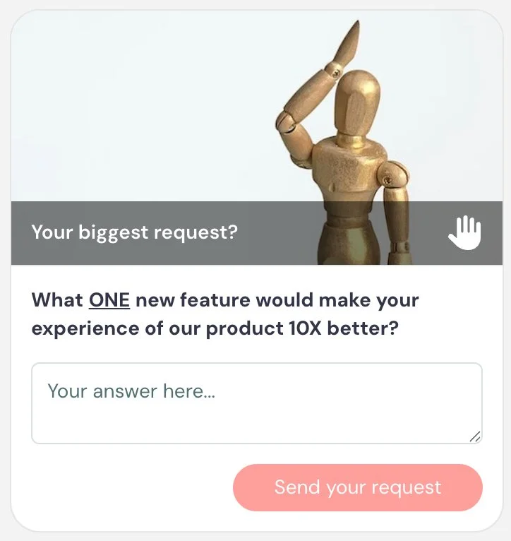
Example 5 — Identify missing features (Data)
Surfaces product gaps directly from attendees, useful for roadmap and prioritization
Card title: Your biggest request
Card description: What one new feature would make your experience of our product 10x better?
Button text: Share your request
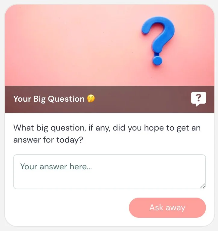
Example 6 — Big question (Engagement, Data)
Surfaces what attendees expected coming in, in their own words, so you can gauge whether the session met those expectations and understand their intent
Card title: Your big question 🤔
Card description: What big question, if any, did you hope to get an answer for today?
Button text: Ask away
Best practices
Keep questions focused and easy to answer. The more specific your question, the more useful the responses will be.
Use simple, low-effort prompts early in the session as icebreakers to get attendees comfortable engaging.
If you plan to monitor responses in real time, enable moderator notifications so your team can respond quickly or follow up after the session.
Poll
What it is
An interaction that lets attendees answer a multiple-choice question during the session.
What it’s best for
- Gathering structured data from attendees
- Engaging attendees in real time
- Segmenting your audience based on responses
- Making the session feel interactive instead of passive
How it works
When the interaction appears, attendees see a question with one or more answer options. They select their response and submit it.
You can control whether attendees see the poll results and when those results are revealed.
If you choose to show results, you have several options:
- When answered → attendees see results immediately after submitting
- After expiration → attendees see results after a set amount of time
- At end of presentation → results are only shown at the end of the session
- Never → results are not shown to attendees
If you select After expiration, you define how long the poll remains open before it closes. This gives attendees time to respond before results are revealed.
You can also choose whether to display a countdown timer during this period to indicate how much time is left to answer.
Poll responses are recorded and can be used to understand your audience or guide follow-up.
Poll responses are cumulative over time, meaning results become more meaningful as more attendees participate.
Key settings specific to this interaction
Show poll results → controls if and when attendees see results: When answered / After expiration (with configurable timer) / At end of presentation / Never
Poll type → single select or multi-select. When multi-select is enabled, “Check all that apply.” is automatically shown.
Notify moderators of responses → sends responses via email, desktop notification, or Slack (based on chat notification settings), just like chat messages.
Appear at, Pin above video, Make this interaction required, and Property name are shared across interactions.
When to use vs. not use
Use it when:
- You want to engage attendees at key moments
- You want to understand your audience’s situation or intent
- You want to segment attendees for follow-up
- You want to gather structured data
Do not use it when:
- You need open-ended responses → use Question
- You want to test knowledge with a correct answer → use Quiz
Examples
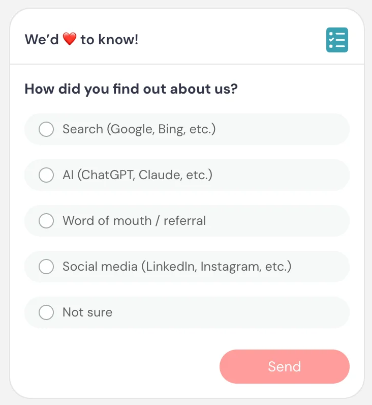
Example 1 — Marketing source (Data)
Helps understand acquisition channels
Card title: We’d love to know ❤️
Card description: How did you find out about us?
Answers: Search (Google, Bing, etc.) / AI (ChatGPT, Claude, etc.) / Word-of-mouth / Referral / Social media (LinkedIn, Instagram, etc.) / Not sure
Button text: Send
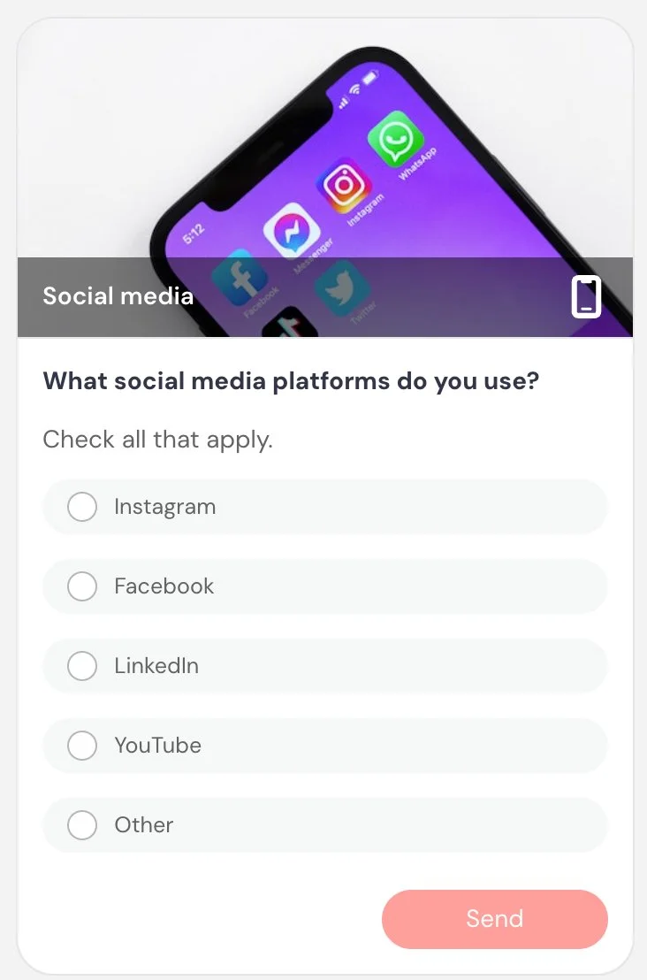
Example 2 — Social media usage (Data)
Segments audience by platform for follow-up
Card title: Social media
Card description: What social media platforms do you use?
Answers (multi-select): Instagram / Facebook / LinkedIn / YouTube / Other
Button text: Send
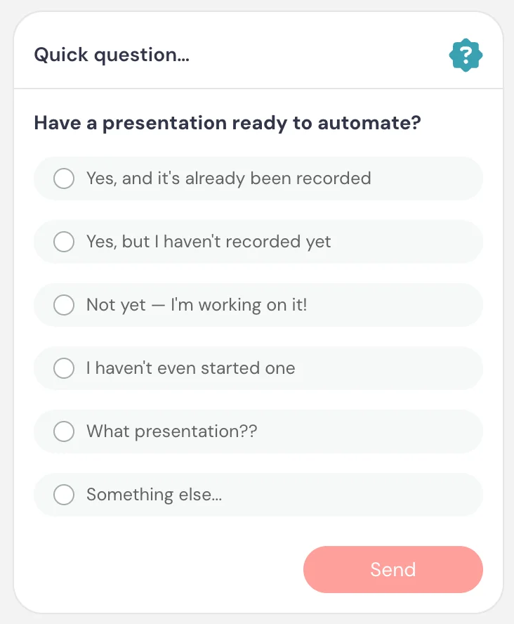
Example 3 — Readiness check (Data)
Segments attendees by where they are in the process
Card title: Quick question…
Card description: Do you have a presentation ready to automate?
Answers: Yes, and it’s already been recorded / Yes, but I haven’t recorded it yet / Not yet — I’m working on it / I haven’t even started one / What presentation?? / Something else…
Button text: Send
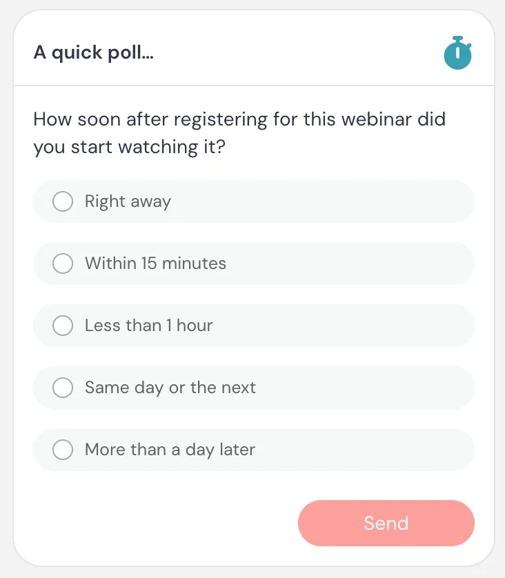
Example 4 — Make point through poll results (Engagement)
Showing results immediately after the attendee answers offers proof for how immediacy affects attendance behavior
Card title: A quick poll…
Card description: How soon after registering for this session did you start watching?
Answers: Right away / Within 15 minutes / Less than one hour / Same day or the next / More than a day later
Button text: Send
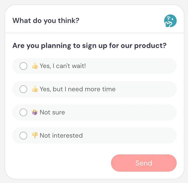
Example 5 — Interest signal (Data)
Identifies high-intent vs low-intent attendees
Card title: What do you think?
Card description: Are you planning to sign up?
Answers: 👍 Yes, I can’t wait / 👍 Yes, but I need more time / 🤷 Not sure / 👎 Not interested
Button text: Send
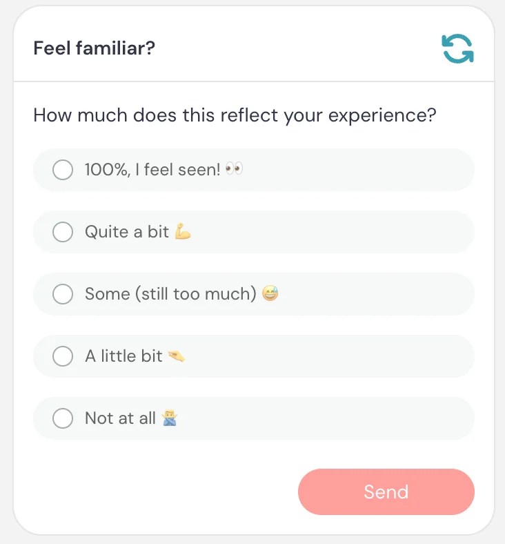
Example 6 — Relatability check (Engagement)
A sales technique that gets attendees to privately self-identify with the problem, even if they don't consciously register it that way, building their own awareness of the need before you present the solution
Card title: Feel familiar?
Card description: How much does this reflect your experience?
Answers: 💯 I feel seen 👀 / Quite a bit 💪 / Some (still too much) 😅 / A little bit 🤏 / Not at all 🙅
Button text: Send
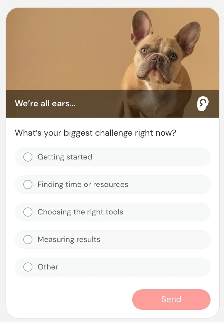
Example 7 — Identify challenges (Data)
Segments attendees by pain point for targeted sales follow-up
Card title: We’re all ears…
Card description: What’s your biggest challenge right now?
Answers: Getting started / Finding time or resources / Choosing the right tools / Measuring results / Other
Button text: Send
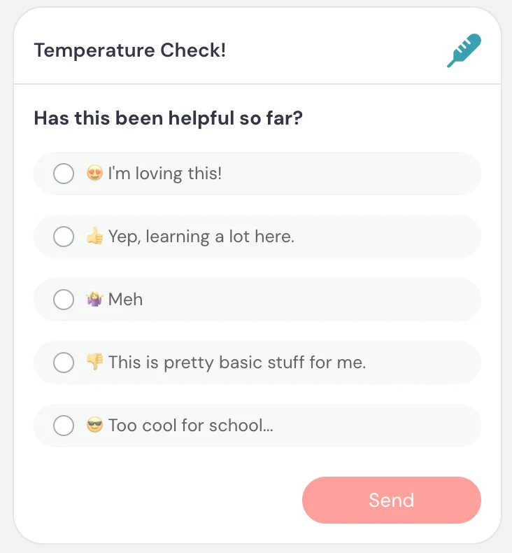
Example 8 — Temperature check (Engagement)
Also a reliable gap-filler.
Mid-session engagement check to gauge how content is landing
Card title: Temperature check 🌡️
Card description: Has this been helpful so far?
Answers: 😍 I’m loving this / 👍 Yep, learning a lot / 🤷 Meh / 👎 This is pretty basic stuff for me / 😎 Too cool for school…
Button text: Send
Example 9 — Understand primary goal (Data)
Segments attendees by intent
Card title: What’s your main goal?
Card description: What are you trying to accomplish right now?
Answers: Generate leads / Improve onboarding / Close more deals / Educate customers
Button text: Send
Example 10 — Content direction (Engagement, Data)
Guides pacing or future content
Card title: What should we cover next?
Card description: Which topic would you like to go deeper on?
Answers: Interactions / Integrations / Analytics / Promotion
Button text: Send
Example 11 — Identify experience level (Data)
Helps tailor messaging and follow-up for training/onboarding
Card title: Quick question
Card description: How familiar are you with our product?
Answers: Just getting started / Some experience / Very experienced
Button text: Send
Best practices
Use polls immediately after introducing a concept to keep attendees engaged and involved.
If showing results, choose timing intentionally:
- Use When answered for quick engagement
- Use After expiration to create a shared moment where everyone sees results together
- Use At end of presentation if results are part of a recap or reveal
- Use Never when you only want to collect data or when results may not yet be meaningful
Keep questions simple and easy to answer. The more natural the question feels in context, the higher your response rate will be.
Quiz
What it is
An interaction that asks attendees a multiple-choice question with a defined correct answer and evaluates their response.
What it’s best for
- Reinforcing key concepts during training
- Testing understanding or retention
- Snapping attendees back to attention — if they get it right, it reinforces that they’re engaged; if they get it wrong, it pulls their focus back
- Creating a sense of progress or achievement
How it works
When the interaction appears, attendees see a question with multiple answer options. You define which answer is correct. Attendees select an answer and submit it. Their response is evaluated against the correct answer.
When results are shown, attendees can see:
- Whether they got the answer right or wrong
- What the correct answer is
You can control when results are shown:
- When answered → shown immediately after submitting
- After expiration → shown after the response window closes
- At end of presentation → shown at the end of the session
- Never → results are not shown to attendees
If you include multiple quizzes, you can optionally show a final results summary at the end of the session.
Quizzes can also be tied to completion requirements. You can require attendees to answer a percentage of quizzes, or answer a percentage correctly. This can be used to determine whether a session is considered complete (for example, in certification or onboarding flows).
Key settings specific to this interaction
Show quiz result → controls when attendees see results: When answered / After expiration / At end of presentation / Never
Quiz type → single-answer or multi-answer. When multi-answer is enabled, “Check all that apply.” is automatically shown. The correct answer can be a combination of answers.
Include in quiz results card → includes this quiz in a cumulative results summary shown at the end of the session. When multiple quizzes are included, attendees will see a final score such as number of correct answers, incorrect answers, unanswered questions, and percentage correct.
Appear at, Pin above video, Make this interaction required, and Property name are shared across interactions.
When to use vs. not use
Use it when:
- You want to reinforce learning with immediate feedback
- You want attendees to actively process what they just learned
- You’re running structured training, onboarding, or certification tied to completion
Do not use it when:
- You only need opinions or preferences → use Poll
- There isn’t a clear correct answer
- You want open-ended input → use Question
Examples
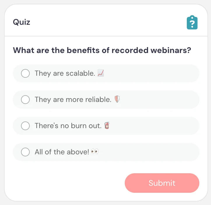
Example 1 — Concept check (Comprehension)
Reinforces a key concept and verifies if people are paying attention and, if not, brings them back
Card description: What are the benefits of recorded sessions?
Answers: Scalable 📈 / More reliable 🛡️ / No burnout 🧯 / All of the above 👀 ✅
Button text: Submit
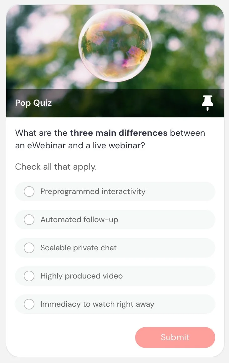
Example 2 — Multi-select concept check
(Comprehension)
Reinforces a key concept and verifies if people are paying attention and, if not, brings them back
Card title: Pop quiz
Card description: Which of the following are true about automated sessions? Check all that apply.
Answers: They can run 24/7 ✅ / They include pre-programmed interactions ✅ / They require a live presenter / They can send automated follow-ups ✅ / They can’t support private chat
Button text: Submit
Example 3 — Best practice check (Comprehension)
Reinforces best practices and verifies if people are paying attention and, if not, brings them back
Card title: What should you do first?
Card description: When launching a campaign, what is the most important first step?
Answers: Define your target audience ✅ / Choose colors / Schedule posts
Button text: Submit
Example 4 — Certification-style training (Comprehension)
Used as part of structured learning or evaluation
Card title: Knowledge check
Card description: Which metric best indicates performance?
Answers: Conversion rate ✅ / Number of clicks / Time spent on page
Button text: Submit
Example 5 — Final reinforcement (Comprehension)
Reinforces a key concept from earlier and verifies if people are paying attention and, if not, brings them back
Card title: Final check
Card description: What is required to track a completed action?
Answers: Tracking code on the destination page ✅ / Clicking a button / Watching the full video
Button text: Submit
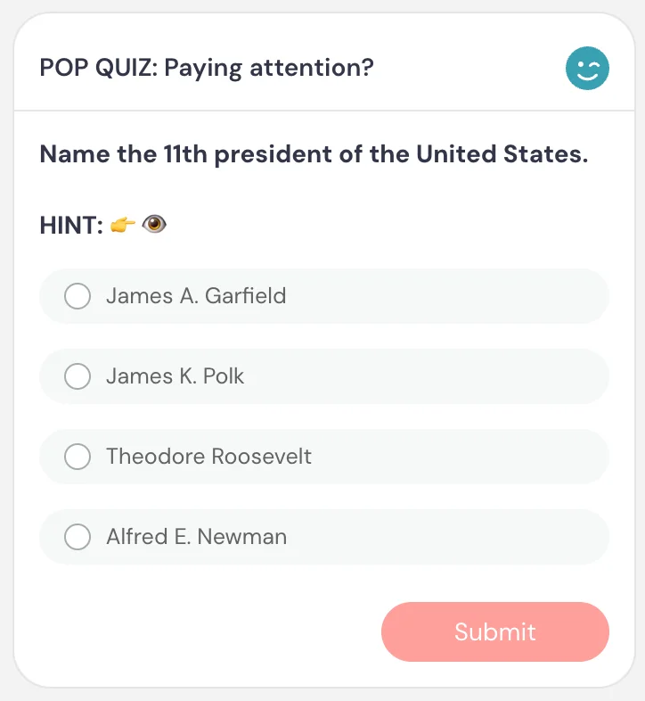
Example 6 — Attention check with a wink (Comprehension)
Also a reliable gap-filler.
A playful attention check that works when the presenter has already mentioned the answer earlier in the session — proving that people who were paying attention will get it right. A great way to reward attentiveness with a moment of delight.
Card title: POP QUIZ: Paying attention?
Card description: Name the eleventh president of the United States. HINT 👉🫦
Answers: James A. Garfield / James K. Polk ✅ / Theodore Roosevelt / Alfred E. Newman
Button text: Submit
Best practices
Use quizzes shortly after explaining a concept to reinforce learning while it’s fresh.
If quizzes are tied to completion, clearly align them with what attendees need to understand or demonstrate.
If you include multiple quizzes, consider enabling the final results summary to give attendees a clear sense of progress (e.g., “You got 4 out of 5 correct”).
Keep questions simple and focused. The goal is to reinforce key concepts and ensure understanding.
Note on poll vs. quiz: Unlike polls, quizzes are designed around correct vs. incorrect answers. Use Poll when you want opinions or segmentation, and Quiz when you want to evaluate understanding.
Feedback
What it is
An interaction that lets attendees rate the eWebinar, product, service, or experience on a 1–5 scale, and optionally leave additional comments.
What it’s best for
- Measuring how effective your session or experience is
- Collecting attendee satisfaction ratings
- Quickly identifying what worked well or didn’t
- Gathering feedback without requiring a long response
How it works
When the interaction appears, attendees see a 1–5 rating scale. After an attendee chooses a rating, they are prompted to share additional written feedback (optional). This text field appears only after they rate.
You can also choose whether attendees see the average rating and when it appears.
Key settings specific to this interaction
Show average rating → controls if and when attendees see the average rating: When answered / After expiration / At end of presentation / Never
Appear at, Pin above video, Make this interaction required, and Property name are shared across interactions.
When to use vs. not use
Use it when:
- You want to measure how well your session or content is performing
- You want a quick satisfaction or sentiment signal
- You want optional written feedback after a rating
Do not use it when:
- You only need a specific open-ended response → use Question
- You want structured segmentation → use Poll
- You want to collect contact or follow-up requests → use Contact form
Examples
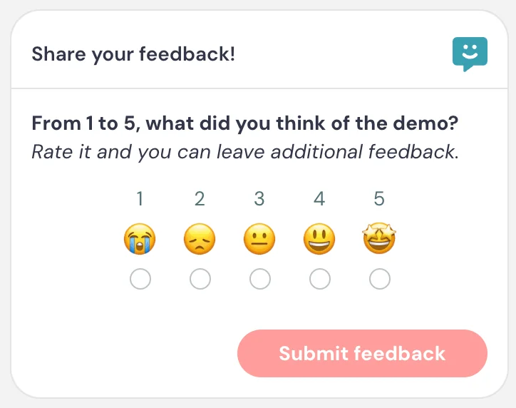
Example 1 — Session satisfaction (Data)
General session rating with optional comments
Card title: Share your feedback!
Card description: From 1 to 5, what do you think of the presentation? Rate it, and you can leave additional feedback.
Button text: Submit feedback
Example 2 — Training usefulness (Data)
Measures whether content delivered value
Card title: Was this helpful?
Card description: How useful was this training?
Button text: Submit
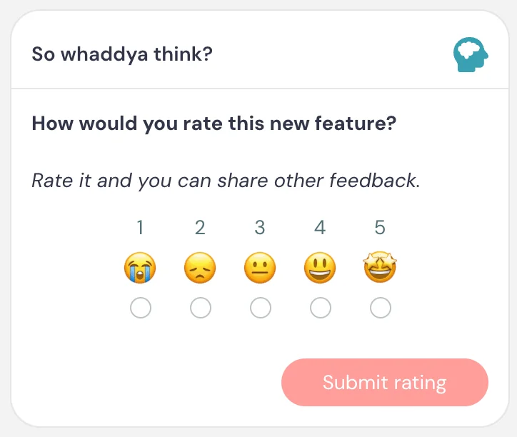
Example 3 — Product feedback (Data)
Collects quick sentiment on a product feature or update
Card title: Whaddy think? 🤔
Card description: How would you rate this new feature? Rate it, and you can share other feedback.
Button text: Submit rating
Example 4 — Vibe check (Engagement)
Also a reliable gap-filler.
Mid-session sentiment check to gauge enthusiasm and momentum
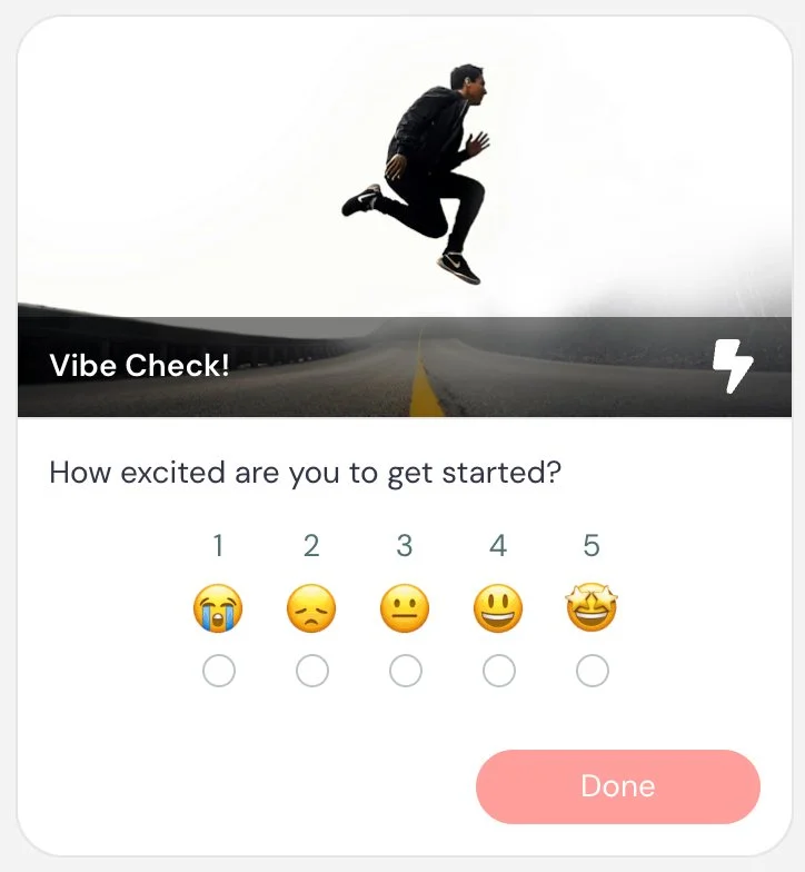
Card title: Vibe check! ✌️
Card description: How excited are you to get started?
Button text: Done
Example 5 — Confidence check (Data)
Measures whether attendees feel ready to take action after training
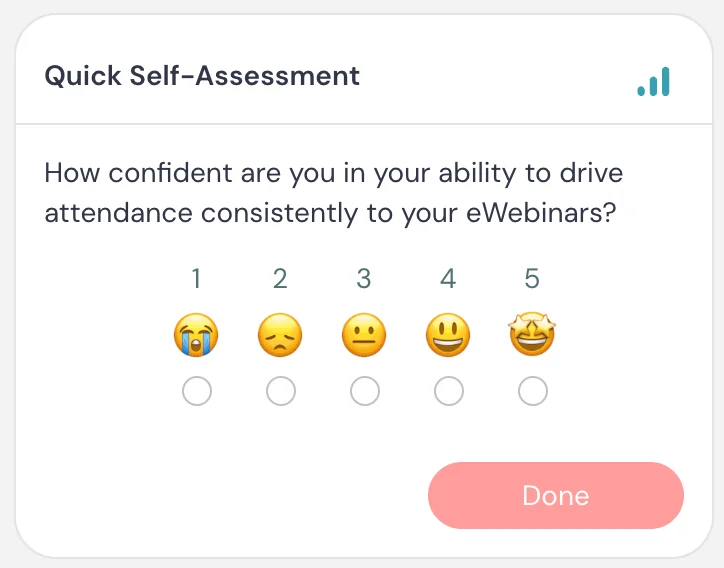
Card title: Quick self-assessment
Card description: How confident are you in your ability to apply what you just learned?
Button text: Done
Example 6 — Content clarity check (Data)
Identifies sections that may need more detail or a different approach
Card title: Was this clear?
Card description: Rate how clearly this topic was explained
Button text: Submit
Best practices
Use Feedback near the end of the session, after attendees have had enough time to evaluate the experience.
You can also use it mid-session as a quick “vibe check” to understand how attendees are feeling about what they’ve seen so far.
Keep the prompt broad enough that the rating feels natural, but specific enough that you know what they are rating.
Private message
What it is
A scheduled chat message that appears privately to an attendee during the session.
What it’s best for
- Prompting quiet attendees to engage
- Asking a question in a way that feels personal
- Checking in during gaps without other interactions
- Starting a one-on-one conversation
- Creating a more personalized experience
How it works
Private messages appear in chat, not in the interaction panel. To the attendee, they feel like a direct message from the moderator.
If the attendee replies, their response appears in chat and may trigger the auto response if it is enabled.
Key settings specific to this interaction
Skip if moderator chat is ongoing → prevents the private message from sending if the attendee is already chatting with a moderator.
Merge fields → private messages support merge fields, making them the most personalized interaction type. The most common is {firstName}, but you can insert any attendee property — including answers from their registration form or responses to previous polls. This allows you to craft messages that feel genuinely tailored to each attendee.
When to use vs. not use
Use it when:
- You want to encourage non-engaged attendees to ask questions
- You want to check in at a key moment
- You want to fill a gap in the session with a personal engagement prompt
- You want a question to feel like it’s being asked directly to the attendee
Do not use it when:
- You are trying to welcome attendees at the beginning → use the built-in chat welcome message instead
- You want to ask the whole audience a visible question → use Question or Poll
Examples
Example 1 — Mid-session check-in (Engagement)
Also a reliable gap-filler.
Nudges quiet attendees to engage partway through the session
Message: We’re about halfway through — anything you wanna ask?

Example 2 — Before a key decision point (Engagement)
Offers personalized guidance right before an attendee needs to make a choice
Message: Want help figuring out which option is best for you?

Example 3 — Near the end (Engagement)
Gives attendees a final, personal opening to ask questions before the session ends
Message: Any questions for me, {firstName}, before we wrap up?

Example 4 — Onboarding support (Engagement)
Checks in on attendees who may be struggling to apply the training to their own setup
Message: Need help applying this to your own account?
Example 5 — Personal engagement prompt (Engagement)
Opens a one-on-one conversation early to understand what the attendee wants from the session
Message: What’s one thing you’re hoping to get out of this session?
Best practices
Turn on Skip if moderator chat is ongoing in most cases. This prevents the message from appearing while an attendee is already in an active conversation, so it doesn’t interrupt or feel out of place.
Do not use Private message as a welcome message. Welcome messages are already built into chat settings.
Interactions for Your Primary CTA (Conversion Event)
eWebinar supports one conversion event per eWebinar. Before choosing which interaction to use, you need to decide what that one action is — because everything in this section is designed to drive toward it.
The CTA-based interactions (Call to action, Special offer, and Thinkific offer) all share the same underlying conversion system. That means if you use any of them — even multiple times throughout the session — they all point to the same tracking code. You only set it up once, and it applies across all of them.
The other conversion types — Contact form and Next eWebinar — work differently and are covered in their own sections below.
For the full details on how conversion tracking works, see Understanding Conversion Tracking →
Call to action
What it is
A clickable interaction that sends attendees to a specific URL and can be used as part of tracking a conversion event.
What it’s best for
- Driving attendees to take a meaningful, outcome-based action
- Guiding attendees toward a milestone that indicates success or progress
- Prompting completion of a key step (e.g., setup, activation, engagement)
- Moving attendees forward in a funnel
For purchase- or revenue-focused outcomes, use Special offer instead.
How it works
When the interaction appears, attendees see a card with a button. When they click the button, they are taken to the URL you’ve configured.
This interaction is commonly used as part of a conversion tracking setup. Instead of tracking the click itself, you place tracking code on a post-action confirmation page — for example, a thank-you page after submitting a form, completing a step in your product, or reaching a key milestone. When that code fires, the conversion is recorded.
Only one conversion event can be tracked per eWebinar, so this interaction is typically used to drive attendees toward a single, high-value outcome.
Key settings
This interaction does not have any unique settings beyond those shared across interactions.
When to use vs. not use
Use it when:
- You want to drive a meaningful, outcome-based action
- You can track success based on what happens after the click (not just the click itself)
- The action represents a strong signal of progress, activation, or engagement
Do not use it when:
- You’re trying to drive a purchase or close a deal → use Special offer
- You just want to share a simple link without tracking → use Link
- The action is low-value or informational (e.g., just viewing a help doc)
Examples
Example 1 — Activation milestone
Conversion is tracked after the attendee completes the activation step
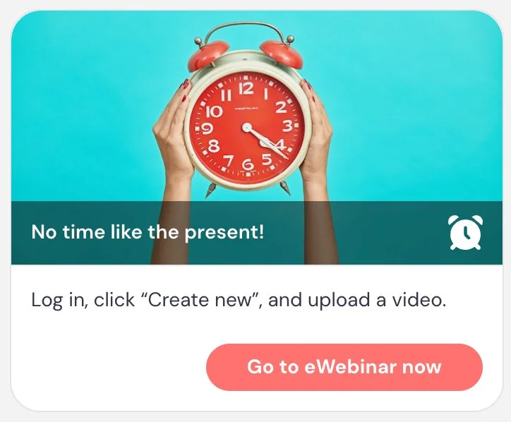
Card title: No time like the present!
Card description: Log in, create something new, and see it in action.
Button text: Try it now
Example 2 — Book a call
Conversion is tracked after the meeting is scheduled
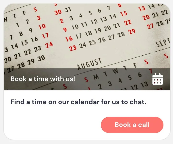
Card title: Book a time with us
Card description: Find a time in our calendar for us to chat.
Button text: Book a call
Example 3 — Complete integration setup
Conversion is tracked after the integration is successfully connected
Card title: Set up your first integration
Card description: Connect your CRM to start syncing contacts automatically.
Button text: Set it up now
Example 4 — Create your first campaign
Conversion is tracked after the campaign is created
Card title: Launch your first campaign
Card description: Start your first campaign to begin reaching your audience.
Button text: Launch campaign
Example 5 — Newsletter or content signup
Conversion is tracked after the form is submitted on the confirmation page
Card title: Stay in the loop
Card description: Get tips and updates delivered to your inbox.
Button text: Sign up
Best practices
Choose one clear, high-value action as your primary CTA and design your eWebinar to drive toward it.
You can surface your CTA more than once throughout the session. For example, introduce it early and pin it above the video so it remains accessible, then show it again at key moments like the middle or end.
Avoid overusing it — repeat enough to make it easy to act, but not so often that it becomes distracting.
Make sure the destination reflects a meaningful outcome, since conversions are tracked based on what happens after the click — not the click itself.
For training eWebinars, consider placing tracking code directly in your product — for example, on a confirmation screen that appears after a key action is completed. This tells you whether attendees actually did the thing you trained them to do, not just whether they clicked a button. Since you can only track one conversion event per eWebinar, choose the action that most clearly signals success — ideally a culminating step that demonstrates the attendee learned and applied what you intended.
Note on conversion tracking: Only one conversion type can be tracked per eWebinar: CTA-based (Call to action, Special offer, Thinkific offer), Contact form, or Next eWebinar. Learn more about conversion tracking →
Special offer
What it is
A clickable interaction designed to present an offer and drive a purchase or high-intent conversion.
What it’s best for
- Driving purchases, signups, or bookings
- Presenting a time-sensitive or exclusive offer
- Converting engaged attendees into customers
For onboarding- or product-usage actions, use Call to action instead.
How it works
When the interaction appears, attendees see a card with an offer and a button. When they click the button, they are taken to the URL you’ve configured.
Like Call to action, this interaction is used as part of a conversion tracking setup. The conversion is not the click itself — it is recorded when tracking code fires on the destination (such as a checkout confirmation page or after signup is completed).
Only one conversion event can be tracked per eWebinar, so this interaction is typically used to drive the primary revenue or deal-related outcome.
Key settings
This interaction does not have any unique settings beyond those shared across interactions.
When to use vs. not use
Use it when:
- You are presenting a purchase, signup, or booking opportunity
- The outcome is revenue-related or tied to closing a deal
- You want to position the action as an “offer” rather than just a next step
Do not use it when:
- You’re driving to a next step (as opposed to a purchase) → use Call to action
- You just want to share a simple link without tracking → use Link
- The action is low-commitment or informational
Examples
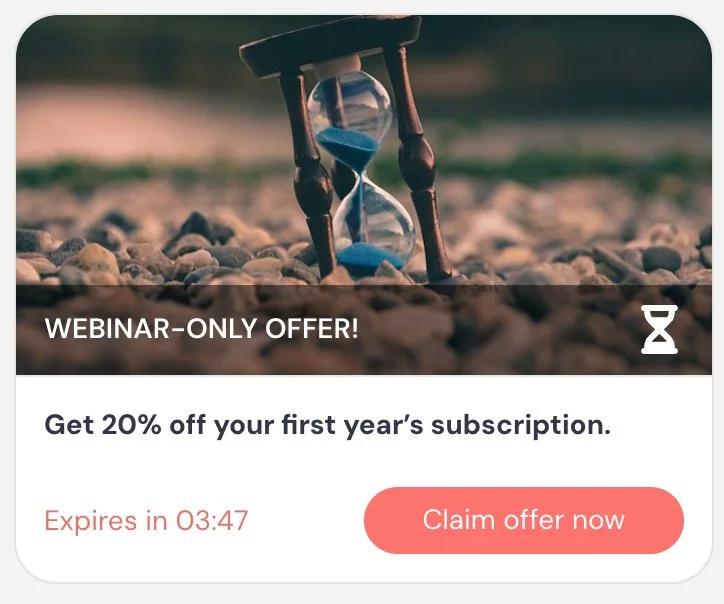
Example 1 — Urgency-driven attendee offer
Conversion is tracked after purchase is completed. The countdown timer creates urgency and reinforces that the offer is exclusive to attendees.
Card title: WEBINAR-ONLY OFFER!
Card description: Get 20% off your first year subscription.
Button text: Claim offer now
Expiration: 30:00 (countdown timer enabled)
Example 2 — Start free trial
Conversion is tracked after the user signs up
Card title: Start your free trial
Card description: Try the platform free for 14 days — no credit card required
Button text: Start free trial
Example 3 — Book a demo
Conversion is tracked after the meeting is scheduled
Card title: Book a live demo
Card description: See how this fits your workflow with a personalized walkthrough
Button text: Book a demo
Example 4 — Purchase a course
Conversion is tracked after purchase is completed
Card title: Get full access to the course
Card description: Unlock all lessons and resources to go deeper on this topic
Button text: Enroll now
Example 5 — Join a membership program
Conversion is tracked after signup is completed
Card title: Join the membership
Card description: Get ongoing access to training, resources, and community
Button text: Join now
Example 6 — Upgrade to a paid plan
Conversion is tracked after the upgrade is completed
Card title: Upgrade your plan
Card description: Unlock advanced features and remove usage limits
Button text: Upgrade now
Best practices
Choose one clear, high-value offer as your primary CTA and design your eWebinar to build toward it.
You can surface your offer more than once during the session. For example, introduce it early and pin it above the video so it remains accessible, then show it again at key moments like the middle or end.
Use urgency thoughtfully — limited-time or exclusive offers can increase conversions, but should feel credible and aligned with the value you’re presenting.
Avoid competing offers. The more focused the offer, the more effective your conversion tracking and results will be.
Note on conversion tracking: Only one conversion type can be tracked per eWebinar: CTA-based (Call to action, Special offer, Thinkific offer), Contact form, or Next eWebinar. Learn more about conversion tracking →
Contact form
What it is
An interaction that allows attendees to submit their contact information and a message directly within the session, and can be used as a conversion event.
What it’s best for
- Capturing inbound interest from attendees
- Letting attendees request follow-up or ask questions
- Generating qualified leads during or after the session
This is often used when the goal is to let attendees signal interest or request follow-up — without sending them away from the session. Since you already have their contact information from registration, the form acts less like a lead capture tool and more like a hand-raise: a way for attendees to say “I’m interested, reach out to me.”
How it works
When the interaction appears, attendees see a form with their name and email already pre-populated from registration. There is also an optional message field — attendees don’t need to enter anything there to submit. All they have to do is click the button.
When the form is submitted:
- The contact request is sent to the configured email address
- The submission can be used as the eWebinar’s conversion event
Unlike Call to action or Special offer, the conversion happens directly within the session — no redirect or external tracking code is required.
Only one conversion event can be tracked per eWebinar, so this interaction is typically used when form submissions represent your primary success metric.
Key settings specific to this interaction
Send contact request to this email → where submissions are delivered
Require email field → ensures contact information is captured (if email is not required, another contact field such as phone will be required)
Hide phone number → removes the phone field from the form
Appear at, Pin above video, Make this interaction required, and Property name are shared across interactions.
When to use vs. not use
Use it when:
- You want attendees to request contact, a demo, or follow-up
- You want to capture intent without sending attendees away from the session
- A submitted request represents a qualified lead or conversion
Do not use it when:
- You want attendees to complete an action in your product → use Call to action
- You want to drive purchases or external checkout flows → use Special offer
- You only need to share a link → use Link
Examples
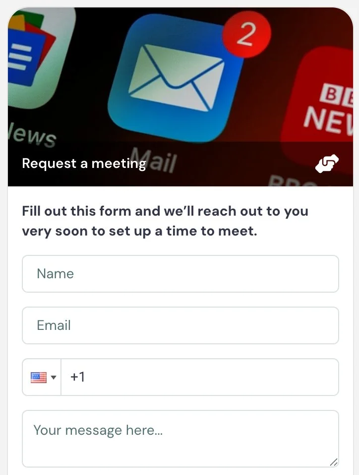
Example 1 — Meeting request
Conversion is tracked when the form is submitted
Card title: Request a meeting
Card description: Fill out this form and we’ll reach out to you very soon to set up a time to meet.
Button text: Request meeting
Example 2 — Request a sales call
Conversion is tracked when the form is submitted
Card title: Speak with sales
Card description: Interested in learning more? Submit your details and we’ll contact you.
Button text: Request a call
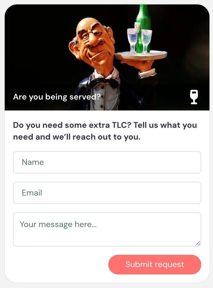
Example 3 — Onboarding support (non-conversion use)
Not used as a conversion event — used to proactively surface attendees who need help
Card title: Are you being served? 🫶
Card description: Do you need some extra TLC? Tell us what you need and we’ll reach out to you.
Button text: Submit
Example 4 — Capture high-intent interest mid-session
Conversion is tracked when the form is submitted
Card title: Ready to take the next step?
Card description: Let us know you’re interested and we’ll follow up shortly.
Button text: I’m interested
Example 5 — Ask a question (non-conversion use)
Not used as a conversion event — used to direct questions to someone who is not monitoring chat, like a guest speaker
Card title: Have a question for Diane?
Card description: Submit your question and we’ll follow up with you.
Button text: Send message
Best practices
Use the Contact form as a conversion event only when submitting the form represents your primary goal (e.g., qualified lead, demo request, or follow-up).
Make the value of submitting clear — attendees should understand what will happen after they raise their hand.
You can also use this interaction outside of conversion tracking to collect questions or feedback, but in that case it functions more like a structured input tool rather than a primary outcome.
Note on conversion tracking: Only one conversion type can be tracked per eWebinar: CTA-based (Call to action, Special offer, Thinkific offer), Contact form, or Next eWebinar. Learn more about conversion tracking →
Next eWebinar
What it is
An interaction that allows attendees to register for another eWebinar in your account directly from within the current session.
What it’s best for
- Moving attendees from one session to the next
- Driving continued engagement in an eWebinar series
- Guiding attendees deeper into your content or funnel
This is typically used in eWebinar series, onboarding flows, or multi-step education journeys.
How it works
When the interaction appears, attendees see a card promoting another eWebinar. They can select a session and register directly from within the current session.
You choose which eWebinar to promote from your active eWebinars.
An eWebinar can contain only one Next eWebinar interaction. Once one is on the timeline, the type no longer appears in the add menu.
There are two registration options:
One-click registration — automatically registers the attendee using their existing name and email from the current session. No form is shown.
Pop-up registration form — opens a registration form that is pre-populated with the attendee’s known information. The attendee can edit fields and complete any additional required fields before registering.
If the attendee chooses an on-demand session, they can be taken directly into the next eWebinar when the current one ends — similar to how one episode automatically leads into the next on Netflix.
Key settings specific to this interaction
eWebinar selection → choose which active eWebinar to promote
Registration type → One-click registration (auto-register with name + email) / Pop-up registration form (pre-filled, editable form with additional fields)
Appear at, Pin above video, Make this interaction required, and Property name are shared across interactions.
When to use vs. not use
Use it when:
- You have multiple eWebinars or a series
- You want attendees to continue learning or progressing
- Registration for the next eWebinar is a meaningful next step
Do not use it when:
- You’re trying to drive a purchase or revenue action → use Special offer
- You want attendees to take action inside your product → use Call to action
- You just want to share a link → use Link
Examples
To give you a sense of what this interaction looks like, here’s an example used to drive viewers of the first session in our eWebinar Academy to the second:
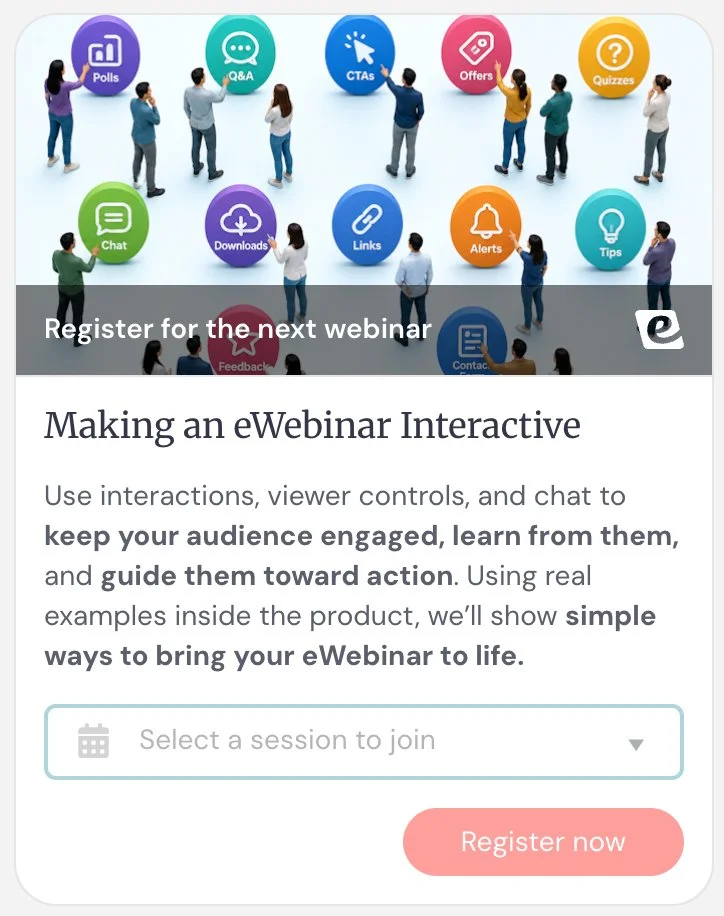
Example 1 — Onboarding series progression
Attendees register for the next onboarding eWebinar
Card title: Continue your onboarding
Card description: Join the next session to keep moving through the setup process.
Button text: Register now
Example 2 — Education series
Attendees move deeper into the series
Card title: Don’t miss the next session
Card description: Continue with the next lesson in this series.
Button text: Save your spot
Example 3 — Certification path
Attendees advance toward completing a program
Card title: Continue your certification
Card description: Complete the next module to stay on track for certification.
Button text: Register now
Example 4 — Post-session nurture
Keeps engaged attendees moving forward
Card title: Want to go deeper?
Card description: Join our advanced session for more strategies and examples.
Button text: Join next session
Example 5 — On-demand binge experience
Attendees move directly into the next on-demand session
Card title: Up next: Advanced setup
Card description: Keep going with the next eWebinar in this series.
Button text: Continue watching
Best practices
Use Next eWebinar when you want attendees to continue while you already have their attention.
This works especially well for eWebinar series, onboarding flows, or training paths where each session builds on the last.
For on-demand sessions, think of it like creating a binge-watch experience: one session can naturally lead into the next, helping attendees keep learning without needing to start over or search for the next step.
Use one-click registration when you want the transition to feel as seamless as possible.
Note on conversion tracking: Only one conversion type can be tracked per eWebinar: CTA-based (Call to action, Special offer, Thinkific offer), Contact form, or Next eWebinar. Learn more about conversion tracking →
Understanding Conversion Tracking
Conversion tracking lets you measure the primary desired outcome of your eWebinar.
eWebinar supports one conversion type per eWebinar, with three options:
- CTA-based conversion (Call to action, Special offer, Thinkific offer)
- Contact form submissions
- Next eWebinar registrations
How it works
You can only enable one conversion type at a time.
1. CTA-based conversion (shared across multiple interactions)
Call to action, Special offer, and Thinkific offer all use the same underlying conversion system.
That means:
- You only need to enable conversion tracking once
- When you enable it on any one of these interactions, it is automatically active across all of them
- They all share the same tracking code
- They all contribute to the same conversion event
So if you enable conversion tracking on a Call to action, then later add a Special offer, conversion tracking is already enabled there — no additional setup is required.
You can also use multiple CTA-based interactions throughout your eWebinar — for example, a Call to action early in the session and a Special offer near the end. Because they all share the same tracking code, they all contribute to the same conversion event. There is no conflict and no additional setup required.
These interactions are essentially different ways to present the same conversion action, not separate conversion types.
Important: Conversion is not based on the click itself. It is recorded when your tracking code fires on the destination (for example, a confirmation or thank-you page).
2. Contact form conversion
If you choose Contact form as your conversion type:
- Only contact form submissions are tracked
- CTA-based interactions are not included
- The conversion happens directly within the session, when the form is submitted
- No external tracking code is required
3. Next eWebinar conversion
If you choose Next eWebinar as your conversion type:
- Only registrations for the next eWebinar are tracked
- Other interactions are not included
What this means in practice
You are always tracking one primary outcome. The key decision is: what action defines success for this eWebinar?
- A purchase, signup, or key action → use CTA-based conversion
- A lead or follow-up request → use Contact form
- Progress through a series → use Next eWebinar
Best practice
Before building your eWebinar, decide: what is the one action that defines success?
Then choose the conversion type that matches that outcome, and build your interactions around guiding attendees toward it.
When to introduce your CTA
There are two common approaches:
Surface it early and keep it visible. If you think attendees may be ready to convert at any point — or if you want to reduce friction for those who are already sold — introduce your CTA early, pin it above the video, and surface it again at its natural moment in the presentation. This ensures it’s always accessible without being intrusive.
Wait for the right moment. If your presentation builds toward a reveal or pitch, hold the CTA until that moment. This preserves the structure of your presentation and ensures the offer lands with full context behind it.
Either approach works. The right choice depends on how your session is structured and how much you want to control the moment of conversion.
Learn more about conversion tracking →
Interactions to Share Something Valuable
Tip
What it is
A simple, non-interactive message used to highlight a key idea, insight, or reminder during the session.
What it’s best for
- Reinforcing important takeaways
- Emphasizing key points or best practices
- Adding clarity or context without requiring action
- Breaking up content with lightweight visual cues
How it works
When the interaction appears, attendees see a card with a short message. Tips do not require any action from the attendee. They are purely informational and meant to support the content being presented.
Unlike most other interactions, Tips do not collect any data and are not tied to tracking or follow-up.
Key settings
This interaction does not have any unique settings beyond those shared across interactions. Tips also do not include a property name, because they do not collect or store any data.
When to use vs. not use
Use it when:
- You want to highlight an important idea without interrupting the flow
- You want to reinforce something the presenter just said
- You want to add helpful context or guidance
Do not use it when:
- You want attendee input → use Poll or Question
- You want to drive an action → use Call to action or Special offer
- You want to share a resource link → use Link
Examples
Example 1 — Feature reinforcement (Engagement)
Also a reliable gap-filler.
Reinforces the value of something that was just explained
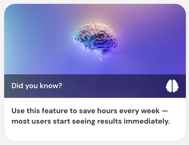
Card title: Did you know? 💡
Card description: You can use this feature to save hours every week — most users start seeing results immediately.
Example 2 — Scenario intro (Engagement)
Uses a tip to introduce a real-world scenario or case study mid-session
Card title: Client #2: Co-op in Chelsea
Card description: My client had lived in his co-op apartment located in the heart of Chelsea for 20+ years.
Example 3 — Chat engagement prompt (Engagement)
Encourages attendees to use chat without interrupting the flow of the presentation
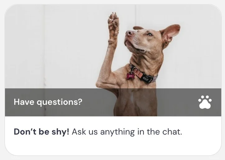
Card title: Have questions? 🙋
Card description: Don’t be shy — ask us anything in the chat.
Example 4 — Resource guide (Engagement)
Surfaces support resources at a natural moment in the session
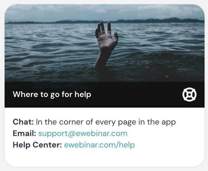
Card title: Where to go for help
Card description: Chat: in the corner of every page in the app / Email: support@yourcompany.com / Help center: yourcompany.com/help
Example 5 — Team recognition (Engagement)
A warm, human moment that adds personality — works well after a product update or feature reveal
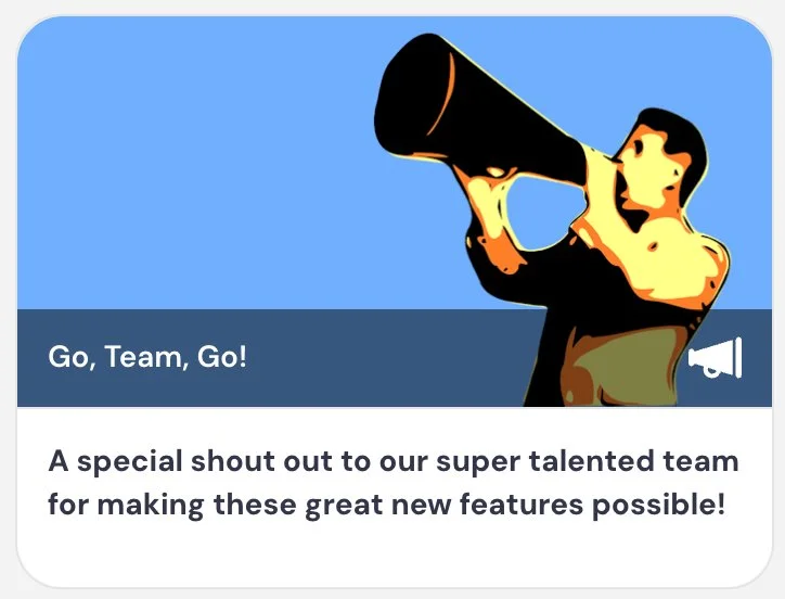
Card title: Go team go! 🎉
Card description: A special shout out to our super talented team for making these great new features possible.
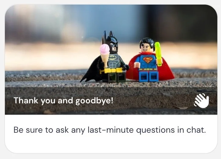
Example 6 — Closing prompt (Engagement)
A gentle closing tip (and moment of delight) that directs attendees to chat before the session ends
Card title: Thank you and goodbye 👋
Card description: Be sure to ask any last minute questions in chat.
Example 7 — Best practice reminder (Engagement)
Also a reliable gap-filler.
Reinforces a best practice attendees can apply immediately
Card title: Pro tip
Card description: Keep your follow-up process consistent to improve conversion rates
Example 8 — Reinforce a key concept (Engagement)
Also a reliable gap-filler.
Anchors the overarching philosophy of the session in a single memorable line
Card title: Remember
Card description: The goal isn’t just to present — it’s to create an experience
Example 9 — Friction reduction (Engagement)
Also a reliable gap-filler.
Reinforces a simple principle that's easy to apply right away
Card title: Keep it simple
Card description: The fewer steps in your process, the higher your conversion rate
Best practices
Keep Tips short and focused. They should feel like helpful nudges, not additional content blocks.
Use them sparingly — too many can distract from the main presentation instead of reinforcing it.
Use images when appropriate to help Tips stand out visually and break up longer stretches of content.
Link
What it is
A simple interaction that sends attendees to a URL without tracking it as a conversion event.
What it’s best for
- Sharing helpful resources or supporting content
- Linking to documentation, articles, or tools
- Giving attendees optional next steps without pressure
How it works
When the interaction appears, attendees see a card with a button. When they click the button, they are taken to the URL you’ve configured. Unlike Call to action or Special offer, this interaction does not track conversions. It is purely for navigation.
Key settings
This interaction does not have any unique settings beyond those shared across interactions.
When to use vs. not use
Use it when:
- You want to share a resource or additional context
- The action is optional or informational
- You don’t need to track the outcome as a conversion
Do not use it when:
- You want to track a meaningful action → use Call to action or Special offer
- The link represents a key success outcome
- You want to drive purchases or signups
Examples
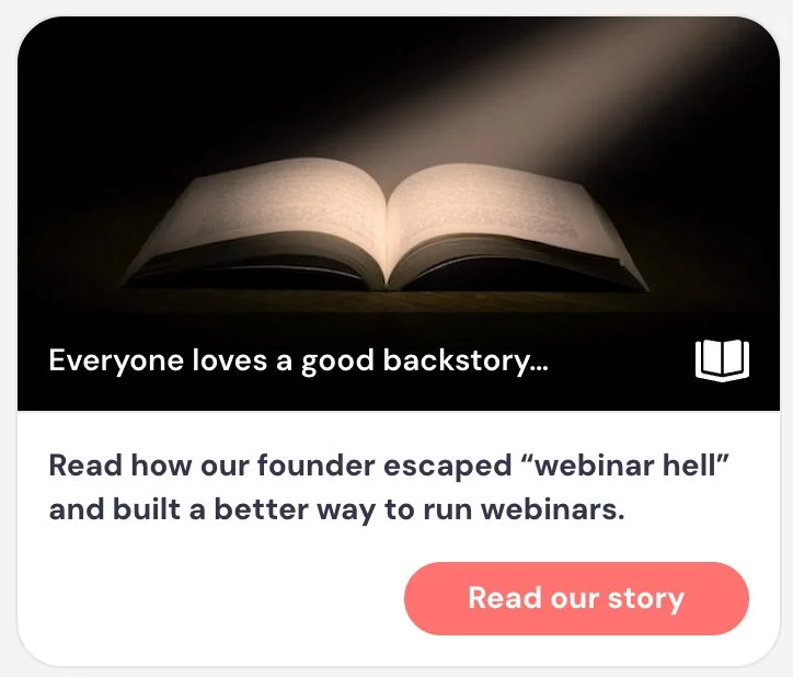
Example 1 — Founder story (Engagement)
Builds trust and connection by linking to the origin story behind the product or brand
Card title: Everyone loves a good backstory…
Card description: Read how our founder identified a problem that needed solving and built a better way.
Button text: Read our story
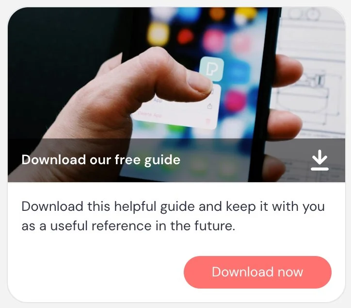
Example 2 — Resource download (Engagement)
Gives attendees a tangible resource to take away from the session
Card title: Download our free guide
Card description: Download this helpful guide and keep it as a useful reference going forward.
Button text: Download now
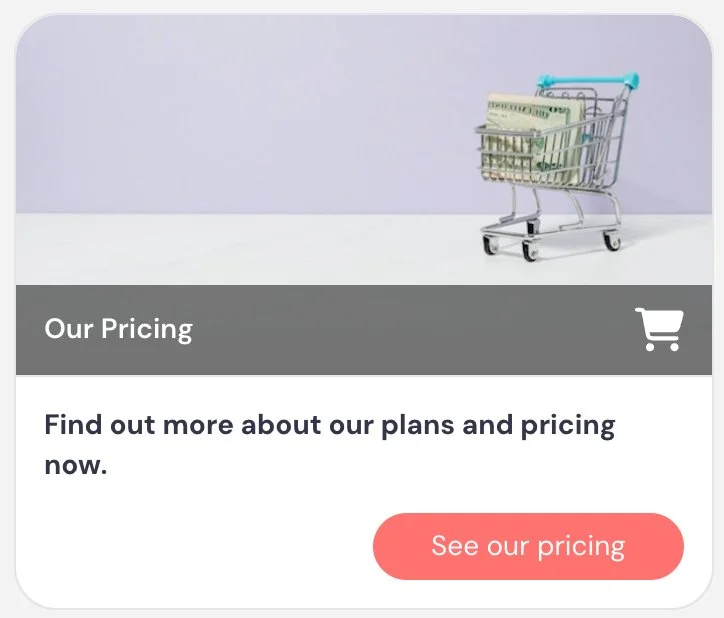
Example 3 — Pricing page (Engagement)
Surfaces pricing information without making it the primary CTA
Card title: Our pricing
Card description: Find out more about our plans and pricing.
Button text: See pricing
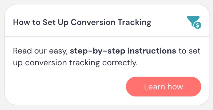
Example 4 — Help article (Engagement)
Links to documentation or a help article at the moment it’s most relevant
Card title: How to set this up
Card description: Read our step-by-step instructions to get this configured in your account.
Button text: Learn how
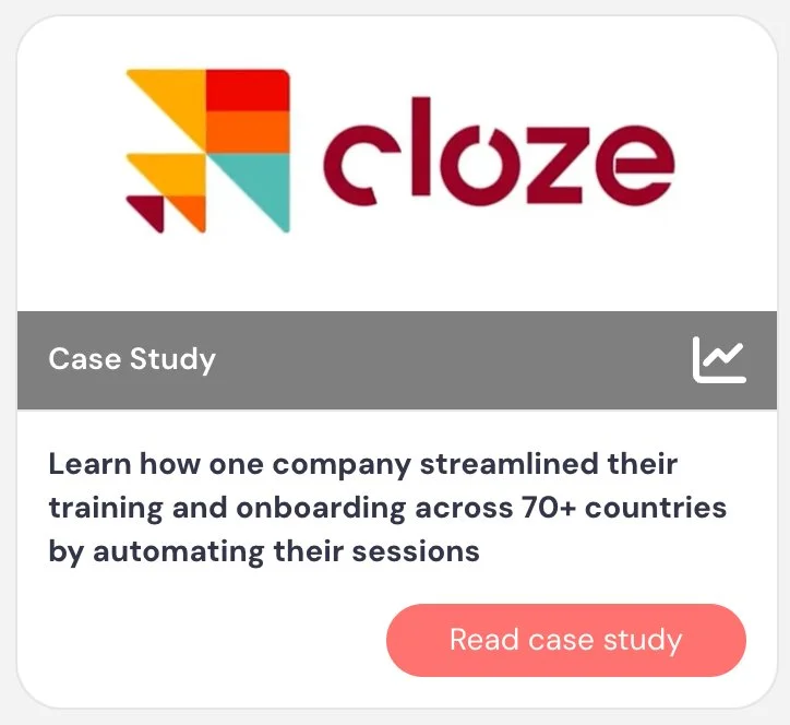
Example 5 — Case study (Engagement)
Adds social proof by linking to a real-world example. If you have the company’s logo, use it as the image for this interaction — it makes the card feel more credible and recognizable.
Card title: Case study
Card description: Learn how one company streamlined their training and onboarding across 70+ countries by automating their sessions.
Button text: Read case study
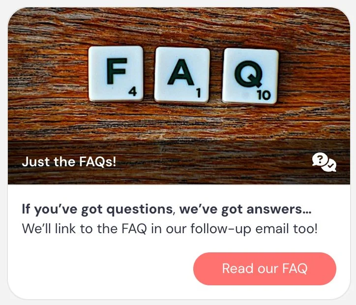
Example 6 — FAQ (Engagement)
Surfaces common questions at a natural moment, with a note that the link will also appear in follow-up
Card title: Just the FAQs! ❓
Card description: If you’ve got questions, we’ve got answers. We’ll link to the FAQ in our follow-up email too.
Button text: Read our FAQ
Example 7 — Hands-on practice with auto-pause (Engagement)
Used in combination with Auto-pause video to create a hands-on practice moment. The auto-pause message tells attendees to come back and click play when they’re done — so the card just needs to get them where they’re going.
Card title: Try it now
Card description: Go give this a try in your own account.
Button text: Sign in
Example 8 — Use a template or tool (Engagement)
Reduces friction by giving attendees a ready-made starting point
Card title: Use this template
Card description: Start with this template to speed things up.
Button text: Use template
Best practices
Use Link interactions to support your content — not replace it. They should feel optional and helpful, not required.
For workshop-style sessions, combine Link with Auto-pause video to create hands-on moments. Pause the video, send attendees to complete a step or try something, then have them return and continue.
Set expectations during your intro or housekeeping. Let attendees know they can pause the session at any time to explore resources and resume when they’re ready (you must enable the ability to pause under Settings).
Use links to reduce friction. Instead of asking attendees to remember something for later, give them a direct path to it in the moment.
Include the links you share during the session in your follow-up emails so attendees can easily access them later.
Avoid overusing links. Too many can distract from the main experience or pull attendees away for too long.
Important note: If the action you’re linking to represents a meaningful outcome (like a signup, purchase, or key product action), you should use Call to action or Special offer instead so it can be tracked.
Image overlay
What it is
An interaction that displays an image or GIF on top of the video for a set period of time.
What it’s best for
- Highlighting something visually during the presentation
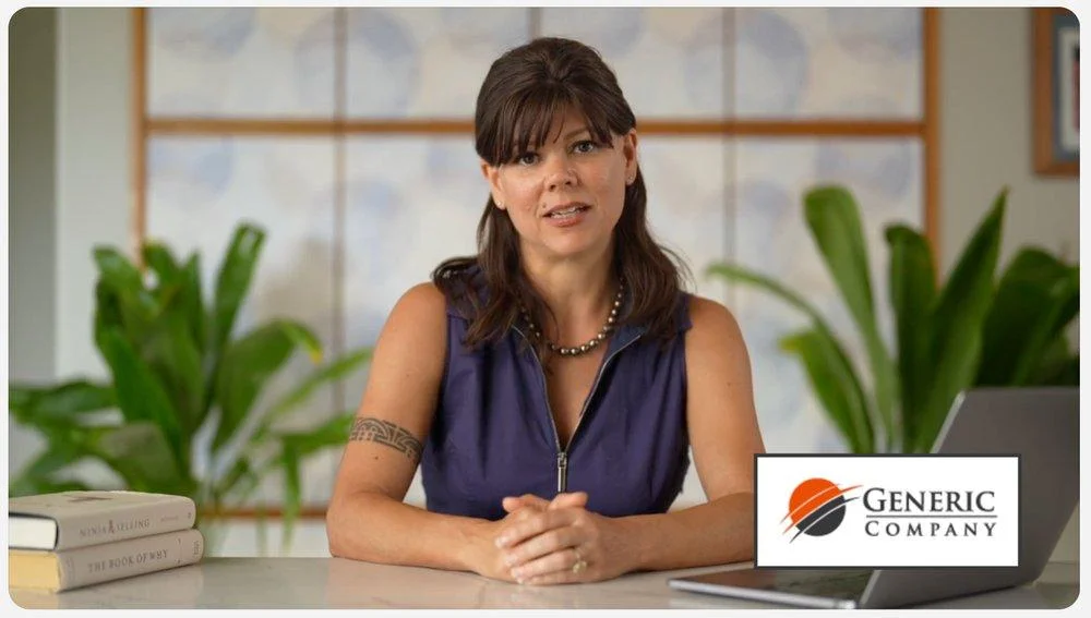
- Displaying a badge, logo, screenshot, or graphic
- Adding a visual callout instead of using an interaction card
- Creating a clickable image that works like a simple link
- Adding a visual you forgot to include in your slide deck — without having to re-record
- White-labeling a training experience by placing a customer’s logo in the corner of the video, creating the feeling of a branded, custom-built session for that customer
- Introducing moments of delight or humor to keep attendees engaged
How it works
When the interaction appears, the image or GIF is displayed directly over the video from the start time to the end time you choose. You can position the image, adjust its size, add a background, choose an entrance animation, and optionally make it clickable by adding a URL.
If you add a URL, clicking the image sends attendees to that destination. This works like the Link interaction and does not track conversions.
Key settings
- Start at / End at → controls when the image appears and disappears
- Image name → internal label only; attendees do not see it
- Image size → adjusts how large the image appears over the video
- Background → clear, white, or a custom color behind the image
- Entrance animation → none, fade, bounce, or zoom
- Effect → adds a ripple/glimmer effect to draw attention
- URL → optional destination if the attendee clicks the image
When to use vs. not use
Use it when:
- A visual cue would be more effective than a card
- You want to call attention to something on screen
- You want to show a logo, badge, diagram, or screenshot
- You want a clickable graphic (rather than just a button) as an alternative to a Link interaction — use Image overlay instead of Button overlay when you want the entire graphic to be the clickable element
- You want to add moments of humor, personality, or delight
Do not use it when:
- You need to track a conversion → use Call to action or Special offer
- You need text-heavy instructions → use Tip or another card-based interaction
- You just need a simple clickable button → use Button overlay
Examples
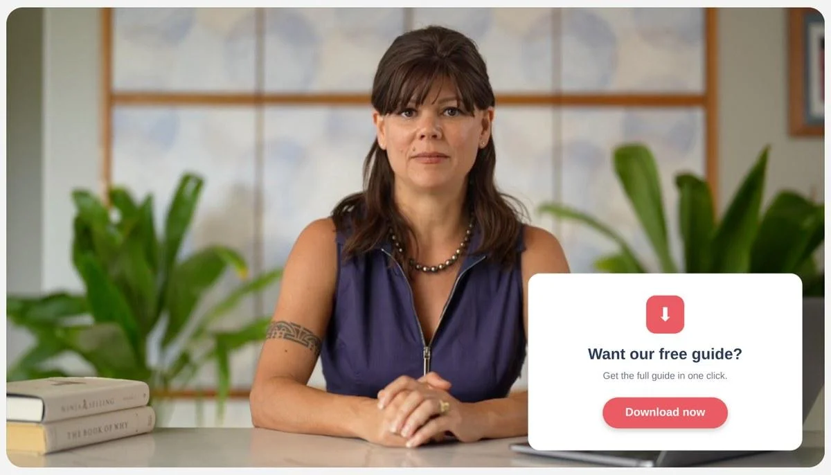
Example 1 — Clickable download graphic (Engagement)
Use Image overlay instead of Button overlay when you want the entire graphic — not just a button — to be the visual element. Making the whole image clickable keeps the design clean.
Image: A designed graphic promoting a downloadable resource (e.g., a guide, checklist, or template), with a button built into the graphic itself
URL: Link to the download
Example 2 — White-labeled enterprise training (Engagement)
Creates a branded, high-touch experience for enterprise customers. Duplicate the eWebinar for each customer and swap the logo — each customer sees their own branding without re-recording the video.
Image: Customer or partner logo placed in the corner of the video
URL: None
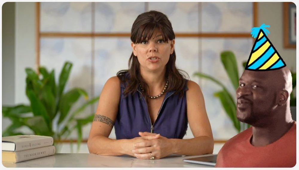
Example 3 — Delight / attention reset (Engagement)
Also a reliable gap-filler.
Re-engages attention with a moment of pure delight. Works especially well after a dense section or as a transition between topics.
Image: Animated GIF — for example, a chinchilla in a party hat wiggling its shoulders
URL: None
Example 4 — Clickable product screenshot (Engagement)
Lets attendees jump directly to what they just saw
Image: Screenshot of a feature or interface
URL: Link to that feature or tool
Example 5 — Visual emphasis / missing slide content (Engagement)
Adds or reinforces content without needing to re-record the video
Image: Key stat, diagram, or step that was missing from the original slide deck
URL: None
Best practices
Use image overlays when the visual itself adds value. They should enhance the experience, not distract from it.
Use them to break up visual monotony and re-engage attention, especially during longer sections.
You can also use overlays to patch or enhance your content — for example, adding a missing visual, reinforcing a point, or emphasizing something without re-recording your video.
For enterprise or repeatable use cases, overlays can help create a white-labeled experience by adding logos or branding dynamically.
If you make the image clickable, treat it like a Link interaction: useful for navigation or resources, but not for conversion tracking.
Use animated GIFs sparingly. When used intentionally, they can add humor and reset attention — but overuse can become distracting.
Button overlay
What it is
An interaction that displays a visible, clickable button directly on top of the video for a set period of time.
What it’s best for
- Creating a visible call-to-action directly within the video frame
- Drawing attention to a link without using a card in the interaction panel
- Adding a more prominent and explicit clickable element than a Hotspot
How it works
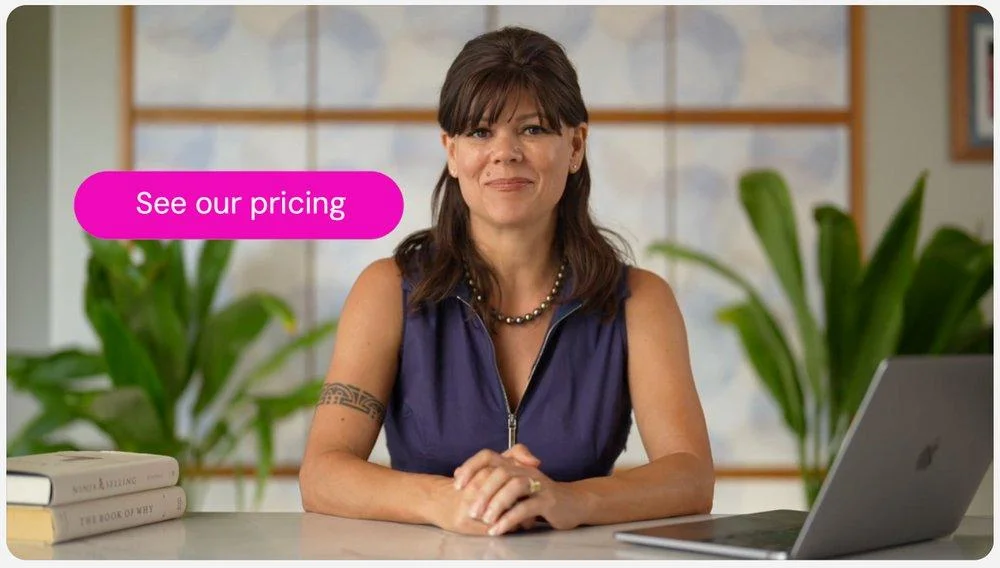
When the interaction is triggered, a styled button appears directly on top of the video from the start time to the end time you choose. You can customize the button label, color, position, and size, and optionally add an entrance animation.
When an attendee clicks the button, they are taken to the URL you’ve configured. Like Image overlay, Hotspot, and Link, this does not track conversions.
Key settings
- Start at / End at → controls when the button appears and disappears
- Button name → internal label only; attendees do not see it
- Button text → the label shown on the button
- URL → destination attendees go to when they click the button
- Button size → adjusts how large the button appears over the video
- Button color → customize the button background and text color
- Position → where the button is anchored on the video frame
- Entrance animation → none, fade, bounce, or zoom
- Effect → adds a ripple/glimmer effect to draw attention
When to use vs. not use
Use it when:
- You want a visible, labeled clickable element over the video
- A button label communicates the action more clearly than an image or invisible area
- You want to direct attendees to a resource at a specific moment without using the interaction panel
- You want something more prominent and explicit than a Hotspot
Do not use it when:
- You need to track a conversion → use Call to action or Special offer
- You want the overlay to display an image → use Image overlay
- You want the clickable area to be invisible → use Hotspot
Examples
Example 1 — Direct resource access (Engagement)
Appears when the presenter references a guide, so attendees can grab it immediately
Button text: Download the guide
URL: Link to PDF or resource
Example 2 — Product walkthrough (Engagement)
Overlaid during a product demonstration to let attendees jump directly into the app
Button text: Try it now
URL: Link to the feature or tool
Example 3 — Follow-along step (Engagement)
Appears during a walkthrough so attendees can access the resource without leaving the video flow
Button text: Open the template
URL: Link to template or tool
Example 4 — Supplemental reading (Engagement)
Overlaid on the video when the presenter references a resource in passing
Button text: Read the full article
URL: Link to blog post or help article
Example 5 — Reinforce a key step (Engagement)
Appears over the video during a moment where the presenter is directing attendees to a next step
Button text: Book your spot
URL: Link to registration or booking page
Example 6 — Pricing page (Engagement)
A simple, low-friction way to surface pricing at the right moment without making it the primary CTA
Button text: See pricing
URL: Link to pricing page
Best practices
Use button overlays when the action label itself communicates the value. Unlike a Hotspot, the button text gives attendees an immediate reason to click without needing any additional context or script guidance.
Keep button text short and action-oriented. Phrases like “Get the guide”, “Try it now”, or “Open template” perform better than generic labels like “Click here”.
Position the button intentionally. Place it in a corner or consistent location so it does not obscure the main content of the video.
Like Image overlay and Hotspot, button overlays do not track conversions. If the action represents a key success outcome, use Call to action or Special offer instead so it can be tracked.
Hotspot overlay
What it is
An invisible clickable area placed on top of the video for a set period of time.
What it’s best for
- Turning part of the video into a clickable link
- Creating interactive moments directly inside the video
- Letting attendees click on a specific object, slide element, or area
- Making the session feel more exploratory and interactive
- Adding playful or unexpected moments of engagement
How it works
When editing, you can see the hotspot area so you can position and resize it on the video. After saving, the hotspot itself is invisible to attendees. They only see the video, but the area you defined becomes clickable during the time window you set.
If an attendee clicks the hotspot, they are taken to the URL you configured. Like Image overlay and Link, this does not track conversions.
Key settings
- Start at / End at → controls when the hotspot is active
- Hotspot name → internal label only; attendees do not see it
- URL → destination attendees go to when they click the hotspot
- Hotspot size and shape → manually resize the clickable area on the video
- Hotspot corner radius → adjust corners; can make the hotspot rectangular, rounded, or circular
- Glimmer → adds a subtle visual effect to draw attention
When to use vs. not use
Use it when:
- You want attendees to click directly on something in the video
- You want a more immersive interaction than a button or card
- The video itself visually supports the action
- You want to add playful or delightful interaction moments
Do not use it when:
- You need the clickable area to be obvious → use Image overlay or Link
- You need conversion tracking → use Call to action or Special offer
- The attendee would not know where or why to click
Examples
Example 1 — Click a slide element (Engagement)
Presenter says, “Click the button on screen to open the guide.”
Hotspot area: Button shown on the slide
URL: Related guide or resource
Example 2 — Product walkthrough (Engagement)
Lets attendees click directly into what’s being demonstrated
Hotspot area: Feature shown inside a UI
URL: That feature or tool
Example 3 — Resource access within the video (Engagement)
Works as an embedded alternative to a Link interaction
Hotspot area: Visual element on the slide (e.g., checklist, icon, or section)
URL: Supporting resource
Example 4 — Guided interaction moment (Engagement)
Presenter directs attention to a specific part of the video for interaction
Hotspot area: Highlighted object or area on screen
URL: Related page or step
Example 5 — Playful engagement (Engagement)
Adds a fun, memorable moment when clearly guided
Hotspot area: Object, icon, or visual cue (e.g., “click the dog”)
URL: Bonus resource or hidden content
Best practices
Use hotspots when the video itself supports the interaction. They work best when the clickable area is visually obvious or clearly explained.
If the hotspot is not immediately obvious, include clear instructions in your script (e.g., “Click the button on screen” or “Click the icon in the corner”).
Hotspots can be used to create a more interactive video experience, where attendees engage directly with the content rather than only using the interaction panel.
Use the glimmer effect to help draw attention when needed, but don’t rely on it alone — context and guidance matter more.
Testimonial
What it is
An interaction that displays a customer quote or testimonial during the session, often with a name, title, and company.
What it’s best for
- Adding social proof at key moments
- Reinforcing credibility and trust
- Supporting a claim with a real customer example
- Highlighting outcomes, results, or experiences
How it works
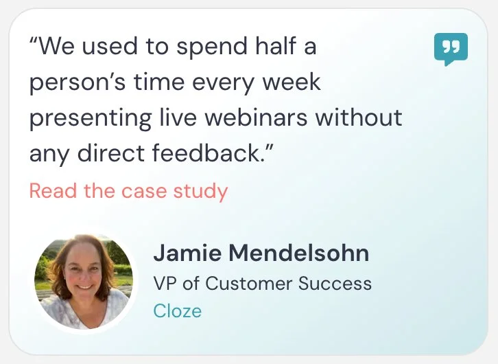
When the interaction appears, it shows a testimonial card with the quote, attribution (name, title, company), and optional image.
You can optionally include:
- A “Read more” link that takes attendees to a longer version of the testimonial (such as a case study or full quote)
- A company link tied to the company name
This interaction is primarily for credibility and context. It does not track conversions.
Key settings
- Testimonial content → the quote shown on the card
- Name / Title / Company → attribution fields
- Image → optional profile or company image
- Call to action link (“Read more”) → links to a longer testimonial, case study, or supporting page
- Company link → optional link tied to the company name
Appear at, Pin above video, Make this interaction required, and Property name are shared across interactions.
When to use vs. not use
Use it when:
- You want to reinforce a key claim with real-world validation
- You’re transitioning into a CTA or offer
- You want to build trust during a sales or onboarding session
Do not use it when:
- The testimonial is long or complex → keep it short and scannable
- You need to drive a primary action → use Call to action or Special offer
- You don’t have credible attribution → anonymous testimonials are less effective
Examples
To give you a sense of what testimonial interactions look like, here are two examples — one with a Read more link and one without:
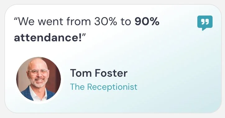
Example 1 — SaaS onboarding validation (Engagement)
Uses a concrete efficiency metric to build credibility with a SaaS audience
Quote: “We reduced onboarding time by 40% after switching to this workflow.”
Name: Alex Chen / Title: Head of Customer Success / Company: GrowthStack
Read more link: Full case study
Example 2 — Real estate brokerage training (Engagement)
Reinforces the training value of the product with a real estate-specific example
Quote: “Our agents finally follow a consistent process — and our listings improved immediately.”
Name: Maria Lopez / Title: Managing Broker / Company: Horizon Realty
Read more link: Agent success story
Example 3 — Product results (Engagement)
Highlights ease of implementation to reduce a common objection
Quote: “This was the easiest implementation we’ve ever done.”
Name: Jordan Patel / Title: Operations Lead / Company: ClearOps
Example 4 — Lead generation session (Engagement)
Supports a lead-gen pitch with a clear, quantified result
Quote: “We doubled our demo bookings within two weeks of launching this.”
Name: Sam Rivera / Title: Marketing Director / Company: PipelinePro
Read more link: Customer story
Example 5 — Light supporting proof near CTA (Engagement)
A brief, low-friction testimonial that reinforces confidence right before a CTA
Quote: “I wish we had started using this a year ago.”
Read more link: See how they got started
Best practices
Use the “Read more” link to expand on the testimonial without overcrowding the card. This keeps the on-screen experience simple while still giving interested attendees a path to deeper proof.
Think carefully before including the Read more link in a sales session. Mid-session, it can pull attendees away from the video at a moment when you want them watching. If you want to include it, save it for testimonials that appear near the end — after your pitch — when attendees have enough context to act on what they read. In training contexts where pausing is expected, it’s less of a concern.
Be intentional about including the company link. Add it when it gives helpful context, such as when the company may be unfamiliar or relevant to the story. If the company is already widely known, the link may not add much value.
Place testimonials near key decision moments, especially before a CTA, to reinforce confidence at the right time.
Conversion alerts
What it is
A notification that appears during the session to show when other attendees have completed your eWebinar’s conversion event.
What it’s best for
- Adding social proof during a sales or onboarding session
- Showing that other attendees are taking action
- Reinforcing momentum around your primary goal
How it works
Conversion alerts are based on the conversion event you choose for the eWebinar. That conversion event might come from a Special offer, a Call to action, a Thinkific offer, a Contact form submission, or a Next eWebinar registration.
When someone completes that conversion event, their activity can appear as a small notification during the session.
For example, the alert might say: Keenan from New York, US — Signed up for a subscription
The text you enter should describe the action someone completed.
Key settings
- Start at / End at → controls when alerts may appear during the session
- URL linked to notification → makes the alert clickable
- Display on → choose whether alerts appear at the top or bottom of the session
- On mobile → choose whether to show or hide alerts on mobile
- Show conversions from last X days → controls how recent conversions must be to appear
Some settings shared across interactions.
When to use vs. not use
Use it when:
- Your eWebinar has a meaningful conversion event
- You want to use real attendee activity as social proof
- You have enough recent conversions within your chosen time window — too few makes the social proof feel weak, and conversions that are too old (e.g., nine months ago) lose their impact
Do not use it when:
- You do not have conversion tracking set up
- Your conversion volume is too low to show alerts naturally
- Showing old conversions would undermine the purpose of the alert
Examples
To give you a sense of what conversion alerts look like, here are two examples from our own eWebinars — one triggered by a Special offer (sales conversion) and one triggered by a Call to action (product activation milestone):


Example 1 — SaaS signup (Engagement)
Use when your conversion event is a trial signup from a Special offer
Alert text: Signed up for a free trial
Example 2 — Demo booking (Engagement)
Use when your conversion event is a scheduled sales call
Alert text: Booked a demo
Example 3 — Product activation milestone (Engagement)
Use when your conversion event is completing a key product setup step from a Call to action
Alert text: Created their first project
Example 4 — Integration setup (Engagement)
Use when your conversion event is successfully setting up an integration
Alert text: Connected their CRM
Example 5 — Contact form submission (Engagement)
Use when your conversion event is submitting the Contact form interaction
Alert text: Requested follow-up
Example 6 — eWebinar series progression (Engagement)
Use when your conversion event is a Next eWebinar registration
Alert text: Registered for the next session
Best practices
Choose when conversion alerts appear intentionally. They often work best after attendees have seen enough of the session to understand the value, or after you have presented the offer or primary CTA.
If you have enough conversion volume, you can use timing to reinforce momentum — for example, showing alerts after the offer is introduced so it feels like others are taking action at the same moment.
Set your time window carefully. If your conversion volume is low, a narrow window (e.g., 14 days) may only surface one or two conversions — which can actually work against you as social proof. If your window is too wide, alerts may show conversions from months ago, which feel stale. Find the window where you have enough recent activity to feel lively without stretching too far back.
Learn more about conversion tracking →
Three Interactions that Serve a Special Purpose
Agenda item (Anchor)
What it is
An interaction used to define sections of your eWebinar and build a navigable agenda for attendees.
What it’s best for
- Structuring your eWebinar into clear sections or chapters
- Helping attendees understand what’s coming next
- Allowing attendees to navigate between parts of the session
- Making replays easier to browse and revisit
- Reinforcing the flow of your presentation
How it works
You place Agenda item (Anchor) interactions throughout your eWebinar to mark the beginning of each section. These anchors appear in the agenda, which attendees can open at any time to see the full structure and jump between sections.
You can also choose to automatically open the agenda at specific moments, such as at the beginning of the session or during transitions.
You can open the agenda even when you are not marking a new section. For example, during your intro, you might say:
“Here’s what we’ll cover today. You can use the agenda to jump to the sections most relevant to you.”
…and trigger the agenda to open so attendees can see the full outline. This means you can reference and open the agenda in your script at any moment without needing to create an anchor — useful when you want to introduce it verbally and have it appear at exactly the right time.
Key settings
- Anchor name → the name of the agenda item attendees see in the agenda
- Include as agenda item → adds this anchor as a visible item in the agenda
- Automatically open agenda at this moment → opens the agenda panel at a specific time
- Only show agenda item in replays → shows the agenda item only when someone watches a replay
Appear at, Pin above video, and Make this interaction required are shared across interactions.
When to use vs. not use
Use it when:
- You want to structure your eWebinar into clear sections
- You want attendees to be able to navigate your content
- You want to reinforce transitions between topics
- You want replay viewers to quickly find the sections most relevant to them
Do not use it when:
- You want attendees to watch the content in order and not skip around
- Your content is not clearly structured into sections
Examples
Here’s what the agenda looks like when open during a session:
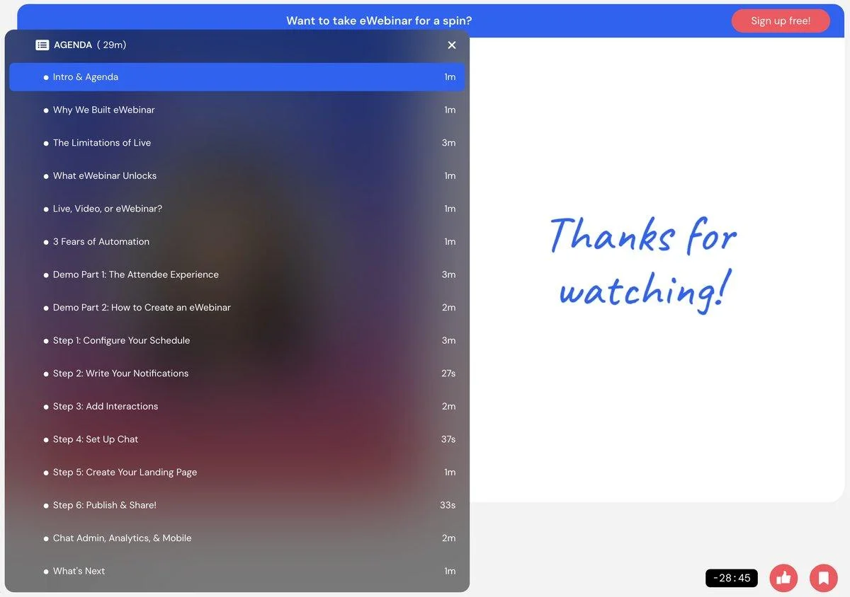
Example 1 — Opening agenda overview
Opens the agenda during the intro so attendees can see what will be covered.
Anchor name: Introduction
Example 2 — Core section marker
Marks the beginning of a main section so attendees can navigate back to it later.
Anchor name: Part 3: Understanding your purpose
Example 3 — Skipping familiar content
During this section, the presenter opens the agenda and says: “If you already know this part, feel free to skip ahead using the agenda.” The anchor marks the current section, but the agenda enables skipping forward.
Anchor name: Getting started
Example 4 — Replay navigation
Agenda items are set to appear only in replays, allowing viewers to jump between sections instead of scrubbing through the video.
Anchor names: Section titles (multiple anchors used)
NOTE: Examples 5 and 6 are meant to be used together, at the exact same moment, since no single user will see them both, as they are conditionally displayed.
Example 5 — Replay navigation tip (desktop)
A Tip interaction set to display only in replays on desktop, helping attendees discover the agenda icon. Available in the Interaction Library.
Interaction type: Tip (conditionally displayed in replays only, on desktop)
Card title: Navigating this replay
Card description: Use the agenda icon to jump to any section.
Example 6 — Replay navigation tip (mobile)
The same tip adapted for mobile, where the agenda icon is hidden until the attendee taps the video. Available in the Interaction Library.
Interaction type: Tip (conditionally displayed in replays only, on mobile)
Card title: Navigating this replay
Card description: Use the agenda icon to jump to any section. Simply tap the video to see it!
Best practices
Use agenda items when your eWebinar has a clear structure. A small number of well-defined sections is more useful than many granular ones.
Open the agenda intentionally during your script. For example, introduce it early and explain how attendees can use it to navigate or revisit sections.
If part of your audience may already know certain content, open the agenda at that moment and explicitly tell them they can skip ahead.
For replay optimization, consider using agenda items as a navigation tool. In replays, attendees already have full video control — they can scrub anywhere. By adding agenda items set to show only in replays, you guide that navigation rather than leaving it completely random. In most cases, you should either show all agenda items during replays only, or show them throughout the session. Avoid mixing both approaches, as it can create an inconsistent experience.
Use agenda items to make your eWebinar more reusable. When structured well, they turn your session into a resource that attendees can return to and navigate easily.
How this relates to Auto-pause video (Anchor): Auto-pause and Agenda item are the same underlying interaction with different settings. Agenda item structures the session and enables navigation. Auto-pause prompts action by pausing the video. The name shown in the editor changes based on how the interaction is configured.
Auto-pause video (Anchor)
What it is
An interaction used to pause the video at a specific moment to prompt action.
What it’s best for
- Giving attendees time to complete a step
- Prompting attendees to take a specific action before continuing
- Turning passive viewing into active participation
- Drawing attention to an interaction you want attendees to respond to
- Creating an intentional break before moving on
How it works
When the interaction is triggered, the video automatically pauses.
You define:
- How long the video should remain paused
- What message is shown during the pause
A countdown timer runs during the pause (unless the attendee resumes early), and the video will automatically continue when time expires.
This creates a structured moment for attendees to complete a specific action, respond to an interaction, or prepare for the next section.
Key settings
- Automatically pause video at this moment → enables the pause
- Pause video for up to → sets how long the video will remain paused before automatically resuming (from 10 seconds up to 30 minutes)
- Pause message → message shown during the pause, guiding the attendee on what to do
Appear at, Pin above video, and Make this interaction required are shared across interactions.
When to use vs. not use
Use it when:
- You want attendees to take action before moving on
- You’re guiding attendees through a step-by-step process
- You want attendees to respond to an interaction (e.g., poll, question)
- You want to emphasize a moment that requires attention or participation
Do not use it when:
- The pause would interrupt flow unnecessarily
- You don’t expect attendees to take action
- You want to structure content → use Agenda item (Anchor)
Examples
Example 1 — Complete a step
Gives attendees time to complete a hands-on step before continuing
Pause duration: 2 minutes
Pause message: Go complete this step in your account, then click play to continue.
Example 2 — Respond to an interaction
Ensures attendees actually engage with a poll or question before moving on
Pause duration: 1 minute
Pause message: Take a moment to answer the question, then click play to continue.
Example 3 — Follow-along exercise
Builds in practice time so attendees apply a concept while it's fresh
Pause duration: 3 minutes
Pause message: Apply what you just learned, then come back and continue.
Example 4 — Intentional break (longer session)
Gives attendees a real break during a longer session to prevent drop-off
Pause duration: 10 minutes
Pause message: Take a short break and come back when you’re ready to continue.
Best practices
Keep pause durations as short as possible. Short pauses create a sense of immediacy and keep attendees engaged, while longer pauses increase the risk that attendees leave and don’t return.
Use auto-pause to drive action, not just to pause the video. The pause should always have a clear purpose.
Use the pause message to clearly guide the attendee: tell them exactly what to do, keep instructions concise, and let them know to click play when they’re ready.
You can also use auto-pause to increase interaction response rates. For example, pause the video after a poll or question and tell attendees you want them to take a moment to answer it before continuing.
Auto-pause vs. required interactions
Auto-pause gives attendees a structured moment to act, but they can skip it by clicking play immediately. If you truly need attendees to respond before continuing — for example, in a certification flow where completion matters — use Make this interaction required instead. The key difference: when the auto-pause timer runs out, the video resumes automatically. With a required interaction, the video won’t continue at all until the attendee responds, and if they don’t respond within the time limit, they are removed from the session. Use required sparingly for this reason.
How this relates to Agenda item (Anchor): Auto-pause and Agenda item are the same underlying interaction with different settings. Agenda item structures the session and enables navigation. Auto-pause prompts action by pausing the video. The name shown in the editor changes based on how the interaction is configured.
In-video registration
What it is
An interaction that surfaces a registration form directly inside the video when eWebinar does not yet know who the viewer is (anonymous attendee in an ungated session).
What it’s best for
- Capturing registrant information in ungated viewing experiences
- Registering viewers who enter through ungated links
- Registering viewers who watch through the embedded player widget
How it works
In-video registration only appears when the viewer is not already identified. That means you can safely add it to an eWebinar without affecting traditional gated registration flows. If someone already registered before entering the session, they will not see this form.
It only appears in ungated viewing experiences, including the ungated on-demand link and the embedded player widget. Note: because the embedded player widget uses ungated sessions, in-video registration will also appear there if enabled.
You can choose when the form appears, and the timing changes the strategy significantly:
Before the session starts — the form appears as soon as the attendee clicks play, before the video begins. Use this when you want to gate access upfront. You can make registration required (they can’t watch without registering) or optional (they can skip and watch anonymously).
Partway through the session — the form appears at a specific moment after the video has started. This lets viewers sample your content before committing to registration, which can increase conversions by building interest first. If you make it required at this point, you’ve created an incentive: they must register to keep watching. Your script can set this up naturally — for example, “If you’re finding this useful and want to keep going, I’ll ask you to register now.”
You can also choose whether to show name and email only or the full registration form.
Key settings
- Surface registration form → choose whether the form appears before watching or at a specific time
- Form title → heading shown above the form. If the form appears before watching, try “Register to watch.” If it appears mid-session, try “Register to keep watching.”
- Form fields → name and email only, or full registration form
- Make registration → required or optional
- Button text / button color → customize the submit button
Best practices
Here’s an example of what in-video registration looks like when it appears over the video player:
Best practices for in-video registration depend on your goals — especially whether you want to require registration upfront or allow viewers to watch before registering.
For detailed guidance on when and how to use in-video registration effectively, see the resources below:
Best practices for in-video registration →
Promoting & Distributing Your eWebinar → (Recommended for strategy and real-world use cases)
Integration-Related Interactions
Thinkific offer
What it is
A Thinkific-specific version of Special offer for promoting a Thinkific course or product during a session.
What it’s best for
- Selling a Thinkific course or product
- Presenting a course offer inside a session
- Syncing course content from Thinkific into the interaction card
Use this interaction only if you are using Thinkific. Otherwise, use Special offer.
How it works
Thinkific offer works the same way as Special offer, with a few Thinkific-specific options.
Before using it, you must connect your eWebinar account to Thinkific. Once connected, you can select the Thinkific product you want to promote and enter the URL attendees should go to when they click the button.
You can also choose whether to sync content from Thinkific. When syncing is enabled, the interaction can pull in course details such as the course name, price, description, and image from Thinkific.
Like Special offer, this interaction can be used as part of a conversion tracking setup. The conversion is not the click itself — it is recorded when tracking code fires after the attendee completes the intended action, such as purchasing the course.
Key settings
- Thinkific product → choose the Thinkific product you want to promote
- Sync content → automatically pulls course information from Thinkific into the card
- Button URL → the destination attendees go to when they click the button
Some settings shared across interactions.
When to use vs. not use
Use it when:
- You use Thinkific
- You want to promote a Thinkific course or product
- You want to sync course details into the interaction card
Do not use it when:
- You are not using Thinkific → use Special offer
- You just want to share a simple link without tracking → use Link
Examples
Example 1 — Sell a Thinkific course
Conversion is tracked after the course purchase is completed.
Card title: Enroll in the full course
Card description: Get complete access to the lessons, templates, and resources.
Button text: Enroll now
Example 2 — Promote a paid certification
Conversion is tracked after enrollment or purchase.
Card title: Join the certification program
Card description: Complete the full training and earn your certification.
Button text: Join program
Example 3 — Upgrade from free lesson to paid course
Conversion is tracked after the paid course enrollment is completed.
Card title: Continue with the full course
Card description: Unlock the remaining modules and go deeper with step-by-step training.
Button text: Continue learning
Note on conversion tracking: Only one conversion type can be tracked per eWebinar: CTA-based (Call to action, Special offer, Thinkific offer), Contact form, or Next eWebinar. Learn more about conversion tracking →
Collect tips with Ko-fi
What it is
An integration-based interaction that lets attendees tip or donate through Ko-fi directly from the session.
What it’s best for
- Accepting optional tips or donations
- Supporting creators, educators, or community-led sessions
- Letting attendees contribute financially without requiring a purchase
How it works
After setting up a Ko-fi account, you enter your Ko-fi username in eWebinar. The interaction card automatically renders your Ko-fi tipping widget based on how your Ko-fi page is configured. Attendees can then submit a one-time or recurring contribution through Ko-fi.
Key settings
- Your Ko-fi username → connects the interaction to your Ko-fi tipping page
Some settings shared across interactions.
When to use vs. not use
Use it when:
- You already use Ko-fi
- Your session is free and you want to accept optional support
- You are running community, creator, education, or nonprofit-style content
Do not use it when:
- You are selling a product or course → use Special offer or Thinkific offer
- You want to track a conversion event
- You need a general payment or checkout flow
Examples
Example 1 — Creator session
Lets attendees support the creator directly after a free training
Ko-fi page: Creator tip jar
Use case: Attendees can support the creator after a free training.
Example 2 — Community education
Funds future free sessions through optional attendee contributions
Ko-fi page: Donation page
Use case: Attendees can contribute to support future free sessions.
Example 3 — Free workshop
Gives attendees a low-pressure way to say thanks after a valuable workshop
Ko-fi page: Coffee / tip page
Use case: Attendees can leave an optional thank-you tip after getting value from the session.
Best practice
Use this only when tipping or donations are a natural fit for your audience. For most business, onboarding, or sales eWebinars, a standard CTA, Special offer, or Link interaction will be more appropriate.
Product Hunt badge
What it is
An integration-based interaction that displays a Product Hunt badge/card inside your session.
What it’s best for
- Promoting a Product Hunt launch
- Sending attendees to your Product Hunt page
- Highlighting Product Hunt traction or social proof
How it works
First, connect your Product Hunt account. Then enter the Product Hunt link slug for the product you want to feature. The interaction pulls in product details from Product Hunt, such as the product name and description, and displays them in the session with a button attendees can click.
Key settings
- Product Hunt link → the final part of the Product Hunt URL used to identify the product
Some settings shared across interactions.
When to use vs. not use
Use it when:
- You are launching on Product Hunt
- You want attendees to support your launch
- Your Product Hunt page adds credibility or social proof
Do not use it when:
- You are not actively using Product Hunt
- You just need a general link → use Link
- You want conversion tracking → use Call to action or Special offer
Examples
Example 1 — Product launch
Drives attendees to support an active Product Hunt launch
Card title: Featured on Product Hunt
Card description: Check out our launch and support us on Product Hunt.
Button text: Come support us
Example 2 — Social proof
Uses Product Hunt community reception as social proof
Card title: See us on Product Hunt
Card description: Read what the Product Hunt community is saying about us.
Button text: View launch
Example 3 — Founder comment flow
Bridges a product overview into a Product Hunt visit to support the launch
Card title: Learn more about the product
Card description: Get the full overview, then visit our Product Hunt page to support the launch.
Button text: Visit Product Hunt
Best practice
Use this only when Product Hunt is part of your launch or credibility strategy. For most eWebinars, a standard Link interaction is simpler and more flexible.