Below is a summary of each section of the Analytics pages of your webinars in the order they are found there:
- Overview and summary
- Activity schedule
- Webinar completion & conversion funnel
- Attendance, watch time, & completion breakdown
- Engagement heatmap
- Interaction response rates
- Quick tip: How to reset your analytics
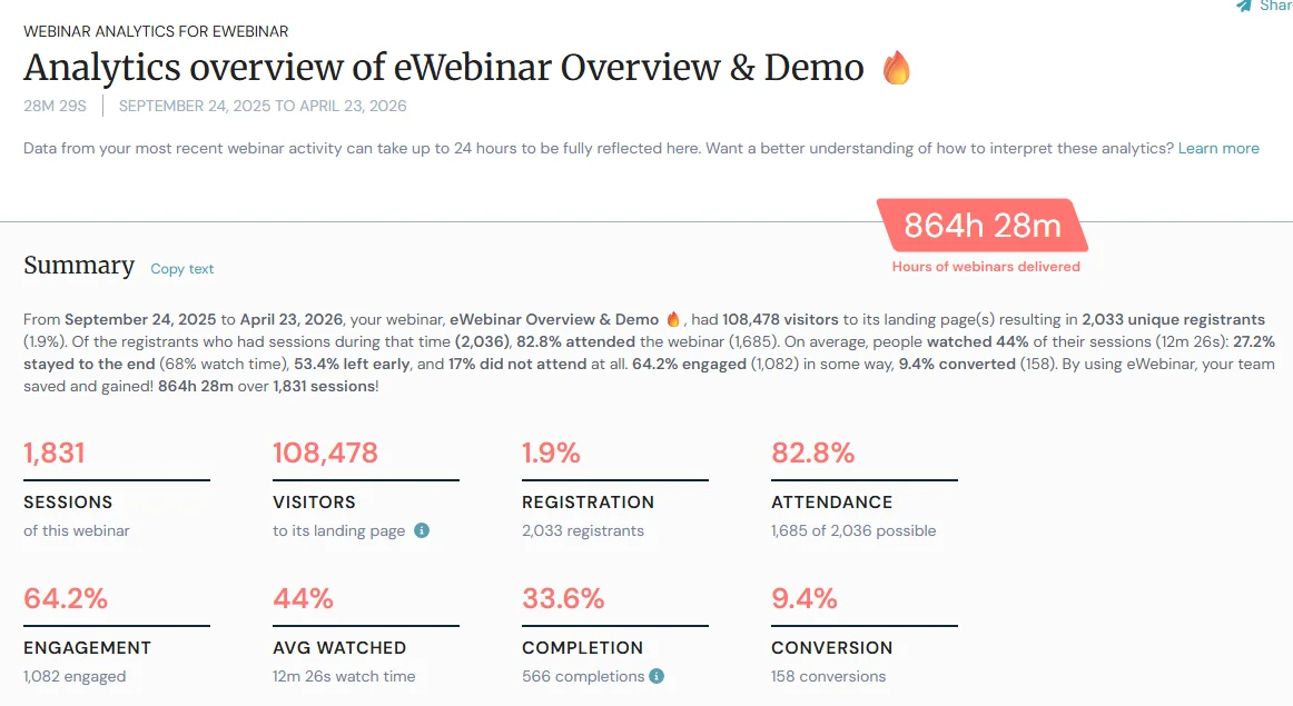
Overview and summary
In the top right corner, you will see the time-saved counter. This is the number of hours you would have spent doing webinars if you hadn’t chosen to automate them. This is calculated by multiplying the number of total sessions attended by the length of your webinar (total sessions x length of video). This is a great way to measure eWebinar’s impact on your productivity, content accessibility and workflow.
On the left, you’ll find a summary paragraph that allows you to easily share the success of your eWebinar with anyone who isn’t using the platform. This summary includes valuable information on attendance and engagement rates, and can be easily shared with the copy text button.
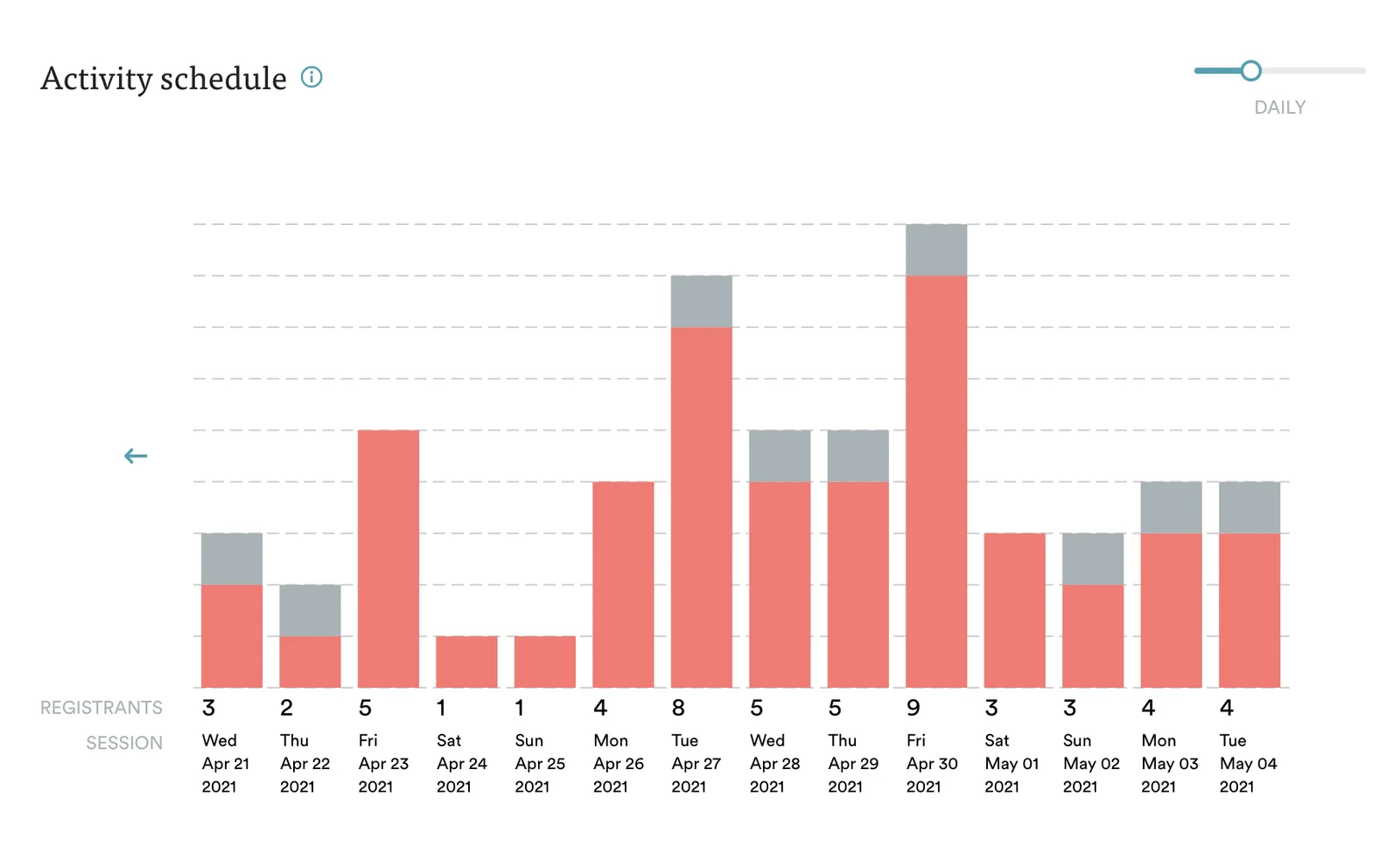
Activity schedule
This shows you how many people are registered for future sessions, so you can forecast and plan effectively. If there’s a day where you expect to see a surge of attendees, for example, you may want to be available to answer questions immediately.
Looking backwards, you can see the actual attendance numbers of past events. This will help you determine your busiest webinar days so you can schedule and market your content accordingly.
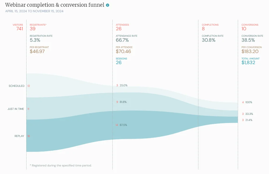
 Webinar completion & conversion funnel
This graph offers a comprehensive overview of how many visitors landed on your registration page, how many registered, how many attended, and how many completed your webinar, per your requirements. If you’d like to see your conversion numbers here as well, see this article to set that up.
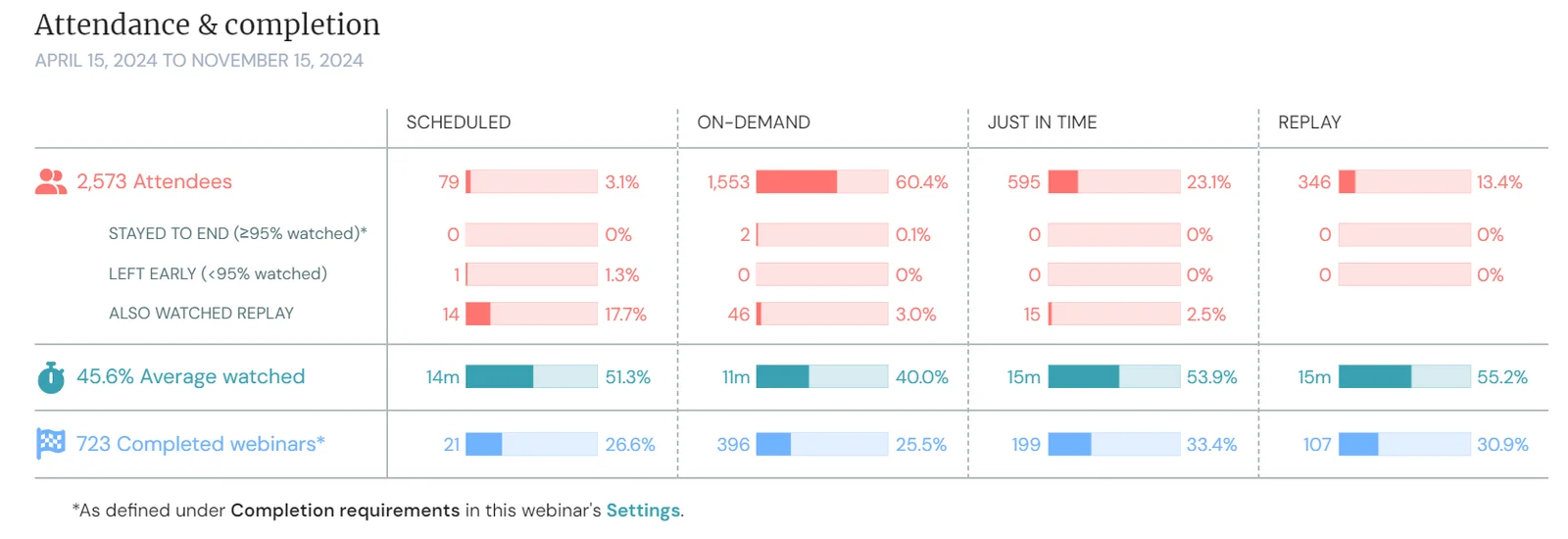
Attendance, watch time & completion breakdown
The attendance chart shows you the type of session (scheduled, on-demand, just in time, or replay) that attendees registered for and their average watch time per session type.
From here, you can easily see which type is most popular. For example, if you are wondering whether you should enable the just-in-time option, you can try it out for 2 to 4 weeks and decide based on your attendance numbers.
On top of this, you can also see how many attendees are staying to the end of your webinar based on the watch time you set, and how many attendees completed your webinar per your completion requirements.
 Engagement heatmap
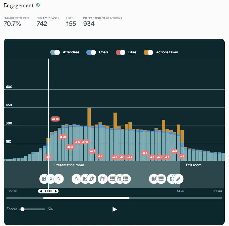
This graph breaks your webinar down by the minute, and shows engagements throughout. Included are 4 types of engagements that eWebinar tracks: attendance, chats, likes (thumbs up button), and actions taken (on interactions).
This data can help you create better presentations. If you see a sudden drop in engagement before your webinar ends, for example, you can watch your video from that point to determine why you’re losing your viewers and how to do better next time.
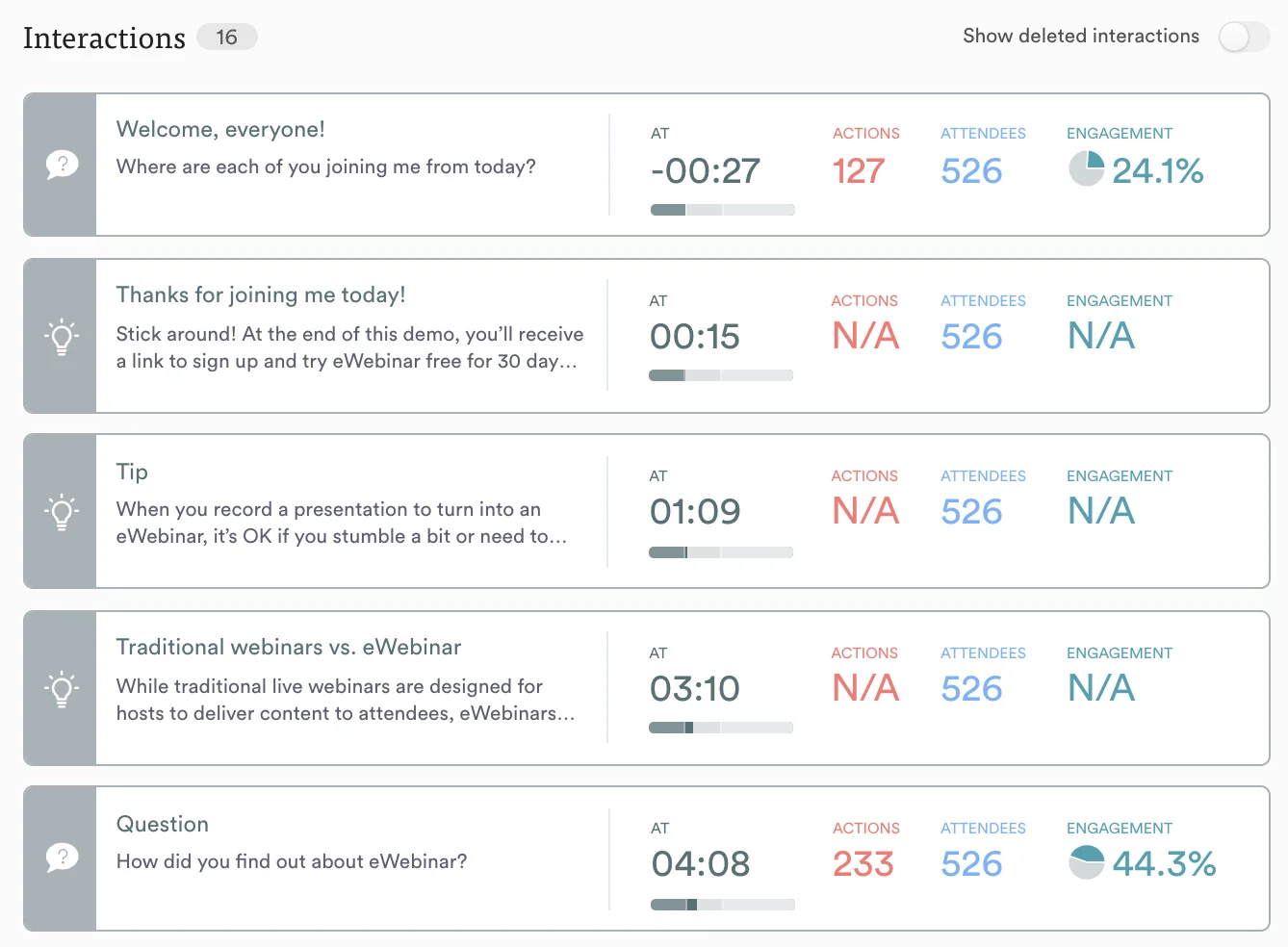
Interaction response rates
This is where you can see how much engagement you have on interactions you've included in your eWebinar. For each one, you can download a list of attendees who responded, as well as their responses.
Your interactions should help you collect meaningful data that you can apply towards your business, and drive attendees towards a call-to-action.
For example, if you want to know how effective your webinar marketing is, you may want to include a multiple-choice poll that asks attendees where they heard about it.
When it comes to your CTA, you may want to promote a webinar-only offer. In order to do this, you can program a time-limited Special Offer, which you can also include in your follow-up email. If you see from analytics that a lot of people have clicked your offer but not many people have claimed it, it may mean that, despite a high-level of interest, the offer was not attractive enough. You may want to change your offer and see if a new one performs better.
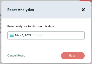
Reset the analytics of any one of your webinars by deleting all of its registrants or changing the date its analytics are counted from.
Whether your have just finished testing your new webinar and want to reset its Analytics before your official launch or you just want to wipe the slate clean, there are two ways to do this:
1. Delete all of your registrants
The first way to reset your Analytics is to delete all of your registrants. To do this, go to the Registrants page of the webinar in question, select all of the registrants, and click Delete. You will be asked to confirm this action before the deletion is permanent.
2. Change the date your Analytics are counted from
The second way to reset your Analytics is to change the date they are counted from. To do this, go to the Analytics page of your webinar and click Reset in the top right corner.
The Reset Analytics modal will open and let you choose the date, presumably ‘Today’, that you would like your Analytics to be counted from.